ILLA Design
Accelerate your internal tools development.
Create with ︎ by contributors


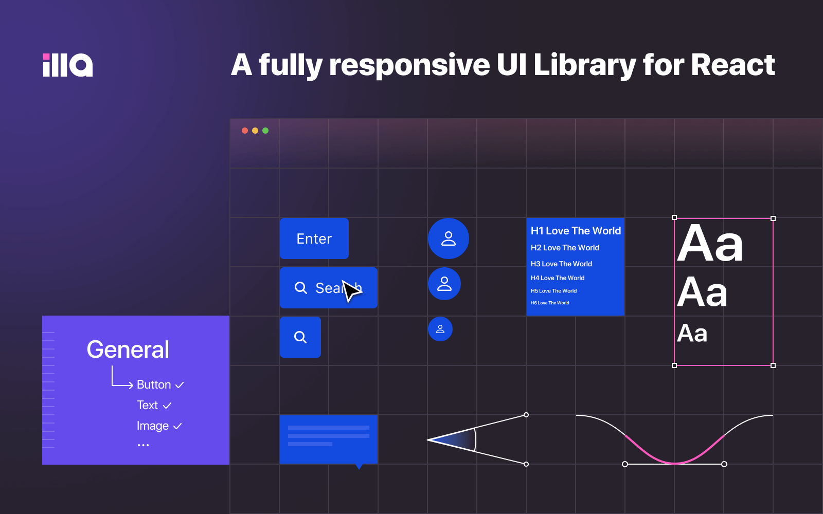
Features
- Made for React: Ready-to-use component library for React.
- TypeScript Friendly: Come with TypeScript typings out of the box and support with predictable static typings.
- High Productivity: Easy and fast, import in 5 seconds.
- Vibrant Design: Beautifully designed components and powerful theming system supports custom themes to match your brand, including light and dark mode.
- Internationalization: Each component was designed with i18n in mind and multiple languages are supported.
- Fully Responsive: Perfectly adaptable with all the devices, desktops to mobiles.
Components
You can review all components in Storybook.
Fast Try
You can quickly use ILLA Design on codesandbox.

Get Started
Step 1: Install
$ pnpm add @illa-design/react @emotion/react framer-motion

# or

$ npm i @illa-design/react @emotion/react framer-motion
Step 2: Use
import { Tag } from '@illa-design/react';

const App = () => (
  <div>
    <Tag>Hello ILLA</Tag>
  </div>
);
Development
Step 1: Clone locally.
$ git clone https://github.com/illacloud/illa-design.git
$ cd illa-design
$ pnpm install
Step 2: Run.
$ pnpm storybookThen your can open storybook in your browser.
Community
Join ILLA Community to share your ideas, suggestions or questions and connect with other users and contributors.
Discussion
Hangout together!
Contributing
Thinking about contributing? All kinds of contributions to ILLA are greatly appreciated and welcomed! Check out Contributing Guide for details about how you can get involved.
We're Hiring
Looking for a passionate and creative team? We are actively hiring engineers for the following positions:
- Frontend Engineer
- Golang Engineer
Contact Us: hr@illasoft.com
License
This project is Apache License 2.0.