@iqorlobanov/react-native-toast v0.5.1
@iqorlobanov/react-native-toast
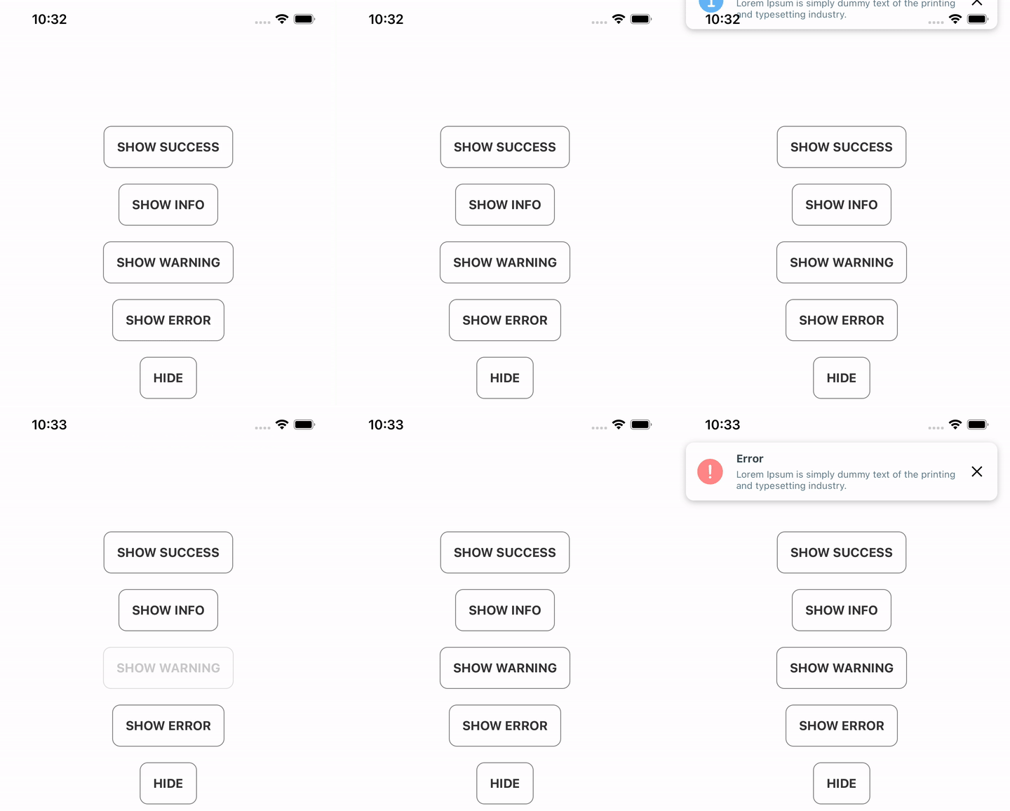
Animated toast component for React Native.

Documentation
Installation
This component created by using
react-native-reanimatedandreact-native-vector-icons. Make sure you have installed react-native-reanimated and react-native-vector-icons before start.
yarn add @iqorlobanov/react-native-toast
# or
npm install --save @iqorlobanov/react-native-toast
Usage
Render the ToastComponent in your app's entry file, as the LAST CHILD in the View hierarchy (along with any other components that might be rendered there):
// App.tsx
import { ToastComponent } from '@iqorlobanov/react-native-toast';

export default function App() {
  return (
    <>
      {/* ... */}
      <ToastComponent />
    </>
  );
}
Then use it anywhere in your app (even outside React components), by calling any Toast method directly:
// Foo.tsx
import { Toast, ToastType } from '@iqorlobanov/react-native-toast';
import { Button } from 'react-native';

export function Foo() {
  return (
    <Button
      title="Show toast"
      onPress={() => {
        Toast.show({
          title: 'Lorem Ipsum',
          description:
            'Lorem Ipsum is simply dummy text of the printing and typesetting industry.',
          type: ToastType.SUCCESS,
          visibilityTime: 5000,
        });
      }}
    />
  );
}
API
The Toast API consists of:
- methods that can be called directly on the
Toastobject - props that can be passed to the
ToastComponentcomponent instance; they act as defaults for all Toasts that are shown
methods
show(options = {})
To show a Toast, call the show() method andd pass the options that suit your needs. Everything is optional, unless specified otherwise:
import { Toast } from '@iqorlobanov/react-native-toast';

Toast.show({
  title: 'Lorem Ipsum',
  description:
    'Lorem Ipsum is simply dummy text of the printing and typesetting industry.',
  type: ToastType.SUCCESS,
  visibilityTime: 5000,
});
The complete set of options is described below:
| option | description | required | type | default value |
|---|---|---|---|---|
type | Toast type. Available values of: SUCCESS, INFO, WARNING, ERROR. | true | ToastType | ToastType.SUCCESS |
title | First line of text | true | string | |
description | Second line of text | false | string | |
visibilityTime | Number of milliseconds after which Toast automatically hides. | false | number | 5000 |
topOffset | Offset from the top of the screen (in px). Has effect only when | false | number | 10 |
withShadow | Enable shadow effect | false | boolean | true |
touchable | Hide toast on toch | false | boolean | true |
showLeftIcon | Show left icon component | false | boolean | true |
showRightIcon | Show close icon component | false | boolean | true |
hide()
To hide the current visible Toast, call the hide() method:
Toast.hide();props
The following set of props can be passed to the ToastComponent component instance to specify certain defaults for all Toasts that are shown:
| prop | description | type | default value |
|---|---|---|---|
titleStyle | Title text style | TextStyle | |
descriptionStyle | Description text style | TextStyle | |
style | Toast view style | ViewStyle | |
leftIconComponent | Custom left icon component | React.ReactNode | |
rightIconComponent | Custom right icon component | React.ReactNode |
// App.tsx
import { ToastComponent } from '@iqorlobanov/react-native-toast';
import CustomRightIcon from './CustomRightIcon'

export default function App() {
  return (
    <>
      {/* ... */}
      <ToastComponent
        titleStyle={{
          fontSize: 16,
          color: 'black',
        }}
        descriptionStyle={{
          fontSize: 14,
          color: 'gray',
        }}
        rightIconComponent={<CustomRightIcon />}
      />
    </>
  );
}
License
MIT