@khoohaoyit/tailwind-grid-center v0.0.5
@khoohaoyit/tailwind-grid-center
A tailwind plugin that center items on last row in a grid.
Installation
Install the plugin from npm:
npm i -D @khoohaoyit/tailwind-grid-centerThen add the plugin to your tailwind.config.js file:
// tailwind.config.js
module.exports = {
  theme: {
    // ...
  },
  plugins: [
    require('@khoohaoyit/tailwind-grid-center'),
    // ...
  ],
};
Usage
Use the grid-cols-center-{n} utilities to specify the amount of columns in a grid:
<div class="grid grid-cols-center-3">
  <div>Item 1</div>
  <div>Item 2</div>
  <div>Item 3</div>
  <div>Item 4</div>
  <div>Item 5</div>
</div>
The respective utilities would generate:
.grid-cols-center-3 {
  grid-template-columns: repeat(6, minmax(0, 1fr));
}
.grid-cols-center-3 > * {
  grid-column: span 2;
}
.grid-cols-center-3 > *:nth-last-child(1):nth-child(3n + 1) {
  grid-column-end: -3;
}
.grid-cols-center-3 > *:nth-last-child(2):nth-child(3n + 1) {
  grid-column-end: -4;
}
.grid-cols-center-3 > *:nth-last-child(1):nth-child(3n + 2) {
  grid-column-end: -2;
}
Note that the output it generates is polynomial, so
grid-cols-center-[10]would generate 47 classes in total.
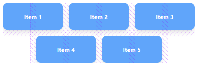
The gridline would look like this:

To use it with responsive modifiers, you need to use tailwindcss@^3.2 using max-width or dynamic breakpoints:
<div class="grid max-sm:grid-cols-center-2 sm:max-lg:grid-cols-center-3 lg:grid-cols-center-4">
  ...
</div>
Configuration
You can configure which values are generated by this plugin under the gridTemplateColumnsCenter key in your tailwind.config.js file:
// tailwind.config.js
module.exports = {
  theme: {
    extend: {
      gridTemplateColumnsCenter: {
        13: '13',
        14: '14',
        15: '15',
        16: '16',
      },
    },
  },
};
Utilities for centering items in a grid are generated up to 12 columns by default.
Links
- How it works by css-irl.info
3 years ago
3 years ago
3 years ago
3 years ago
3 years ago
3 years ago
3 years ago