@lehnfeld/gatsby-theme-intro v2.1.0
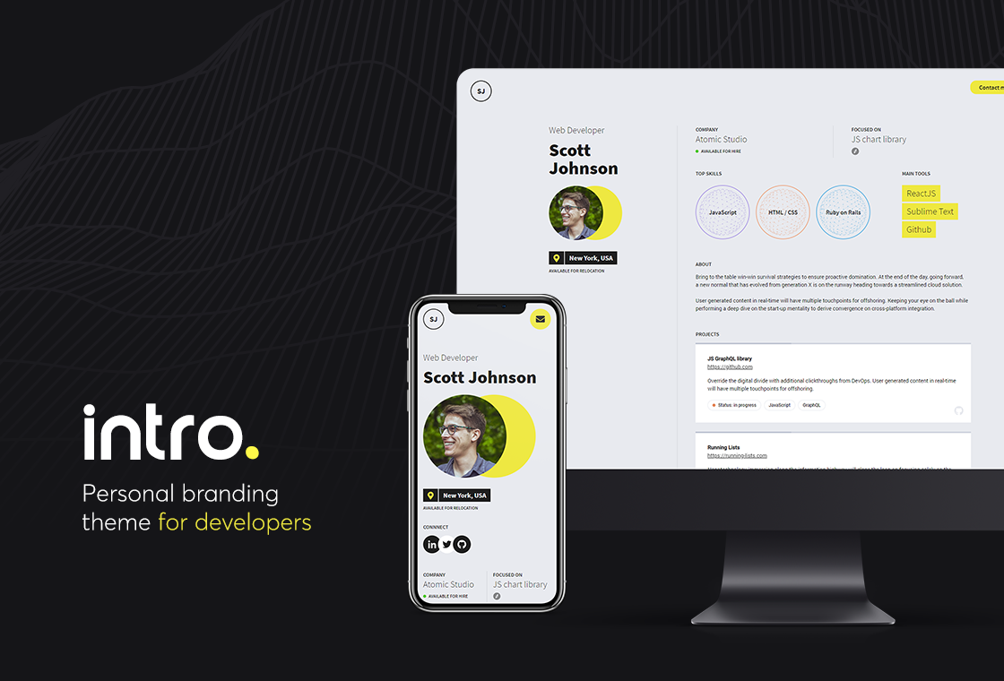
Intro - Personal branding theme for developers
Intro is an open source Gatsby theme built specially for developers.
Tell your story by showing your skills, projects and career path.
Preview
Live Demo
Live demo is available at: https://weeby.studio/intro/preview
Features
- Show your skills, tools, projects & career path
- 10 predefined color versions
- YAML files as a data source
- Contact form integrated with Formspree
- Uses utility-first TailwindCSS framework
- Responsive design (desktop / mobile)
🚀 Getting Started
Install theme & dependencies
mkdir my-site
cd my-site
yarn init -y
yarn add gatsby react react-dom @wkocjan/gatsby-theme-intro
Enable theme
Then add the theme to your gatsby-config.js.
module.exports = {
  plugins: [
    {
      resolve: "@wkocjan/gatsby-theme-intro",
      options: {
        theme: "classic",
      },
    },
  ],
}
Run your site
That's it, you can now run your site using
gatsby developThis process will create content/ directory within your site with a sample data.
Edit content
You can change the website's content by editing .yaml files in content/ directory:
profile.yaml
Follow existing convention to provide your profile information, skills & tools.
Do not remove existing parameters from the file, as it may break the website.
projects.yaml
For each project you can provide:
| Parameter | Value | Is required? |
|---|---|---|
| name | Name of the project | yes |
| url | URL of the project | no |
| description | Project's description | no |
| status | Either in progress or live | no |
| tags | List of tags | no |
| icon | Either github or website | no |
| image | Path to the image | no |
work-history.yaml
For each entry you can provide:
| Parameter | Value | Is required? |
|---|---|---|
| company | Name of the company | yes |
| period | Start / End date | no |
| position | Your position at the company | no |
| url | URL of the company | no |
social.yaml
List of your social media accounts. Please just fill the url parameter or leave it empty.
Do not add custom items to the list.
Enable email notifications
Contact form is integrated with Formspree. To enable form submissions to your e-mail, please sign up for a Formspree account and create a new form in your dashboard.
Once you do it, you'll get your unique endpoint - please add it to gatsby-config.js, within a siteMetadata object.
Configuration
Here is the list of configuration options you can set in gatsby-config.js:
module.exports = {
  siteMetadata: {
    description: "Personal page of John Doe",
    locale: "en",
    title: "John Doe",
    formspreeEndpoint: "https://formspree.io/f/{your-id}",
  },
  plugins: [
    {
      resolve: "@wkocjan/gatsby-theme-intro",
      options: {
        basePath: "/",
        contentPath: "content/",
        showThemeLogo: true,
        theme: "classic",
      },
    },
  ],
}
After modyfying gatsby-config.js it may be required to restart gatsby develop process.
- The
siteMetadatasection is responsible for SEO settings. - By modifying
basePathparameter you can run the website on different URL (e.g.https://mydomain.com/profile). It may be useful when integrating with existing Gatsby site. - By setting
showThemeLogotofalseyou can hide the Intro logo in the footer area. - Change the
themeparameter to load different color variant. Please refer to the list below for available values.
Available color variants
| Name | Preview |
|---|---|
blue | click here |
bright-green | click here |
bright-orange | click here |
bright-red | click here |
classic (default) | click here |
dark-blue | click here |
dark-green | click here |
dark-pink | click here |
gh-inspired | click here |
warm-red | click here |
Customization
Component shadowing
You can use Gatsby component shadowing technique to customize the theme.
- All components are located in
src/componentsdirectory. - All parameters accepted by components are defined using PropTypes. You can find types definitions in one centeral
src/typeslocation. - Code you want to overwrite should be placed within
src/@wkocjan/gatsby-theme-intro/directory.
Please refer to the official documentation to learn more.
Custom color variant
As theme parameter in theme configuration (gatsby-config.js) you can pass either the name of the existing theme or an object of colors.
Example:
module.exports = {
  (...)
  plugins: [
    {
      resolve: "@wkocjan/gatsby-theme-intro",
      options: {
        (...)
        theme: {
          'back': '#edf0f3',
          'front': '#2b3137',
          'lead': '#2781ed',
          'lead-text': '#ffffff',
          'line': '#ced9e3',
          'skill-1': '#405060',
          'skill-2': '#fc8732',
          'skill-3': '#2ebc50',
        },
      },
    },
  ],
  (...)
}
Please remember, that after modyfying gatsby-config.js file it may be required to restart gatsby develop process.
Changelog
2.0.0
The theme is now compatible with Gatsby v3 and TailwindCSS v2.
1.1.0
The version introduces required changes to make the contact form work after latest changes from Formspree.
To upgrade, please add formspreeEndpoint property to siteMetadata object in your gatsby-config.js. For more information about configuring Formspree, please refer to the documentation above.
About
Intro. is a theme created by Wojciech Kocjan from Weeby Studio.
The theme has been initially launched in 2018 as a commercial project written in JavaScript. In 2020 it's been rewritten to Gatsby and open sourced.
Thank you for using it!
4 years ago


