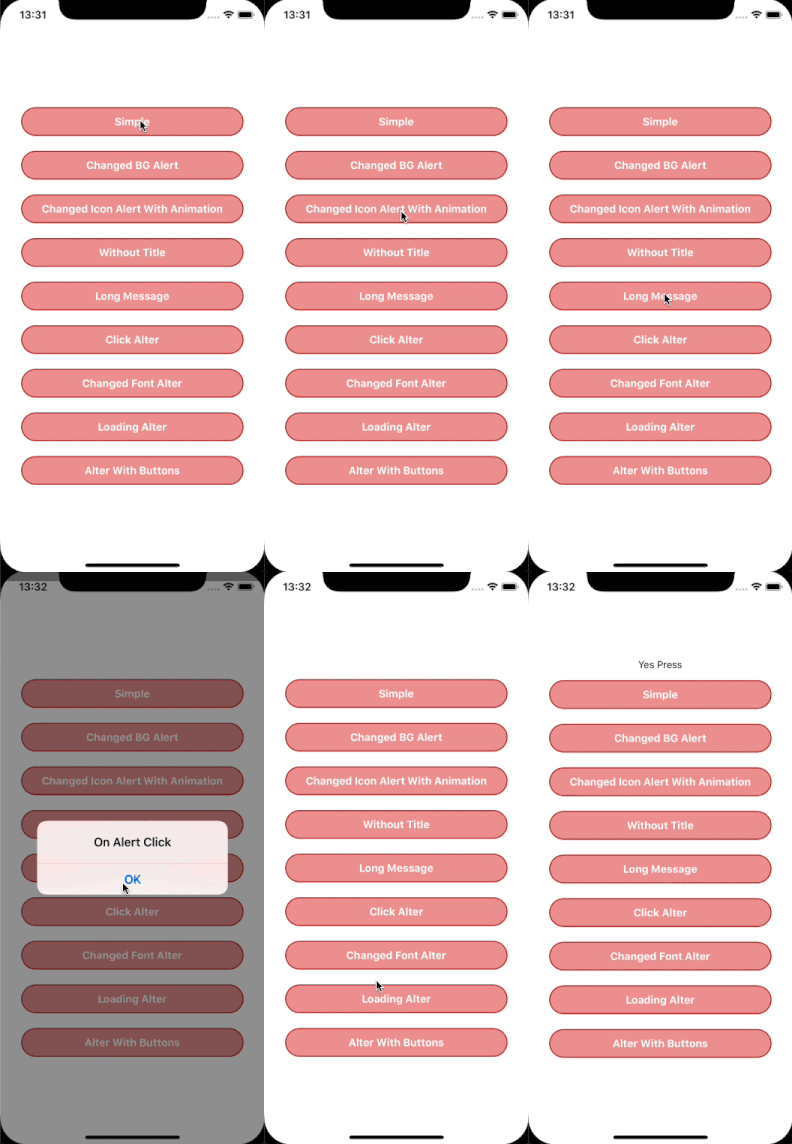
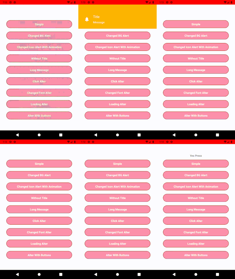
1.0.11 • Published 6 years ago
@logisticinfotech/react-native-animated-alert v1.0.11
react-native-animated-alert
Installation and Usage
Please check this blog for detail usage this link
Simple Usage
import Alert from '@logisticinfotech/react-native-animated-alert';
Below code will show and hide alert the simple alert.
onPressShow = () => {
    Alert.showAlert();
}

...

onPressHide = () => {
    Alert.hideAlert();
}

...

onAlertShow = () => {
    console.log(‘Alert is visible’)
}

onAlertHide = () => {
    console.log(‘Alert is hidden’)
}

...

render(){
    return(
        <View>
        ...
            <Alert
                alertTitle="Title"
                alertMessage="Message"
                onAlertShow={this.onAlertShow}
                onAlertHide={this.onAlertHide}
            />
        ...
        </View>
    )
}

Basic Properties
| Prop | Default | Type | Description |
|---|---|---|---|
| alertBGContainerStyle | {} | style | Alert main container style. |
| alertBGColor | '#A9A9A9' | string | Alert background color. |
| alertIconVisible | true | bool | Display or hide alert icon side to title. |
| alertLoadingVisible | true | bool | Show loading type alter. |
| alertIconSource | bellIcon | source | Change the default bell icon. This will be not display id loading is visible. |
| alertIconSize | 24 | number | size of the alter icon. |
| alertIconTintColor | '' | string | color of the icon if source has transparent pixel. |
| alertIconResizeMode | 'center' | enum of ['center','contain','cover','repeat','stretch'] | Image resize mode. |
| alertAnimatedIcon | true | bool | Icon of alert will be show animated. |
| alertAnimatedIconDuration | 200 | number | Animation time duration of alert icon. |
| alertTitle | '' | string | Display title of the alter. |
| alertTitleStyle | InLibrary | style | Style of alter title display. |
| alertMessage | '' | string | Display message of the alter. |
| alertMessageStyle | InLibrary | style | Style of alter message display. |
| alertButtonTitle | [] | array(string) | Display the alert button. max is 2 buttons. This will be not display id loading is visible. |
| alertButtonPosition | 'end' | enum of ['start','center','end'] | Style of the non selected date or time. |
| alertButtonStyle | InLibrary | style | Style of the alert buttons. |
| alertButtonTextStyle | InLibrary | style | Style of text of the alert buttons . |
| alertAutoHide | true | bool | Auto hide alter. This will be not display id loading is visible or button is visible |
| alertAutoHideDuration | 2000 | number | Time in millisecond after alter auto hide if it enable. This will be not display id loading is visible or button is visible |
| alertTapToDismiss | false | bool | Hide alert on tap on it. This will be not display id loading is visible. |
| onPressAlert | () => {} | function | Call when click on the alter. |
| onPressButtonOne | () => {} | function | Call when button one(left button) is press. |
| onPressButtonTwo | () => {} | function | Call when button two(right button) is press if has two buttons. |
| onAlertShow | () => {} | function | Call when alert is visible. |
| onAlertHide | () => {} | function | Call when alert is hide. |