0.0.3 • Published 7 months ago
@lostisworld/svelte-textcircle v0.0.3
svelte-textcircle
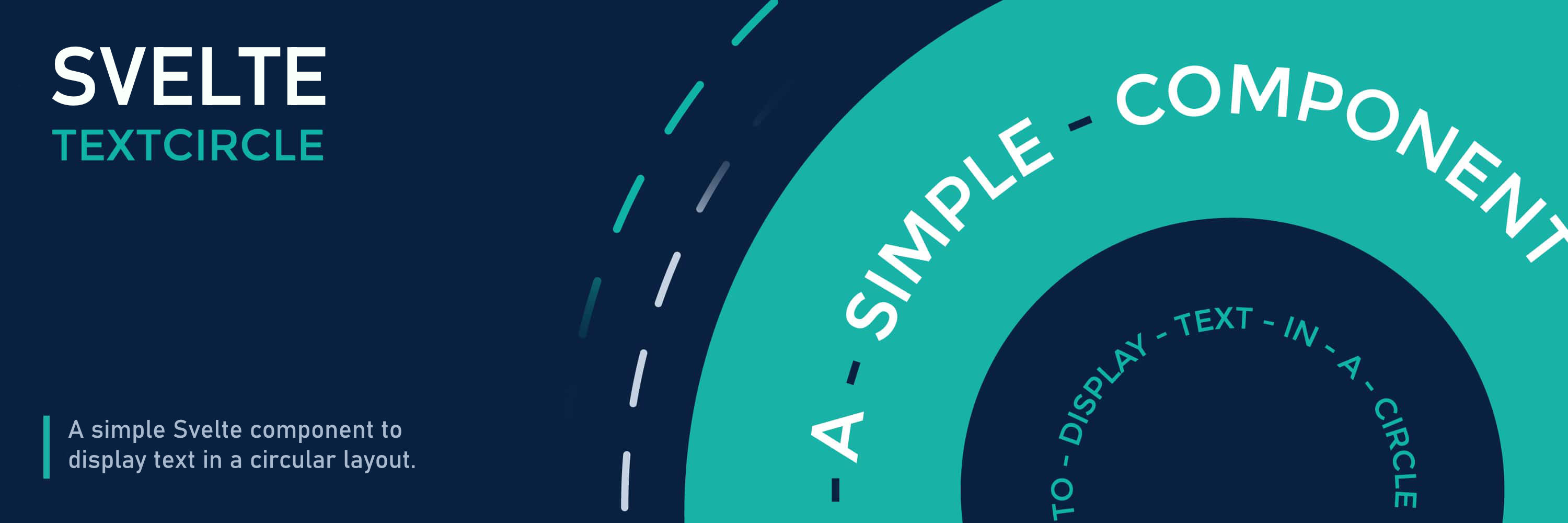
A Svelte component that displays text in a circular layout with customizable animations and styling.

You can check out the Demo in a Svelte Playground!
Features
- Display text strings in a circular arrangement.
- Customize circle size, typography (font size, weight, transform), and appearance.
- Add a custom divider character between words.
- Set initial rotation.
- Control animation: duration, easing, delay, direction, iteration count.
- Trigger animation on component hover or when it enters the viewport.
- Option to stop animation on hover.
- Place custom content (like images, icons, or other components) in the center.
- Highly customizable via props.
- Automatically pauses animation when the component scrolls out of view and resumes it upon re-entry, leveraging
IntersectionObserverfor improved performance. - Built for Svelte 5 using runes.
- Respects
prefers-reduced-motion.
Installation
# npm
npm install @lostisworld/svelte-textcircle

# pnpm
pnpm add @lostisworld/svelte-textcircle
Basic Usage
<script>
	import { Textcircle } from '@lostisworld/svelte-textcircle';
</script>

<!-- Basic usage -->
<Textcircle text={['Svelte', 'Text', 'Circle']} />

<!-- With central content -->
<Textcircle text={['Place', 'Content', 'Here']}>
	<img src="/your-logo.svg" alt="Logo" style="max-width: 80%; height: auto;" />
</Textcircle>
Props
Main Props
| Property | Type | Default | Description |
|---|---|---|---|
| text | string[] | Required | An array of text strings to display in the circle. |
| class | string | '' | Additional CSS class(es) for the main container. |
| options | object | {} | Object for visual customization options. |
| animation | object | {} | Object for animation settings. |
| children | Snippet | null | Svelte Snippet for content in the center. |
Options Props (options={{...}})
| Property | Type | Default | Description |
|---|---|---|---|
| circlesize | string | '250px' | Size (width & height) of the circle. |
| textTransform | 'uppercase' | 'lowercase' | 'none' | 'uppercase' | CSS text-transform for the text. |
| fontSize | string | '1em' | CSS font-size for the text. |
| fontWeight | 'lighter' | 'normal' | 'bold' | 'bolder' | string | 'normal' | CSS font-weight for the text. |
| divider | string | '♦' | HTML entity or character to place between words. Set to '' or undefined to disable. |
| dividerColor | string | currentColor | CSS color for the divider character. Defaults to text color. |
| rotate | number | undefined | Initial rotation offset in degrees. |
Animation Props (animation={{...}})
| Property | Type | Default | Description |
|---|---|---|---|
| duration | string | '30s' | CSS animation-duration. |
| easing | 'ease' | 'ease-in' | 'ease-out' | 'ease-in-out' | 'linear' | string | 'linear' | CSS animation-timing-function. |
| delay | string | '0s' | CSS animation-delay. |
| direction | 'normal' | 'reverse' | 'normal' | CSS animation-direction. |
| count | 'infinite' | number | 'infinite' | CSS animation-iteration-count. |
| animateInView | boolean | true | Start animation only when component is in viewport. Overridden by animateOnHover. |
| animateOnHover | boolean | false | Pause animation initially, play only on hover. |
| stopAnimateOnHover | boolean | false | If animating by default (animateInView is true and animateOnHover is false), pause animation on hover. |
Examples
Custom Options
<Textcircle
	text={['Custom', 'Styling', 'Example']}
	options={{
		circlesize: '300px',
		fontSize: '1.1rem',
		fontWeight: 700,
		divider: '•',
		dividerColor: 'dodgerblue',
		rotate: -15
	}}
/>
Custom Animation
<Textcircle
	text={['Animated', 'Text', 'Circle']}
	animation={{
		duration: '10s',
		easing: 'ease-out',
		direction: 'reverse',
		count: 5, // Animate 5 times
		animateOnHover: true // Only animate when hovered
	}}
/>
Stop Animation on Hover
<Textcircle
	text={['Stop', 'On', 'Hover']}
	animation={{
		duration: '20s',
		stopAnimateOnHover: true // Default animation stops when hovered
	}}
/>
Central Content
<Textcircle text={['Svelte', 'TextCircle', 'Component', 'with', 'Logo']}>
	<div
		style="display: flex; justify-content: center; align-items: center; width: 100%; height: 100%; background: #eee; border-radius: 50%;"
	>
		<img src="/logo.svg" alt="Logo" style="width: 60%; height: auto;" />
	</div>
</Textcircle>
CSS Customization
You can target the component's elements using these CSS classes for further styling:
.textcircle: The main containerdiv..textcircle-container: Thepelement holding the rotating text..textcircle-char: Individualspanelements for each character..textcircle-char-divider: Thespanelement for the divider character..textcircle-children: Thedivcontaining the slotted central content.
You can also override the CSS variables used internally, although using the props is recommended:
--s: Circle size--fs: Font size--fw: Font weight--tt: Text transform--ro: Initial rotation (in degrees, applied via style)--du: Animation duration--ti: Animation timing function (easing)--de: Animation delay--di: Animation direction--c: Animation iteration count--dc: Divider color--aoh: Animation play state (controlled internally)
Notes
- For optimal appearance with longer text, you might need to decrease
fontSizeor increasecirclesize. - The component maintains its aspect ratio, but ensure the
circlesizeis appropriate for different screen sizes.
Contributing
Contributions are welcome! Please ensure all changes are well-documented and tested.
- Fork the repository.
- Create a new branch for your feature or bugfix.
- Commit your changes with clear and descriptive messages.
- Submit a pull request.
License
MIT