14.0.1 • Published 4 years ago
@majesnix/color-picker v14.0.1
Angular Material Color Picker for @angular/material 7.x, 8.x, 9.x, 10.x, 11.x
Description
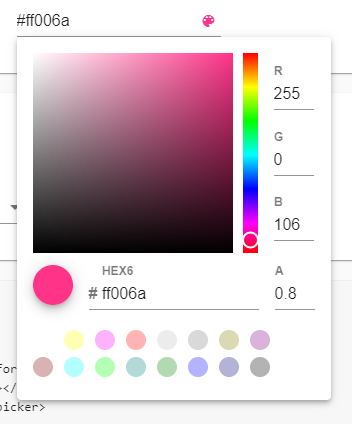
An Angular Material Color Picker.
DEMO
@see DEMO stackblitz

Choose the version corresponding to your Angular version:
| Angular | @angular-material-components/color-picker |
|---|---|
| 11 | 5.x+ |
| 10 | 4.x+ |
| 9 | 2.x+ |
| 8 | 2.x+ |
| 7 | 2.x+ |
Getting started
Choose the version corresponding to your Angular version:
| Angular | @angular-material-components/color-picker |
|---|---|
| 10 | 4.x+ |
| 9 | 2.x+ |
| 8 | 2.x+ |
| 7 | 2.x+ |
npm install --save @angular-material-components/color-pickerSetup
import { MAT_COLOR_FORMATS, NgxMatColorPickerModule, NGX_MAT_COLOR_FORMATS } from '@angular-material-components/color-picker';

@NgModule({
   ...
   imports: [
        ...
        NgxMatColorPickerModule
   ],
   providers: [
    { provide: MAT_COLOR_FORMATS, useValue: NGX_MAT_COLOR_FORMATS }
   ],
   ...
})
export class AppModule { }
@see src/app/demo-colorpicker/demo-colorpicker.module.ts
Using the component
Color Picker (ngx-mat-color-picker)
<mat-form-field>
    <input matInput [ngxMatColorPicker]="picker" [formControl]="colorCtr" [disabled]="disabled">
    <ngx-mat-color-toggle matSuffix [for]="picker"></ngx-mat-color-toggle>
    <ngx-mat-color-picker #picker [touchUi]="touchUi" [color]="color"></ngx-mat-color-picker>
</mat-form-field>
List of @Input
| @Input | Type | Default value | Description |
|---|---|---|---|
| disabled | boolean | null | If true, the picker is readonly and can't be modified |
| touchUi | boolean | false | Whether the calendar UI is in touch mode. In touch mode the calendar opens in a dialog rather than a popup and elements have more padding to allow for bigger touch targets. |
Theming
- @see @angular/material Using a pre-built theme
- Add the Material Design icon font to your index.html
<link href="https://fonts.googleapis.com/icon?family=Material+Icons&display=block" rel="stylesheet">License
MIT

