@martinmaffei95/image-uploader v1.1.0
React Image Uploader
A simple input component to upload images and return base64 files. ⚡ Ready for integration with react-hooks-forms or formik. ⚡ Easy to personalize the style with Tailwind
How work
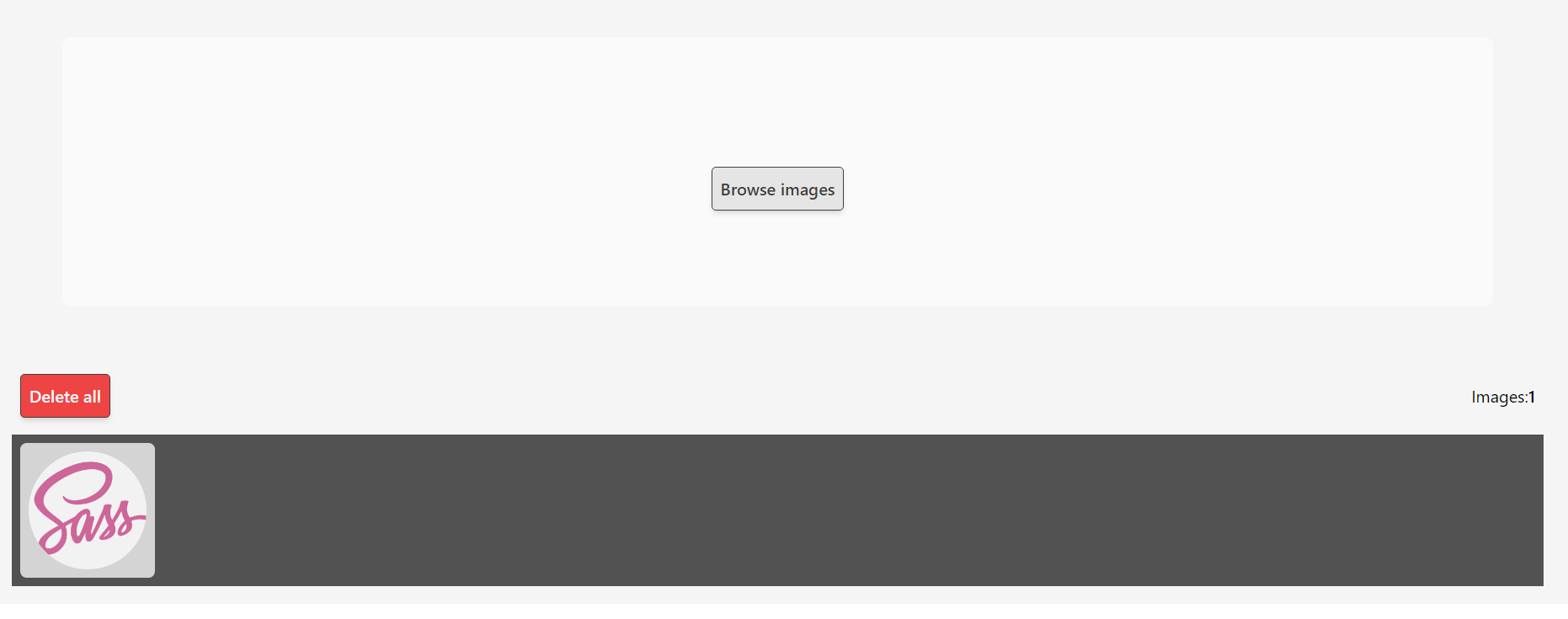
The component take the images who enter by a input (type:file). Later transforms that files to base64 array and uses the same array to render a gallery with the images and execute the setFieldValue function.
Every image have a "delete" button individually. The gallery have a "delete all" button too and a "counter" of images.
Support drag and drop
How use
For a simple way to integrate with a formularies this component provide a prop called setFieldValue this recieves a function which change the value of the field. Used that with the name property to set the input name.
Simple way
The setFieldValue uses the fieldName and saves the input value on them.
import { useState } from 'react';
import { ImageUploader, Image } from 'image-uploader';

const MyComponent = () => {
  const [values, setValues] = useState<{ [name: string]: Image[] }>();
  const setFieldValue = (name: string, value: any) => {
    setValues((state) => ({
      ...state,
      [name]: value,
    }));
  };
  return (
    <ImageUploader
      config={{
        inputConfig: {
          fieldName: 'simpleInputForm',
          setFieldValue,
        },
      }}
    />
  );
};

export default MyComponent;
Formik
Its really simple using the component with formik. In this example we destruct the useFiedlValue function from the useFormik(). Only need give that function to the component with a field name.
import ImageUploader from 'image-uploader';
import { Image } from 'image-uploader';
import { useFormik } from 'formik';

const MyComponent = () => {
  // create the initialValue for Formik with her type
  const initialValues = {
    formikInputImages: [],
  };

  type formikInputForm = {
    formikInputImages: Image[];
  };
  //create the onSubmit function for Formik
  const onSubmit = () => {};

  //Destructuring the setFieldValue function from useFormik()
  const { setFieldValue } = useFormik<formikInputForm>({
    initialValues: initialValues,
    onSubmit,
  });

  return (
    <ImageUploader
      config={
        inputConfig:{
        setFieldValue,
        fieldName: 'formikInputImages',
      }}
    />
  );
};

export default MyComponent;
React hook forms
We mantain the same simplicity using RHF. Destruct the setValue function from useForm() and give that function to the component. Not forgive the fieldName.
In this particulare case we use the watch function to. We use for observe changes on the state and update correctly the form value.
import ImageUploader from '../components/ImageUploader/components/ImageUploader';
import { FaImages } from 'react-icons/fa';
import { useForm } from 'react-hook-form';

const MyComponent = () => {
  const { setValue, watch } = useForm();
  watch(['rofInputImages']);

  return (
    <ImageUploader
      config={
        inputConfig:{
        setFieldValue: setValue,
        fieldName: 'rofInputImages',
      }}
    />
  );
};

export default MyComponent;
Error & validation
Validation
On inputConfig can set if you want the input accept multiple files -or not- and what type of file they can accept.
You can validate min & max size of every files. In case of error the component throw a error but, by default, dont executes anything, only executes a exception.
Error
In the config object u have error.onError this function will be executed if the max or min validation throw a Error
<ImageUploader
  config={{
    inputConfig: {
      fieldName: 'simpleInputForm',
      setFieldValue,
      min: 1000,
      max: 15000,
      multiple: false,
      accept: '.jpg, .jpeg, .png',
    },
    error: {
      onError: (error) => alert(JSON.stringify(error)),
    },
  }}
/>
Drag and Drop
You can execute functions in the onDragOver onDragLeave onDrop events.
include any of this events on the config object
<ImageUploader
  config={{
    inputConfig: {
      fieldName: 'simpleInputForm',
      setFieldValue,
    },
    dragAndDropEvents: {
      onDragLeave: (e) => console.log('ON DRAG LEAVE EVENT', e),
      onDragOver: (e) => console.log('ON DRAG OVER EVENT', e),
      onDrop: (e) => console.log('ON DROP EVENT', e),
    },
  }}
/>
Presonalization 🎨
Every part of the component should be personalized. Have support for inline-styles(CSSProperties) and classNames(string) -- ptss... its compatible with tailwind 😉.
The config object is divide diferent objects who represents every part of the component.
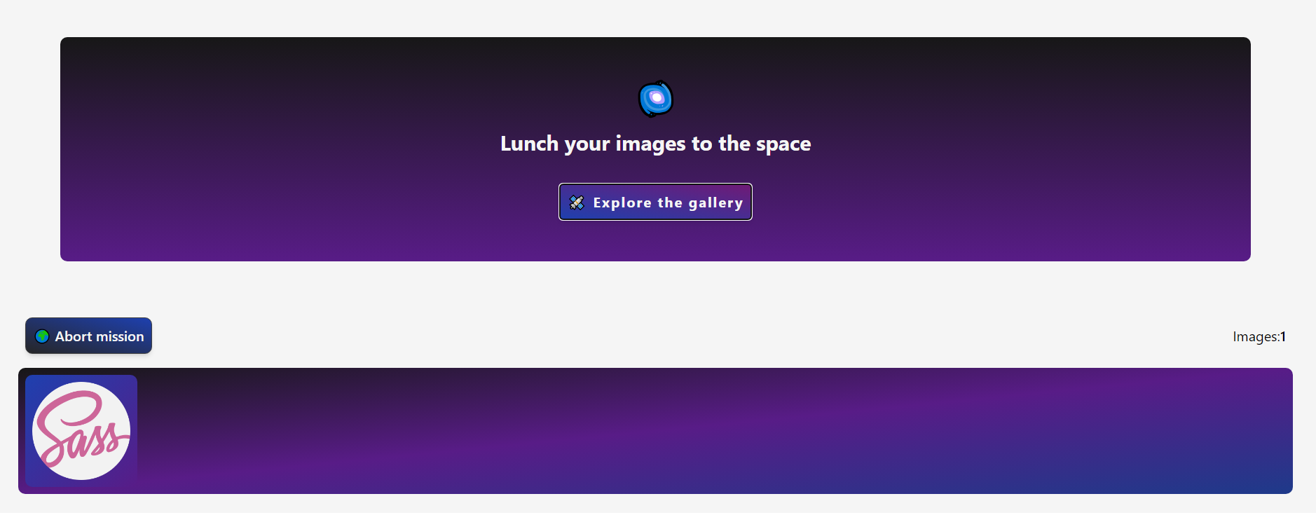
If you look a fast style can use the colorScheme prop and get a complete styled component. Later u can overwrite every style. This accept 'base'
| 'blue'
| 'pink'
| 'yellow'
| 'green'
| 'red'
| 'purple'
| 'black'
| 'ball'
| 'galaxy';
In the next section show all the props (includes the personalization props).
Fast example:
<ImageUploader
  config={{
    colorScheme: 'galaxy',
  }}
/>
And now change from this

to THIS!🎉🎉🎉

All Props
Dependencies in use
- Tailwind : All styles has made whit TailwindCss
- tailwind-merge : to make easy the integration with tailwind
- tailwind-animated : uses in some
colorSchemes - uuid : used for make ids for every image.
Last Updates
1.1.0 Added
colorSchemesconfig. the validations ofmin&maxsize is ready Added theonErrorprop1.0.0 First up
Licence
MIT Licence