@mdbootstrap/react-card-deck v1.0.2
Responsive Card Deck built with Bootstrap 5, React 17 and Material Design 2.0. Bootstrap card-deck with multiple rows and standard breakpoints.
Check out React Bootstrap Card Deck Documentation for detailed instructions & even more examples.
Card deck layout
In addition to styling the content within cards, Bootstrap includes a few options for laying out series of cards.
Cards group
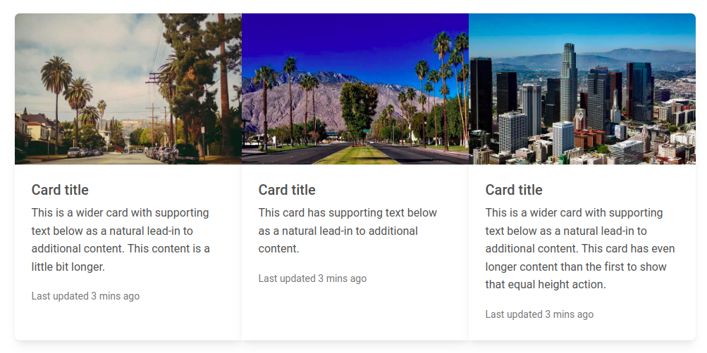
Use card groups to render cards as a single, attached element with equal width and height columns. Card groups start off stacked and use display: flex; to become attached with uniform dimensions starting at the sm breakpoint.

import React from "react";
import {
  MDBCard,
  MDBCardImage,
  MDBCardBody,
  MDBCardTitle,
  MDBCardText,
  MDBCardGroup,
  MDBContainer,
} from "mdb-react-ui-kit";

export default function Basic() {
  return (
    <MDBContainer className="mt-3">
      <MDBCardGroup>
        <MDBCard>
          <MDBCardImage
            src="https://mdbootstrap.com/img/new/standard/city/041.webp"
            alt="..."
            position="top"
          />
          <MDBCardBody>
            <MDBCardTitle>Card title</MDBCardTitle>
            <MDBCardText>
              This is a wider card with supporting text below as a natural
              lead-in to additional content. This content is a little bit
              longer.
            </MDBCardText>
            <MDBCardText>
              <small className="text-muted">Last updated 3 mins ago</small>
            </MDBCardText>
          </MDBCardBody>
        </MDBCard>

        <MDBCard>
          <MDBCardImage
            src="https://mdbootstrap.com/img/new/standard/city/042.webp"
            alt="..."
            position="top"
          />
          <MDBCardBody>
            <MDBCardTitle>Card title</MDBCardTitle>
            <MDBCardText>
              This is a wider card with supporting text below as a natural
              lead-in to additional content.
            </MDBCardText>
            <MDBCardText>
              <small className="text-muted">Last updated 3 mins ago</small>
            </MDBCardText>
          </MDBCardBody>
        </MDBCard>

        <MDBCard>
          <MDBCardImage
            src="https://mdbootstrap.com/img/new/standard/city/043.webp"
            alt="..."
            position="top"
          />
          <MDBCardBody>
            <MDBCardTitle>Card title</MDBCardTitle>
            <MDBCardText>
              This is a wider card with supporting text below as a natural
              lead-in to additional content. This card has even longer content
              than the first to show that equal height action.
            </MDBCardText>
            <MDBCardText>
              <small className="text-muted">Last updated 3 mins ago</small>
            </MDBCardText>
          </MDBCardBody>
        </MDBCard>
      </MDBCardGroup>
    </MDBContainer>
  );
}
How to use?
Download MDB React - free UI KIT
Choose your favourite customized component and click on the image
Copy & paste the code into your MDB project
▶️ Subscribe to YouTube channel for web development tutorials & resources