Memori React

Library to integrate an Agent from Memori in a React app.
Web Platform: AIsuru
Installation
yarn add @memori.ai/memori-reactnpm install @memori.ai/memori-reactUsage
Import the component:
import Memori from '@memori.ai/memori-react';Import the CSS:
import '@memori.ai/memori-react/dist/styles.css';Then use it in your app:
const App = () => (
  <Memori
    memoriName="Memori"
    ownerUserName="memoridev"
    tenantID="www.aisuru.com"
    apiURL="https://backend.memori.ai"
    engineURL="https://engine.memori.ai"
    baseURL="https://www.aisuru.com"
    uiLang="it"
    multilingual
    showShare
    height="100vh"
  />
);
Props
| Prop | Required | Type | Default | Description |
|---|---|---|---|---|
memoriName |
* (see below) | string |
Name of the Memori | |
ownerUserName |
* (see below) | string |
Username of the Memori owner | |
memoriID |
* (see below) | string |
ID of the Memori (agent) | |
ownerUserID |
* (see below) | string |
ID of the Memori owner | |
tenantID |
string |
Tenant ID, example: "aisuru.com" or "app.memorytwin.com" | ||
sessionID |
string |
Initial Session ID, UUID which refers to the session to the Memori and identifies a conversation and its permissions (giver, receiver, anonymous). A session would be started autonomously with the params set, but if you have an existing and valid sessionID you can pass it as already opened one. Use this at your risk, as session recovery might break or start session as anon user. In most cases, you shoudn't use this prop. | ||
authToken |
string |
Authentication token from user login, needed for giver sessions to upload assets | ||
integrationID |
string |
Integration ID, UUID which refers to the public page layout | ||
integration |
Integration |
Integration object | ||
secretToken |
string |
Secret token, the password of a private or secret Memori | ||
height |
string |
"100%" | Height of the Memori | |
showShare |
bool |
true |
Show the share button | |
showCopyButton |
bool |
true |
Show the copy button on messages | |
showTranslationOriginal |
bool |
false |
Show button to see original text when translated | |
showSettings |
bool |
true |
Show the settings panel button | |
showTypingText |
bool |
false |
Show default sentences while loading text (see: Typing stories) | |
showLogin |
bool |
true |
Show the login button | |
showClear |
bool |
false |
Show clear chat history button | |
showOnlyLastMessages |
bool |
true or false * |
Show only last 2 messages. (*) Defaults to true for TOTEM and WEBSITE_ASSISTANT layouts, false otherwise |
|
showUpload |
bool |
true |
Show the upload button within the chat | |
maxTotalMessagePayload |
number |
300000 | Max per-document content length (character count). Kept for backward compatibility: it no longer applies to the sum of all attached documents. | |
disablePastedText |
boolean |
false |
When true, pasted text is not added as a document attachment; only normal textarea paste occurs. | |
maxTextareaCharacters |
number |
Max characters allowed in the chat textarea. When set, shows a counter (e.g. "0 / 500") above the textarea, enforces the limit, and disables paste-as-attachment by default. | ||
showReasoning |
bool |
false |
Show reasoning output | |
baseURL |
string |
Base URL of the Memori, example: "https://aisuru.com" | ||
apiURL |
string |
"https://backend.memori.ai" | URL of the Memori Backend API | |
engineURL |
string |
"https://engine.memori.ai" | URL of the Memori Engine API | |
tag |
string |
Tag of the person opening the session to the Memori, could be the giver or a receiver | ||
pin |
string |
PIN of the person opening the session to the Memori, could be the giver or a receiver | ||
context |
string |
Initial context of the conversation, dictionary with "key: value" pairs as context variables | ||
initialQuestion |
string |
Initial question to ask to the Memori, starts the conversation as this would be sent to the Memori | ||
uiLang |
'en' | 'it' | 'es' | 'fr' | 'de' |
"en" | Language of the UI, es: "en" or "it" | |
multilingual |
bool |
false |
Enable multilingual mode, if enabled the user can switch between spoken languages | |
spokenLang |
string |
Language of the spoken text, as defaults to user selection. Example: "en" or "it" | ||
onStateChange |
function |
Callback function called when the state of the Memori changes | ||
enableAudio |
boolean |
true |
Enable audio output. Defaults to true if otherwise indicated by props or integration config. | |
defaultSpeakerActive |
boolean |
true |
Default value for the speaker activation | |
disableTextEnteredEvents |
boolean |
false |
Disable MemoriTextEntered events listeners for typeMessage functions, useful to avoid issues with multiple widgets in page. |
|
useMathFormatting |
boolean |
false |
Apply math formatting to the messages, defaults to false if otherwise indicated by props or integration config. | |
layout |
string |
Layout of the Memori: "FULLPAGE" (default), "CHAT", "WEBSITE_ASSISTANT", "TOTEM", "HIDDEN_CHAT", or "ZOOMED_FULL_BODY". PII detection is only available via integration config, not as a prop. See Layouts. |
||
customLayout |
React.FC<LayoutProps> |
Custom layout component, see below | ||
customMediaRenderer |
(mimeType: string) => JSX.Element | null |
Custom media renderer, see below | ||
additionalSettings |
JSX.Element |
Custom JSX or component to render within the settings drawer | ||
userAvatar |
string |
Custom URL or React element to use as user avatar | ||
autoStart |
boolean |
false |
Automatically start the conversation when the component is mounted. |
*: one of these pairs is required: memoriName + ownerUserName, memoriID + ownerUserID
Layouts
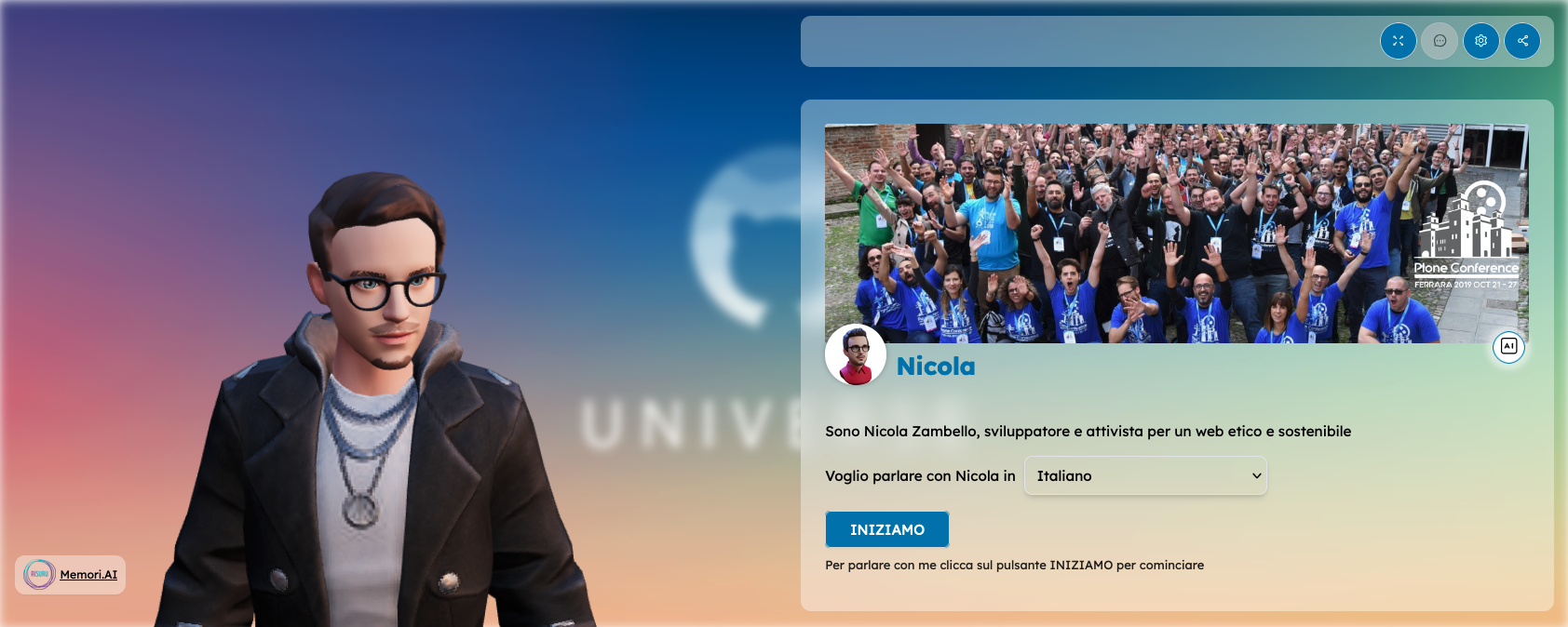
The Memori can be displayed in six layouts: FULLPAGE, CHAT, WEBSITE_ASSISTANT, TOTEM, HIDDEN_CHAT, and ZOOMED_FULL_BODY.
If you don't specify a layout (via the layout prop or via integration config), the default is FULLPAGE.
As a prop (string only, takes precedence over integration):
<Memori layout="FULLPAGE" ... />Via the integration prop: the integration object must have a customData string containing JSON. That JSON can include a layout field: either a string (layout name) or an object { name: LayoutName, piiDetection?: PiiDetectionConfig } to enable PII detection. Used when you use a public page / landing experience from the backend.
// Integration with layout name only
const integration = {
  integrationID: '...',
  customData: JSON.stringify({
    layout: 'FULLPAGE',
    lang: 'it',
    // ...other integration options
  }),
};
<Memori integration={integration} ... />

// Integration with layout + PII detection (PII is only configurable here, not as a layout prop)
const integration = {
  integrationID: '...',
  customData: JSON.stringify({
    layout: {
      name: 'FULLPAGE',
      piiDetection: {
        enabled: true,
        rules: [
          {
            id: 'email',
            label: 'Email',
            pattern: '\\b[A-Za-z0-9._%+\\-]+@[A-Za-z0-9.\\-]+\\.[A-Za-z]{2,}\\b',
            message: { it: 'Contiene email.', en: 'Contains email.' },
          },
        ],
        errorMessage: { it: 'Dati sensibili.', en: 'Sensitive data.' },
      },
    },
    lang: 'it',
  }),
};
<Memori integration={integration} ... />
If both the layout prop and integration.customData.layout are provided, the layout prop (string) wins for the layout name. PII detection is only read from integration config (when customData.layout is an object with piiDetection).
PII detection
PII detection is only available via integration config: pass an integration whose customData JSON has layout as an object with name and piiDetection (see above). It is not configurable via the layout prop.
When enabled, the widget checks each message (including attached document text) against the configured regex rules before sending. If any rule matches, the message is not sent and a single red error bubble is shown with the main errorMessage plus the matched rules’ messages, in the chat’s selected language (when multilingual is enabled).
Config shape (inside integration.customData.layout.piiDetection):
| Field | Type | Description |
|---|---|---|
enabled |
boolean |
When true, PII check runs before sending. |
rules |
array |
List of { id, label, pattern, message }. pattern is a regex string; message is { [lang]: string } (e.g. { it: "...", en: "..." }). Rules with the same id are deduplicated in the error text. |
errorMessage |
object |
Main line shown in the bubble: { [lang]: string }. |
Example (inside customData):
layout: {
  name: 'FULLPAGE',
  piiDetection: {
    enabled: true,
    rules: [
      {
        id: 'email',
        label: 'Email',
        pattern: '\\b[A-Za-z0-9._%+\\-]+@[A-Za-z0-9.\\-]+\\.[A-Za-z]{2,}\\b',
        message: { it: 'Contiene email.', en: 'Contains email.' },
      },
    ],
    errorMessage: { it: 'Dati sensibili.', en: 'Sensitive data.' },
  },
}
Invalid or empty regex patterns are skipped; missing translations fall back to en then the first available value.
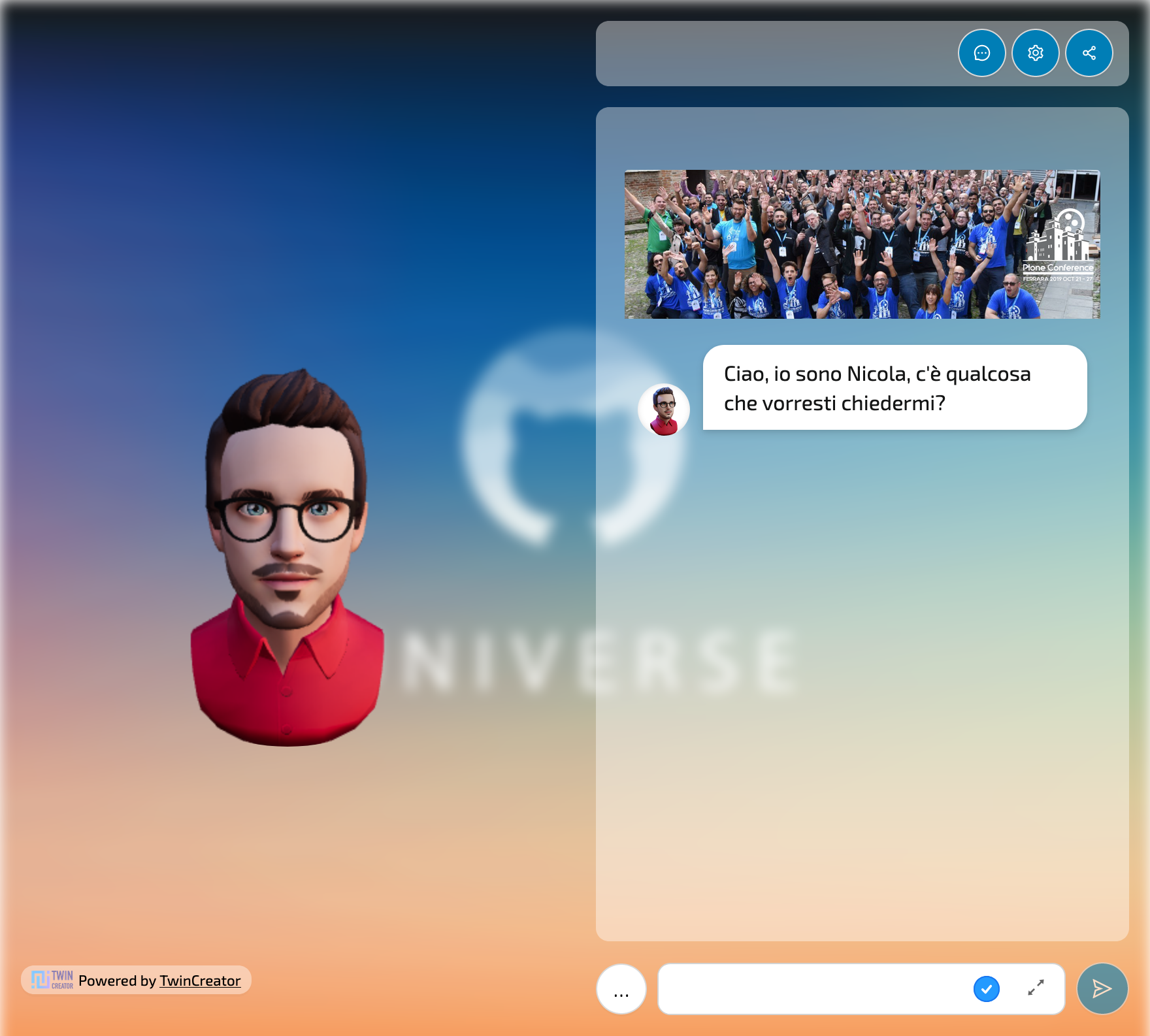
FULLPAGE
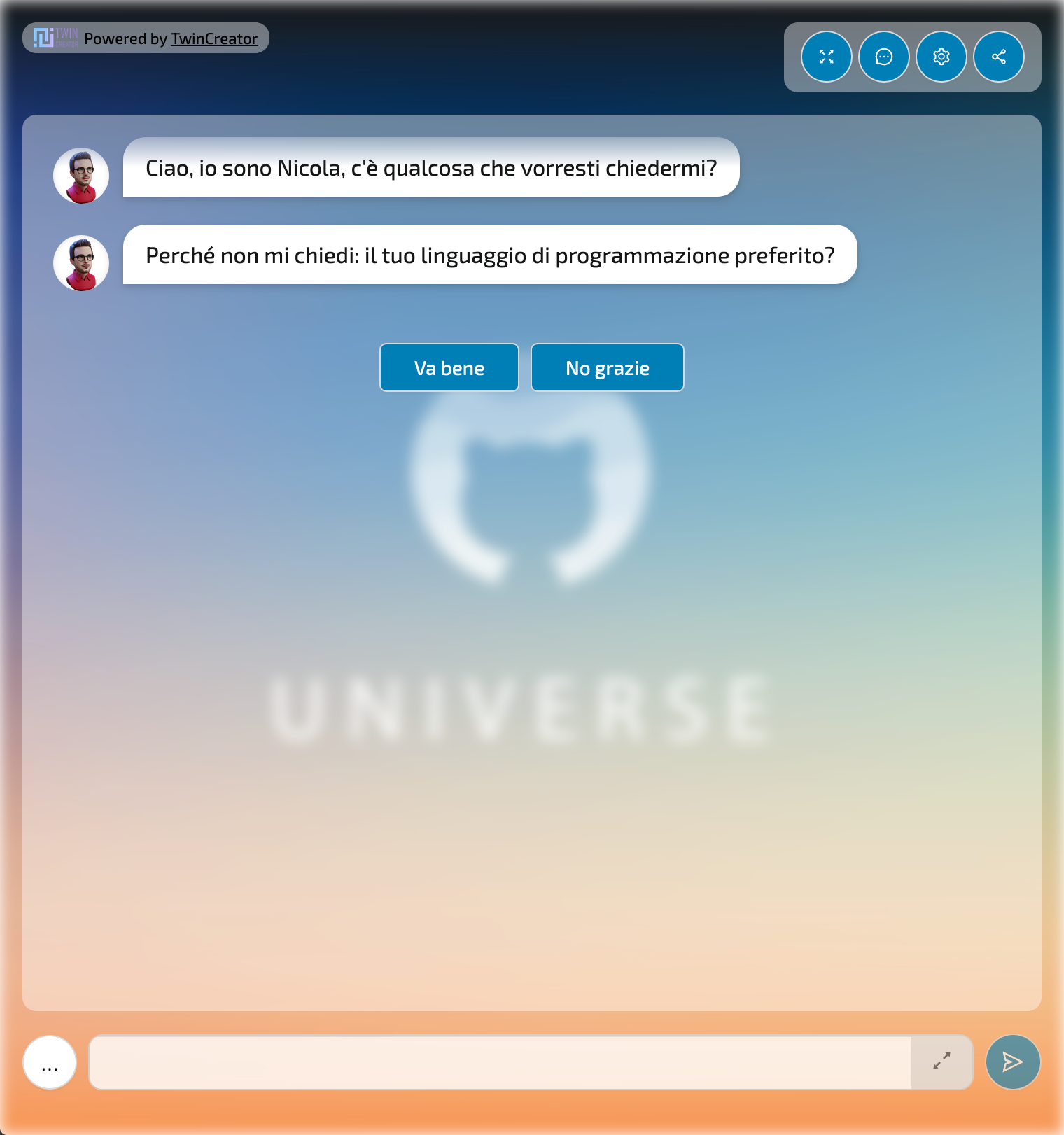
TOTEM
CHAT
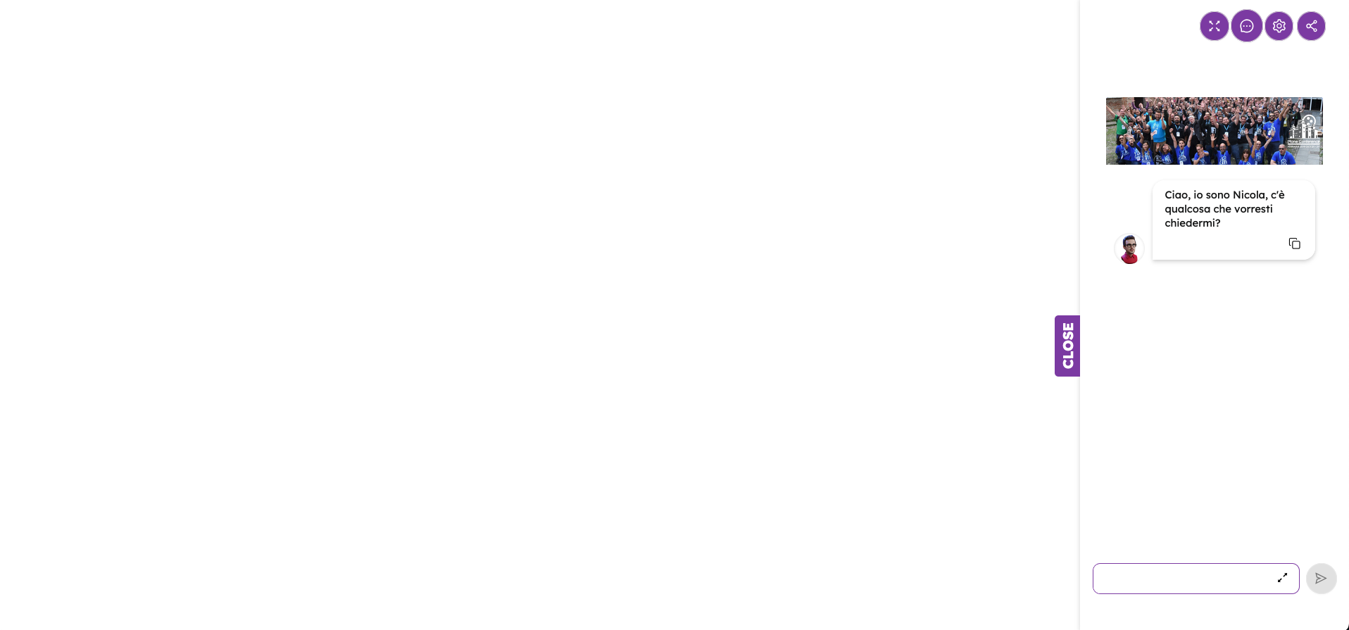
WEBSITE_ASSISTANT

HIDDEN_CHAT
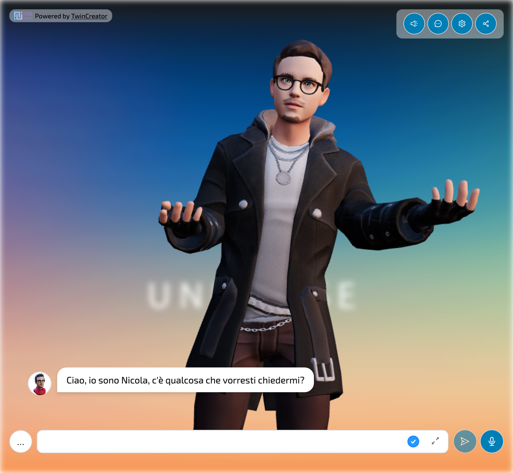
ZOOMED_FULL_BODY
Custom layout
You can override the default layout by passing a custom layout component to the customLayout prop.
The custom layout component must be a React functional component that accepts a LayoutProps object as props.
import { LayoutProps } from '@memori.ai/memori-react/dist/components/MemoriWidget/MemoriWidget';

const MyCustomLayout: React.FC<LayoutProps> = ({
  Header,
  headerProps,
  Avatar,
  avatarProps,
  Chat,
  chatProps,
  StartPanel,
  startPanelProps,
  integrationStyle,
  integrationBackground,
  ChangeMode,
  changeModeProps,
  sessionId,
  hasUserActivatedSpeak,
  loading = false,
  poweredBy,
}) => (
  <>
    {integrationStyle}
    {integrationBackground}

    <Spin spinning={loading} className="memori-mycustom-layout">
      {poweredBy}

      <div className="memori-mycustom-layout--controls">
        {sessionId && hasUserActivatedSpeak && Chat && chatProps ? (
          <Chat {...chatProps} />
        ) : startPanelProps ? (
          <StartPanel {...startPanelProps} />
        ) : null}
      </div>
    </Spin>
  </>
);
And then pass it to the customLayout prop:
  <Memori
    ...
    customLayout={MyCustomLayout}
  />
Styling
You can override the default styles of the Memori by customizing the following CSS custom properties:
memori-client,
#headlessui-portal-root,
.memori-widget {
  --memori-primary: rgb(102, 103, 171);
  --memori-primary-text: #fff;
  --memori-inner-content-pad: 1rem;
  --memori-inner-bg: transparent;
  --memori-chat-bubble-bg: #ffffff60;
  --memori-text-color: #000;
  --memori-button-bg: #fff;
  --memori-button-text: #000;
  --memori-button-padding: 0.5rem 1.5rem;
  --memori-button-border-color: #d9d9d9;
  --memori-button-radius: 5px;
  --memori-button-box-shadow: 0 2px 0 rgba(0, 0, 0, 0.02);
  --memori-blur-background: 0px;
  --memori-drawer--width: 100%;
  --memori-drawer--width--md: 80%;
  --memori-drawer--width--lg: 60%;
  --memori-modal--width: 100%;
  --memori-modal--width--md: 80%;
  --memori-error-color: #ff4d4f;
  --memori-button-disabled-bg: #f9f9f9;
}
You can review the default styles in the styles.css file.
Component overrides
When using the customLayout prop, you can also override the default components used by the client.
const MyCustomChat: LayoutProps['Chat'] = ({ history, sendMessage }) => {
  const [message, setMessage] = React.useState('');

  ...
}

const MyCustomAvatar: LayoutProps['Avatar'] = (props) => {
  ...
}

const CustomLayout: React.FC<LayoutProps> = ({
  avatarProps,
  chatProps,
  StartPanel,
  startPanelProps,
  sessionId,
  hasUserActivatedSpeak,
  loading = false,
  poweredBy,
}) => (
  <>
    <Spin spinning={loading} className="memori-mycustom-layout">
      {poweredBy}

      <div className="memori-mycustom-layout--avatar">
        <MyCustomAvatar {...avatarProps} />
      </div>

      <div className="memori-mycustom-layout--controls">
        {sessionId && hasUserActivatedSpeak && Chat && chatProps ? (
          <MyCustomChat {...chatProps} />
        ) : startPanelProps ? (
          <StartPanel {...startPanelProps} />
        ) : null}
      </div>
    </Spin>
  </>
);
Custom media renderer
You can override the default media renderer by passing a custom function to the customMediaRenderer prop.
This can override the default media renderer for all media types or just for a specific one.
You can also use this to extend the default media renderer with additional media types.
<Memori
  ...
  customMediaRenderer={(mimeType: string) => {
    if (mimeType === 'custom/content-type') {
      return <MyCustomImageRenderer />;
    }

    return null;
  }}
/>
Global utilities
When rendered, the Memori widget exposes some global functions that can be used to interact with the Agent.
Get the state of the conversation
let dialogState = getMemoriState();
let sessionID = getMemoriState().sessionID;
let dialogState = getMemoriState(myWidgetIntegrationId); // in case you have multiple widgets on the same page
Otherwise, you can achieve the same result manually by reading from the HTML code of the widget the attribute data-memori-engine-state.
let dialogState = JSON.parse(
  document.querySelector('div[data-memori-engine-state]')?.dataset
    ?.memoriEngineState ?? '{}'
);
Write and send a message to the Agent
Write and send a message to the agent. You can use this method to send a message, such as to continue a conversation with a specific message or following an action.
typeMessage('Hello World!');Additional parameters:
const waitForPrevious = true; // waits for previous message to be read, default: true
const hidden = true; // message is not visible to the user, only the response is, default: false
const typingText = "Asking the unicorns' opinion..."; // text to show in the loader while the Agent is answering, defaults to none
typeMessage('Hello World!', waitForPrevious, hidden, typingText);
There is also an alias function that does not show the message sent to the user, but only the Agent's response:
const waitForPrevious = true; // waits for previous message to be read, default: true
typeMessageHidden('Hello World!', waitForPrevious);

// alias to
typeMessage('Hello World!', waitForPrevious, true);
Artifact API
The Memori widget exposes a global window.MemoriArtifactAPI that allows you to programmatically create and control artifacts from external JavaScript code. This is particularly useful for integrating with WebSockets, Action Cable, or any scenario where you need to inject and display artifacts dynamically.
Quick Example
// Create and open a simple artifact
window.MemoriArtifactAPI.createAndOpenArtifact(
  '<h1>Hello!</h1><p>This is my artifact</p>',
  'html',
  'My Artifact'
);

// Check current state
const state = window.MemoriArtifactAPI.getState();
console.log('Drawer open?', state.isDrawerOpen);
Available Methods
createAndOpenArtifact(content, mimeType?, title?)- Create and open an artifact with simple parametersopenArtifact(artifact)- Open an artifact with a complete ArtifactData objectcreateFromOutputElement(outputElement)- Process a single<output>element from DOMcloseArtifact()- Close the current artifact drawertoggleFullscreen()- Toggle fullscreen modegetState()- Get the current state of the artifact system
Conversation state change event
The onStateChange prop allows you to listen to state changes in the Memori widget.
<Memori
  ...
  onStateChange={(state) => {
    console.log('Memori state changed:', state);
  }}
/>
Or, you can listen to the MemoriNewDialogState event on the document:
document.addEventListener('MemoriNewDialogState', e => {
  console.log('Memori state changed:', e.detail);
});
where e.details is the new state of the Memori. This is useful to use when working with memori-webcomponent.
See also
- memori-api-client - API client for Memori
- memori-webcomponent - Web component for Memori, uses this library