messageJS
❯ Top Message Generate With Pure Javascript


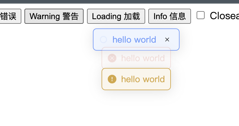
Table of Contents
Overview
If you don't want to introduce the entire component library, but still need a simple page message prompt
Features
- Zero Dependencies
- Pure Javascript
- Lightweight
- Easy to use
Project Structure
└── messagejs/
    ├── LICENSE
    ├── demo.ts
    ├── doc
    │   └── vitepress.config.js
    ├── index.html
    ├── package.json
    ├── pnpm-lock.yaml
    ├── public
    │   └── vite.svg
    ├── src
    │   ├── const.ts
    │   ├── index.ts
    │   ├── style.ts
    │   ├── typescript.svg
    │   └── vite-env.d.ts
    ├── tsconfig.json
    └── vite.config.js
Getting Started
Installation
Install messagejs using one of the following methods:
Using npm
npm install @mizuka/messagejs --save-Usage
Run messagejs using the following command:
Using npm 
import { Message } from "@mizuka/messagejs";

function showMessage(
  type: "success" | "error" | "info" | "warning" | "loading"
): Message {
  const result = Message[type](getMessage(), {
    showClose: isShowClose(),
  });
  return result;
}
OPTIONS
| Property Name | Type | Description |
|---|---|---|
| message | string | (() => string) | The message text to be displayed. It can be a string or a function that returns a string. |
| type | MessageType | The type of the message. It can be one of the following: "success", "error", "info", "warning", "loading". The default value is "info". |
| icon | string | The SVG icon to be displayed. It should be a string representing the SVG code. |
| dangerouslyUseHTMLString | boolean | A boolean value indicating whether the message property should be treated as HTML. The default value is false. |
| customClass | string | A string representing the custom class name to be added to the message container. |
| duration | number | The duration for which the message should be displayed in milliseconds. If set to 0, the message will not auto-close. The default value is 3000. |
| showClose | boolean | A boolean value indicating whether the close button should be displayed. The default value is false. |
| center | boolean | A boolean value indicating whether the message text should be centered. The default value is false. |
| onClose | (instance: Message) => void | A callback function that is called when the message is closed. It takes the Message instance as a parameter. |
| offset | number | The offset from the top of the page where the message should be displayed. The default value is 40. |
| appendTo | HTMLElement | The HTML element where the message should be appended. The default value is document.body. |
Other Example
if you want change the max size display of the message sametime, you can use the following code:
import { Message } from "@mizuka/messagejs";

Message.manager.max = 10; // default 3
if you want change the margin between messages , you can use the following code:
import { Message } from "@mizuka/messagejs";

Message.manager.margin = 8; // default 16
Project Roadmap
-
Task 1: basic implement
Contributing
- Join the Discussions: Share your insights, provide feedback, or ask questions.
- Report Issues: Submit bugs found or log feature requests for the
messagejsproject. - Submit Pull Requests: Review open PRs, and submit your own PRs.
License
This project is protected under the MIT License. For more details, refer to the LICENSE file.