@mythicaldev/md-vue3-forms v1.0.6
Vue3 Forms
Set of simple form components for Vue 3
Installation
npm install @mythicaldev/md-vue3-formsOR
npm i @mythicaldev/md-vue3-formsTailwind configuration
You will need to update your tailwind.config.js file to include the following in your content array.
./node_modules/@mythicaldev/md-vue3-forms/**/*.vueComponents
Below is the list of components, their properties and examples of how to use them.
MDForm
(Required)
Every form is wrapped in this base MFForm component. This component provides a submit button, optional cancel button and assignable actions for those buttons. You next the form elements you need for your form within this base element.
<template>
  <MDForm class="my-5">Form at it's most basic level, only a submit button</MDForm>
  <MDForm class="mb-5" :showCancel="true">Form that includes a cancel button</MDForm>
  <MDForm class="mb-5" :showCancel="true" submitText="Add" cancelText="Back">
    Form that includes a cancel button and custom text for each button
  </MDForm>
  <MDForm
    class="mb-20"
    :showCancel="true"
    submitText="Add"
    cancelText="Back"
    @onSubmitClicked="submit"
    @onCancelClicked="cancel">
    Form that includes a cancel button, custom text and methods assigned to those buttons
  </MDForm>
</template>
<script setup>
  // Import the main form component
  import { MDForm } from '@mythicaldev/md-vue3-forms';

  const submit = () => {};
  const cancel = () => {};
</script>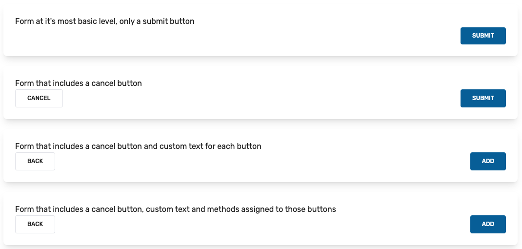
MDForm Props
| Prop | Type | Default | Required | Description |
|---|---|---|---|---|
| showCancel | Boolean | false | false | Display/Hide the cancel button |
| showSubmit | Boolean | true | false | Display/Hide the submit button |
| cancelText | String | Cancel | false | Text for the cancel button |
| submitText | String | Submit | false | Text for the cancel button |
MDForm Emitted Events
| Event | Description |
|---|---|
| onCancelClicked | Emitted when the cancel button is clicked |
| onSubmitClicked | Emitted when the submit button is clicked |
MDGroup
Wrapper element to group related form fields in.
<template>
  <MDForm>
    <MDGroup>Add your form fields here.</MDGroup>
  </MDForm>
</template>
<script setup>
  // Import the base form component and the optional group component.
  import { MDForm, MDGroup } from '@mythicaldev/md-vue3-forms';
</script>
MDText
This is a basic text input field.
<template>
  <MDForm :showCancel="true" submitText="Add" @onSubmitClicked="submit">
    <MDGroup>
      <!-- Bare bones basic text field -->
      <MDText class="mb-5" id="first_name" v-model="state.name.first" />
      <!-- Text field with a placeholder -->
      <MDText class="mb-5" id="last_name" placeholder="Last Name" v-model="state.name.last" />
      <!-- Secure field with a label and placeholder -->
      <MDText
        class="mb-5"
        type="password"
        id="password"
        label="Password"
        placeholder="******"
        v-model="state.password"
      />
      <!-- Required field with a label (Label is used as a placeholder by default) -->
      <MDText class="mb-5" type="email" id="email" label="Email" v-model="state.email" :required="true" />
      <!-- Required, Label, and error state. -->
      <MDText
        class="mb-5"
        id="nickname"
        label="Nick Name"
        v-model="state.nickname"
        :required="true"
        :error="state.errors.nickname"
      />
    </MDGroup>
  </MDForm>
</template>
<script setup>
  import { reactive } from 'vue';
  // Import the main form component, a group to wrap a set of fields in and the text field.
  import { MDForm, MDGroup, MDText } from '@mythicaldev/md-vue3-forms';

  const state = reactive({
    name: {
      first: '',
      last: '',
    },
    email: '',
    nickname: '',
    password: '',
    errors: {
      nickname: 'Nicknames are always required.',
    },
  });

  const submit = () => {
    console.log(state);
  };
</script>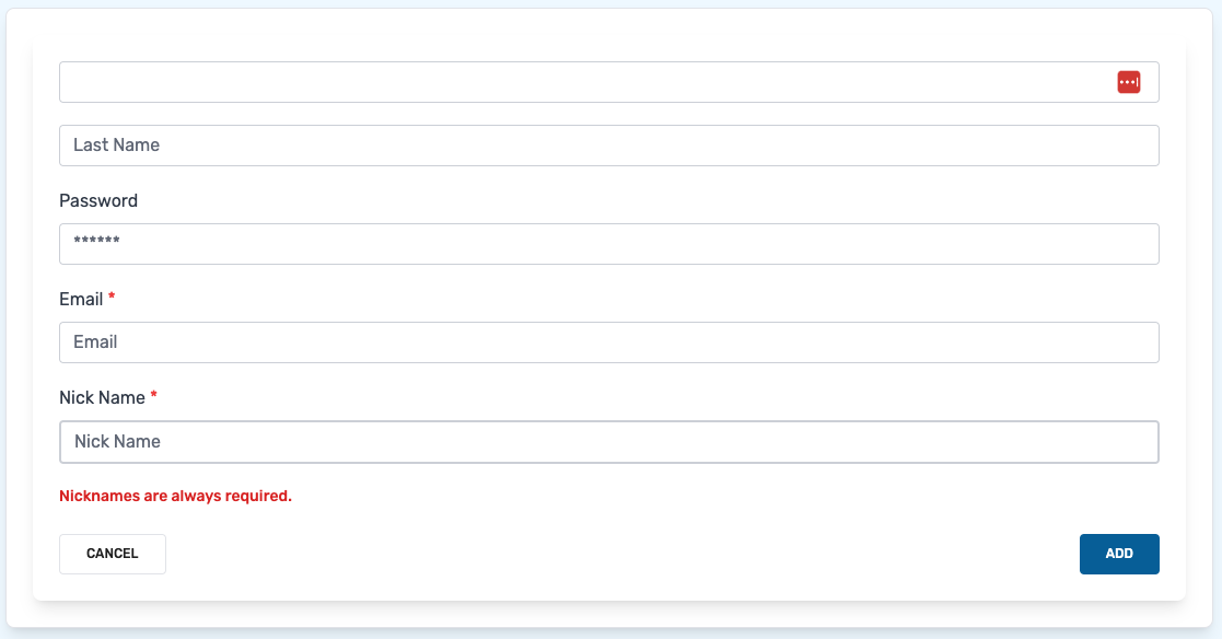
MDText Props
| Prop | Type | Default | Required | Description |
|---|---|---|---|---|
| id | String | true | The id of the field. | |
| label | String | false | The label to add to the field. Empty by default providing no label. | |
| type | String | text | false | The type of field to use. Defaults to a basic text field. |
| modelValue | String, Number | false | The property to update. This should be passed as v-model when implementing | |
| placeholder | String | false | The placeholder to use for the field. Empty by default providing no placeholder. | |
| describedBy | String | false | The aria-describedby value for the field. | |
| help | String | false | Text that will display under the field to give help or context. | |
| error | String | false | Error text to display under the field. | |
| enabled | Boolean | true | false | Determines if the field is enabled or not. |
| success | Boolean | false | false | Style the field indicating success. |
| info | Boolean | false | false | Style the field for information feedback |
| warning | Boolean | false | false | Style the field as warning, for example when there is an error displayed. |
| required | Boolean | false | false | Determines if the field is required or not. |
MDCheckbox
Simple checkbox. Can default to checked or not and emits a single event.
<template>
  <MDForm class="my-10">
    <MDGroup>
      <!-- Bare bones, checkbox only -->
      <MDCheckbox :isChecked="false" @selected="selected" />
      <!-- Include a label if desired -->
      <MDLabel id="check1" label="Unchecked" />
      <MDCheckbox :isChecked="false" @selected="selected" />
      <!-- Default to being checked -->
      <MDLabel id="check2" label="Checked" />
      <MDCheckbox :isChecked="true" @selected="selected" />
    </MDGroup>
  </MDForm>
</template>
<script setup>
  // Import the form, group, label and checkbox components.
  import { MDForm, MDGroup, MDCheckbox, MDLabel } from '@mythicaldev/md-vue3-forms';

  const selected = () => {};
</script>
MDCheckbox Props
| Prop | Type | Default | Required | Description |
|---|---|---|---|---|
| isChecked | Boolean | false | false | Determines if the checkbox is checked or not. |
MDCheckbox Emitted Events
| Event | Description |
|---|---|
| selected | Emitted when the checkbox is checked or unchecked |
MDDatePicker
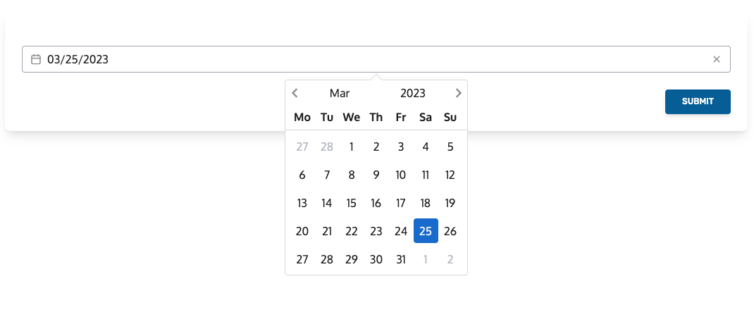
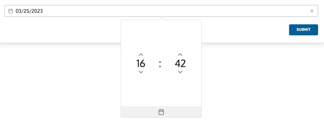
Integrates the @vuepic/vue-datepicker package for a flexible datepicker field.
<template>
  <MDForm class="my-10">
    <MDGroup>
      <!-- Basic, bare bones -->
      <MDDatePicker id="date" v-model="state.start" />
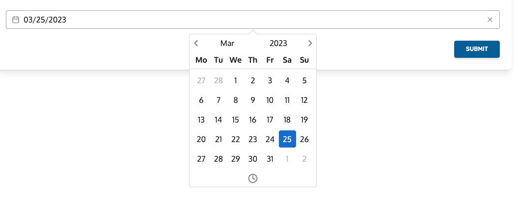
      <!-- With the time picker enabled -->
      <MDDatePicker id="date" v-model="state.end" :enableTimePicker="true" />
    </MDGroup>
  </MDForm>
</template>
<script setup>
  import { reactive } from 'vue';
  // Import the form, group, label and checkbox components.
  import { MDForm, MDGroup, MDDatePicker } from '@mythicaldev/md-vue3-forms';

  const state = reactive({
    start: new Date(),
    end: new Date(),
  });
</script>
Basic, Bare bones
With time picker enabled
MDDatePicker Props
| Prop | Type | Default | Required | Description |
|---|---|---|---|---|
| id | String | true | The id of the form field. | |
| modelValue | Date | new Date() | true | The property to update. This should be passed as v-model when implementing. |
| enableTimePicker | Boolean | false | false | Determines if the time picker is enabled. |
| format | String | MM/dd/yyyy | false | The format to apply to the date-time. |
| label | String | false | The label to add to the field. Empty by default providing no label. | |
| describedBy | String | false | The aria-describedby value for the field. | |
| help | String | false | Text that will display under the field to give help or context. | |
| error | String | false | Error text to display under the field. | |
| success | Boolean | false | false | Style the field indicating success. |
| info | Boolean | false | false | Style the field for information feedback |
| warning | Boolean | false | false | Style the field as warning, for example when there is an error displayed. |
| required | Boolean | false | false | Determines if the field is required or not. |
MDDraggablePicker
Integrates the sortableJS library to allow moving items from one list to another.
<template>
  <MDForm class="my-10">
    <MDGroup>
      <MDDraggablePicker
        id="test"
        v-model="state.books"
        selectedLabel="Selected Items"
        availableLabel="Available Items"
      />
    </MDGroup>
  </MDForm>
</template>
<script setup>
  import { reactive } from 'vue';
  // Import the form, group and draggable components.
  import { MDForm, MDGroup, MDDraggablePicker } from '@mythicaldev/md-vue3-forms';

  const state = reactive({
    books: {
      available: [
        {
          id: 1,
          name: 'The Shining',
        },
        {
          id: 1,
          name: 'Pride and Prejudice',
        },
        {
          id: 1,
          name: '1984',
        },
        {
          id: 1,
          name: 'The Lord of the Rings',
        },
        {
          id: 1,
          name: 'The Old Man and the Sea',
        },
      ],
      selected: [],
    },
  });
</script>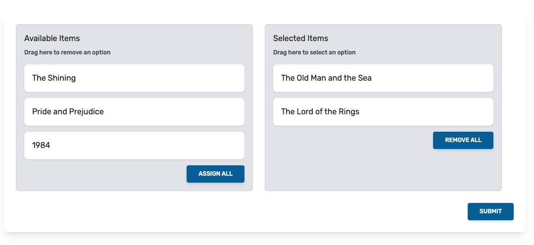
MDDraggablePicker Props
| Prop | Type | Default | Required | Description |
|---|---|---|---|---|
| id | Boolean | true | The id of the element. | |
| availableLabel | String | true | Label for the available column | |
| selectedLabel | String | true | Label for the selected column | |
| modelValue | Object | { available: [], selected: [] } | true | The property to update. This should be passed as v-model when implementing |
| label | String | false | Used to add a label. | |
| error | String | false | Used to display an error to the lists. | |
| required | Boolean | false | false | Determines if the lists should be marked as required or not. |
MDDraggablePicker Emitted Events
| Event | Description |
|---|---|
| onUpdate | Emitted when an item is dragged from one list to another. |
MDDropZone
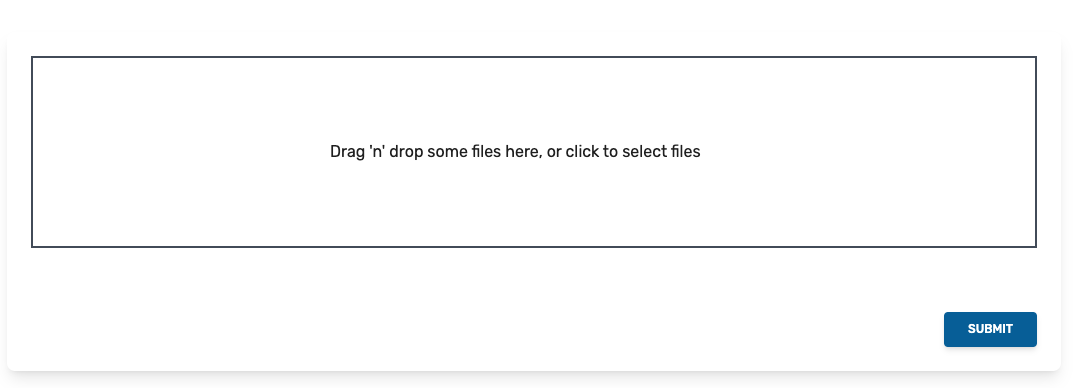
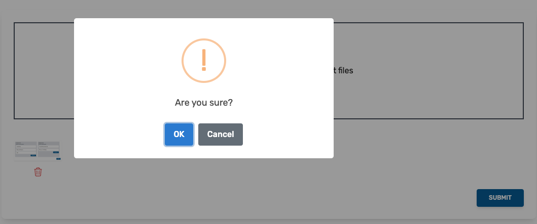
Simple dropzone for image uploads. Utilizes the vue3-dropzone and sweetalert2 libraries.
<template>
  <MDForm>
    <MDGroup>
      <MDDropZone id="images" v-model="state.images" @onDrop="imageAddedToDropzone" />
    </MDGroup>
  </MDForm>
</template>
<script setup>
  import { reactive } from 'vue';
  // Import the components
  import { MDForm, MDGroup, MDDropZone } from '@mythicaldev/md-vue3-forms';

  const state = reactive({
    images: [],
  });
  const imageAddedToDropzone = () => {};
</script>
Empty Dropzone
One Image Added
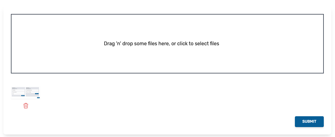
Deleting Image
MDDropZone Props
| Prop | Type | Default | Required | Description |
|---|---|---|---|---|
| id | Boolean | true | The id of the element. | |
| modelValue | Array | [] | true | The property to update. This should be passed as v-model when implementing. |
| label | String | false | Used to add a label. | |
| required | Boolean | false | false | Determines if the lists should be marked as required or not. |
| showPreview | Boolean | true | false | Show the uploaded images below the dropzone. |
| helpText | String | Drag and drop some files here, or click to select files | false | Text to show in the dropzone. |
| hoverText | String | Drop the files here ... | false | Text to display when image is hovered over the dropzone. |
| showConfirmation | Boolean | true | false | Determines if a confirmation is shown when removing an image. |
| confirmationConfig | Object | see configuration object below | false | Configuration to use in the Sweet Alert when deleting an image. |
{
    title: '',
    text: 'Are you sure?',
    icon: 'warning',
    showCancel: true,
    button: {
    color: '#3085d6',
    text: 'OK',
}
MDDropZone Emitted Events
| Event | Description |
|---|---|
| onDrop | Emitted when an an image is added to the dropzone. |
MDSelect
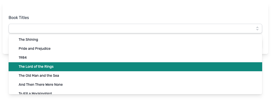
Single select utilizing @headlessui/vue. YOu are able to filter the options by typing into the field or
selected them using the dropdown directly.
<template>
  <MDForm>
    <MDGroup>
      <MDSelect label="Book Titles" id="book_titles" :options="selectOptions" v-model="state.selectedBook" />
    </MDGroup>
  </MDForm>
</template>
<script setup>
  import { reactive } from 'vue';
  // Import the components
  import { MDForm, MDGroup, MDSelect } from '@mythicaldev/md-vue3-forms';

  const selectOptions = [
    {
      value: '1',
      label: 'The Shining',
    },
    {
      value: '2',
      label: 'Pride and Prejudice',
    },
    {
      value: '3',
      label: '1984',
    },
    ...
  ];

  const state = reactive({
    selectedBook: '',
  });
</script>

MDSelect Props
| Prop | Type | Default | Required | Description |
|---|---|---|---|---|
| id | String | true | The id of the field. | |
| options | Array | [] | true | Values to display in the list. See the object below for formatting. |
| label | String | false | The label to add to the field. Empty by default providing no label. | |
| type | String | text | false | The type of field to use. Defaults to a basic text field. |
| modelValue | String, Number | false | The property to update. This should be passed as v-model when implementing | |
| placeholder | String | false | The placeholder to use for the field. Empty by default providing no placeholder. | |
| describedBy | String | false | The aria-describedby value for the field. | |
| help | String | false | Text that will display under the field to give help or context. | |
| error | String | false | Error text to display under the field. | |
| success | Boolean | false | false | Style the field indicating success. |
| info | Boolean | false | false | Style the field for information feedback |
| warning | Boolean | false | false | Style the field as warning, for example when there is an error displayed. |
| required | Boolean | false | false | Determines if the field is required or not. |
Format for options property.
[
  {
    label: '',
    value: '',
  },
];
MDTextArea
Text area with limit if needed.
<template>
  <MDForm class="my-10">
    <MDGroup>
      <MDTextArea label="Description 1" id="description1" v-model="state.description1" />
      <MDTextArea label="Description 2" id="description2" rows="5" v-model="state.description2" />
      <MDTextArea label="Description 3" id="description3" rows="8" v-model="state.description3" :hasLimit="true" />
      <MDTextArea label="Description 4" id="description4" rows="8" v-model="state.description4" :hasLimit="true" />
    </MDGroup>
  </MDForm>
</template>
<script setup>
  import { reactive } from 'vue';
  // Import the components
  import { MDForm, MDGroup, MDTextArea } from '@mythicaldev/md-vue3-forms';

  const state = reactive({
    description1: '',
    description2: '',
    description3: '',
    description4: '',
  });
</script>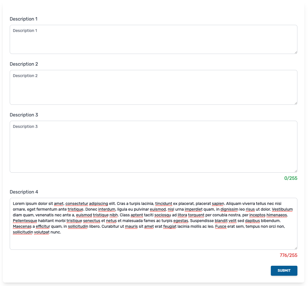
MDTextArea Props
| Prop | Type | Default | Required | Description |
|---|---|---|---|---|
| id | String | true | The id of the field. | |
| label | String | false | The label to add to the field. Empty by default providing no label. | |
| type | String | text | false | The type of field to use. Defaults to a basic text field. |
| modelValue | String, Number | false | The property to update. This should be passed as v-model when implementing | |
| rows | String | 4 | false | The number of rows for the textarea |
| hasLimit | Boolean | false | false | Determines if the field should have a limit or not. |
| limit | Number | 255 | false | The limit to impose on the textarea. |
| placeholder | String | false | The placeholder to use for the field. Empty by default providing no placeholder. | |
| describedBy | String | false | The aria-describedby value for the field. | |
| help | String | false | Text that will display under the field to give help or context. | |
| error | String | false | Error text to display under the field. | |
| success | Boolean | false | false | Style the field indicating success. |
| info | Boolean | false | false | Style the field for information feedback |
| warning | Boolean | false | false | Style the field as warning, for example when there is an error displayed. |
| required | Boolean | false | false | Determines if the field is required or not. |