@orby/css v0.1.0
@orby/css
@orby/css allows to maintain the control and scope of the CSS of JSX-based components, in only 1.9kb in size.

The dynamic context effect happens thanks to the use of Custom properties, each function will be replaced by an associated variable only to the className.
Index
Motivation
Today there is a large number of tools(styled-components, emotion and others) that seek to solve the problem of encapsulation of style and achieve it excellently, but such a solution is far from what the css today offers us as semantics within the shadow -dom, for example in use of the selector :host
:host{
  font-weight: bold;
}
With @ orby / css I am looking for that you do not move away from the traditional CSS semantics, this is the objective and it is what you need to create component styles. the style for a component is and should be simple, if you are going to create components it may not require sass or less to decorate your styles. I invite you to rediscover the simple and practical traditional css in modern times.
Think of orby as a small implementation of the css associated with shadow-dom, but without the cost of shadow-dom.
Functioning
The process of @orby/css is simple, it takes the input css and transforms it into an array that groups the rules defined as an object, then based on those rules, identify which of these are static and dynamic.
Static Styles
Static styles are all rules that do not incorporate the use of functions for defining properties.
styled("button")`
    :host{
        background:${COLOR}
    }
`
the constant
${COLOR}not being a function, the rule is considered static, so it will only print once and before mounting the same component.
Dynamic styles
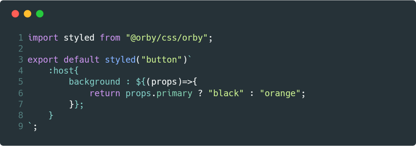
Dynamic styles are all rules that incorporate the use of functions in the definition of properties.
styled("button")`
    :host{
        background:${(props)=>{
            return props.primary ? "black" : "orange";
        }}
    }
`
@orby/cssreplaces functions within the style with custom-properties
Special selectors
To facilitate the printing of @orby/css styles, it makes use of special selectors:
:host: allows to point to the same class, whether static or dynamic.:global: allows to escape the context of scope of the component.
Host selector
This selector allows you to point to the component itself, you can generate the following proposed confinements:
:host(.selector-1){}
:host(:checked){}

:host(.selector-1,.selector-2,.selector-3){}
:host(.selector-1:not(.selector-2)){}

:host.selector-1{}
:host:checked{}

:host[data-any]{}
I tried to homologate the behavior of
: hostproposed in the use of shadowDom see more.
Global selector
This selector allows to escape from the local context of the component
:global(body){}Keyframes
To keep the keyframes animations @orby/css prefix all animation names with the class name, in this way the generated keyframes retain their effect.
let Rotate = styled("div")`
    :host{
        animation : rotate 1s  infinite;
    }
    @keyframes rotate{
        0%{
            transform:rotate(0deg);
        }
        100%{
            transform:rotate(360deg);
        }
    }
`;
CreateStyled
Orby like other libraries like HTM, is not tied to a specific library, if you already create JSX-based components, you can deliver to the label generator function (pragma) to create a styled instance to work.
By default @orby/css delivers support to @orby/code, Preact and React.
Below is how to create the styled function for preact, you can use this resource by importing @orby/css/preact.
import { h } from "preact";
import { createStyled } from "@orby/css";

export default createStyled(h);
parse
to be able to process the rules I created a small script layers to transform the css into an object similar to the one that returns postcss. in only 855 B.
import parse from "@orby/css/parse";

let css = `
    @media (max-width:320px){
        button:not(.sample){
            color : black;
        }
    }
`;

parse(css)
The return of this is an extremely enriched object, ideal for the construction of rules or reading of properties.
[
    {
        selector: "@media (max-width:320px)",
        type: "media",
        value: "(max-width:320px)",
        children: [
            {
                selector: "button:not(.sample)",
                children: [],
                type: "selector",
                properties: [{ index: "color", value: "black" }],
                selectors: [
                    [
                        { value: "button", args: [] },
                        { value: ":not", args: [".sample"] }
                    ]
                ]
            }
        ],
        properties: []
    }
];7 years ago
7 years ago
7 years ago
7 years ago
7 years ago
7 years ago
7 years ago
7 years ago
7 years ago
7 years ago
7 years ago
7 years ago
7 years ago
7 years ago
7 years ago
7 years ago
7 years ago
7 years ago
7 years ago
7 years ago
7 years ago
7 years ago
7 years ago
7 years ago
7 years ago
7 years ago