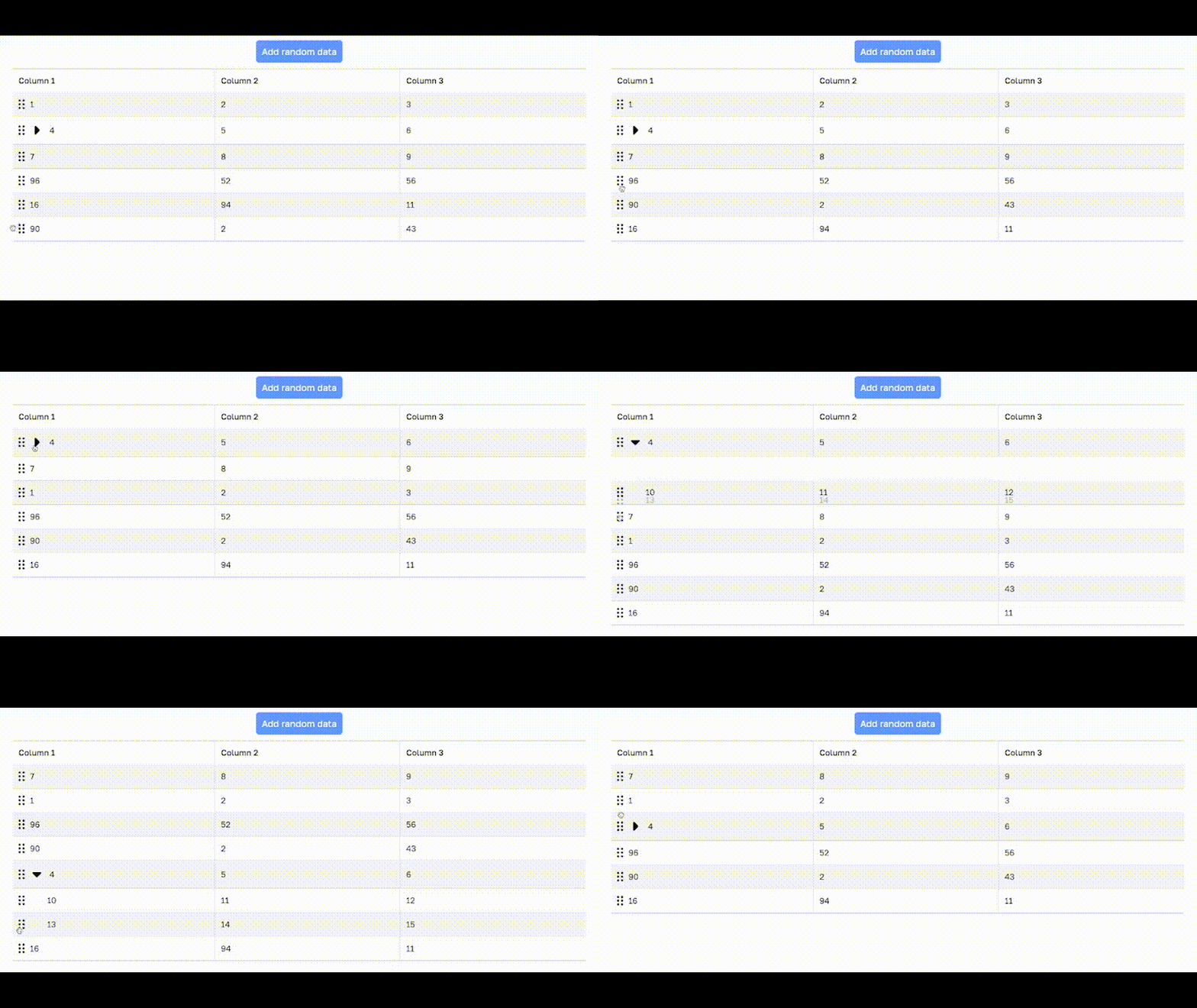
@osx11/react-simple-dnd-table v1.0.13
React Simple DND (Drag to Reorder) Table

Installation
With npm:
npm install @osx11/react-simple-dnd-tableWith yarn:
yarn add @osx11/react-simple-dnd-tableUsage
Applicable for both high-level and low-level api:
You should provide the following css variables:
:root {
  --dnd-table-odd-row-background: #F5F5F5; /* background for odd rows */
  --dnd-table-even-row-background: none; /* background for even rows */
  --dnd-table-row-highlight-border: #5388F1; /* border color for element before of after which the dragging row will be inserted */
  --dnd-table-borders: #cfd9e1; /* general table borders */
}
Please note that you should provide icons for expand button and drag-and-drop icon manually. It should be located somewhere in the assets folder (or any) and imported like that:
import dragHandleIcon from './assets/drag-handle.svg';
import expandArrowIcon from './assets/expand-arrow.svg';
Then you can pass it to dragHandleIcon and expandArrowIcon props of SimpleDNDTable or as url prop for DNDTableHandle.
Note that there may be a typescript error when importing images, including .svg.
To avoid it, create global.d.ts (or any .d.ts) file in the root dir of project and put the following content:
declare module "*.svg";Example of usage with a high-level API
import {useState} from 'react';
import dragHandleIcon from './assets/drag-handle.svg';
import expandArrowIcon from './assets/expand-arrow.svg';
import {SimpleDNDTable, SimpleDNDTableData} from '@osx11/react-simple-dnd-table';

function App() {
  const [data, setData] = useState<SimpleDNDTableData[]>([
    {key: '1', values: ['1', '2', '3']},
    {
      key: '2',
      values: ['4', '5', '6'],
      inner: [
        {key: '4', values: ['10', '11', '12']},
        {key: '5', values: ['13', '14', '15']}
      ]
    },
    {key: '3', values: ['7', '8', '9']},
  ]);

  return (
    <SimpleDNDTable
      data={data}
      onOrderUpdate={setData}
      headers={['Column 1', 'Column 2', 'Column 3']}
      dragHandleIcon={dragHandleIcon}
      expandArrowIcon={expandArrowIcon}
    />
  )
}

export default App;
All the props listed in the above example are mandatory, but there also is an optional prop:
gridColumnSettings: string- via this prop you can manage width of your columns. The default value is30px repeat(1fr, N), where30pxis responsive for the handle width
The example of high-level API using SimpleDNDTable is ready to use and located at
src/example.
To run dev server with example, type:
cd src/example
yarn
yarn dev
Example of usage with a low-level API
Please, see the implementation of SimpleDNDTable (located at src/components/simple_dnd_table/SimpleDNDTable.tsx) as
an example of low-level API usage. Low-level API provides full control over the table, including micro-components
like Table, TableRow, TableData etc.
Customization
You can customize the entire table by overriding the following css clases:
.dnd__table-data-element.dnd__table-data.dnd__table-row.dnd__table-head.dnd__table-header-element.dnd__table-header.dnd__table.dnd__handle.dnd__handle-disabled