1.2.2 • Published 8 years ago
@prince8verma/react-native-snackbar v1.2.2
react-native-snackbar
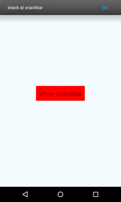
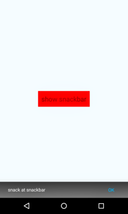
Snackbars are used for displaying a brief message to the user, along with an optional action. They animate up from the bottom of the screen and then disappear shortly afterward. This repo provides snackbar that can appear from bottom or top as per requirements.
It is a simple React-native library, works for both Android and IOS.
You have to Just import it and use it. Its has dependency on react-native-simple-events. It is a minimalist implementation of snackbar. It is small and fast.
Introduced Swipe feature.
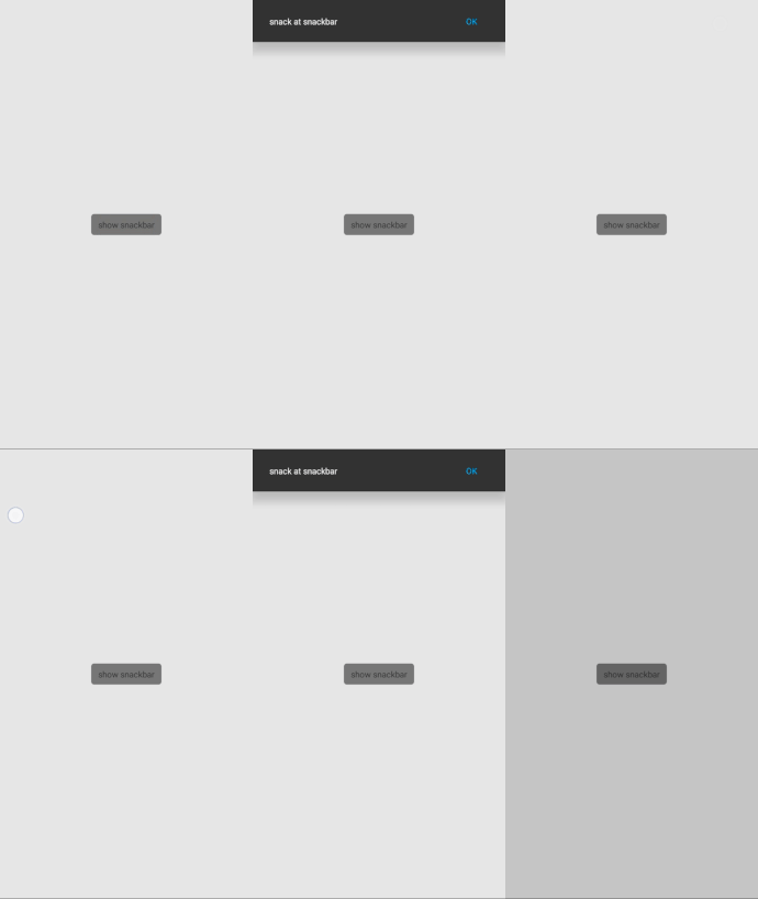
As the snackbar appears you can swipe over the snackbar to hide it.
This looks good in app and works great with minimal implementation of code. 


Installation
npm install @prince8verma/react-native-snackbar --saveImplementation
import Snackbar from '@prince8verma/react-native-snackbar';

<View style={{flxe:1}}>
    {/*...........Root App code.......*/}
    <SnackBar id={"Root_App"}/>
</View>
import {showSnackBar} from '@prince8verma/react-native-snackbar';
showSnackBar({
message: "Your custom message",
textColor: '#FFF', // message text color
position: 'top', // enum(top/bottom).
confirmText: 'OK', // button text.
buttonColor: '#03a9f4', // default button text color
duration: 4000, // (in ms), duartion for which snackbar is visible.
animationTime: 250, // time duration in which snackbar will complete its open/close animation.
backgroundColor:"#323232", //background color for snackbar
onConfirm: () => {}, // perform some task here on snackbar button press.
});example
import React, {Component} from "react";
import {StyleSheet, View, TouchableOpacity} from "react-native";
import Snackbar, {showSnackBar} from '@prince8verma/react-native-snackbar'

export default class Demo extends Component {

    onPress = () => {
        showSnackBar({
            message: "Hello World",
            position: 'top',
            confirmText: 'OK',
            backgroundColor: "#323232",
            duration: 6000,
            onConfirm: () => {
                alert('hi')
            }
        });
    };

    render() {
        return (
            <View style={styles.container}>
                <TouchableOpacity
                    style={{backgroundColor: 'red'}}
                    onPress={this.onPress}>
                    <Text style={styles.welcome}>
                        show snackbar
                    </Text>
                </TouchableOpacity>
                {/* place snackbar code en the end of the root component*/}
                <Snackbar id={"root_app"}/>
            </View>
        );
    }
}

const styles = StyleSheet.create({
    container: {
        flex: 1,
        justifyContent: 'center',
        alignItems: 'center',
        backgroundColor: '#F5FCFF',
    }
});
The option to support:
| property | type | default | description |
|---|---|---|---|
| message | String | 'Had a snack at snackBar.' | Message shown in snackbar. |
| textColor | color string | "#FFF" | message text color |
| position | enum("top"/"bottom") | "bottom" | position of snackbar |
| confirmText | "String" | "OK" | button text. |
| buttonColor | color string | "#03a9f4" | default button text color |
| duration | Int | 5000 | time in ms, duartion for which snackbar is visible |
| animationTime | Int | 250 | time in ms, duration in which snackbar will complete its open/close animation. |
| backgroundColor | color string | "#323232" | background color for snackbar |
| onConfirm | function | undefined | perform some task here on snackbar button press. |