@r0b0t3d/react-native-carousel v3.4.5
react-native-carousel

Getting started
$ yarn add @r0b0t3d/react-native-carousel
Note: Currently, I am using react-native-reanimated for animation. So you should install it as well
$ yarn add react-native-reanimated
Breaking changes
v3.4.0
Added:
- You have to wrap your component inside
withCarouselContext useCarouselContexthook
Removed:
- Remove component's
ref
Changed:
- Methods
goNext,goPrev,snapToItemnow accessible viauseCarouselContext
const {
    goNext,
    goPrev,
    snapToItem
  } = useCarouselContext();
v3.3.0
- Changed:
renderItemnow required and add more props to easy customizationrenderItem: ( data: { item: T; index?: number }, animatedData?: { scrollPosition?: Animated.SharedValue<number>, offset?: number } ) => React.ReactNode
v3.0.0
- Added:
animatedPage: animated value used which is current selected page. Used to pass into thePaginationIndicatorfor animation.
- Removed:
useIndicator,indicatorContainerStyle,renderIndicator, . UsedPaginationIndicatorinsteadrenderOverlay: you can render overlay insiderenderItemfunction
- Changed:
renderImage->renderItem
v2.0.0
- requires
react-native-reanimated@2.1.0
Show cases
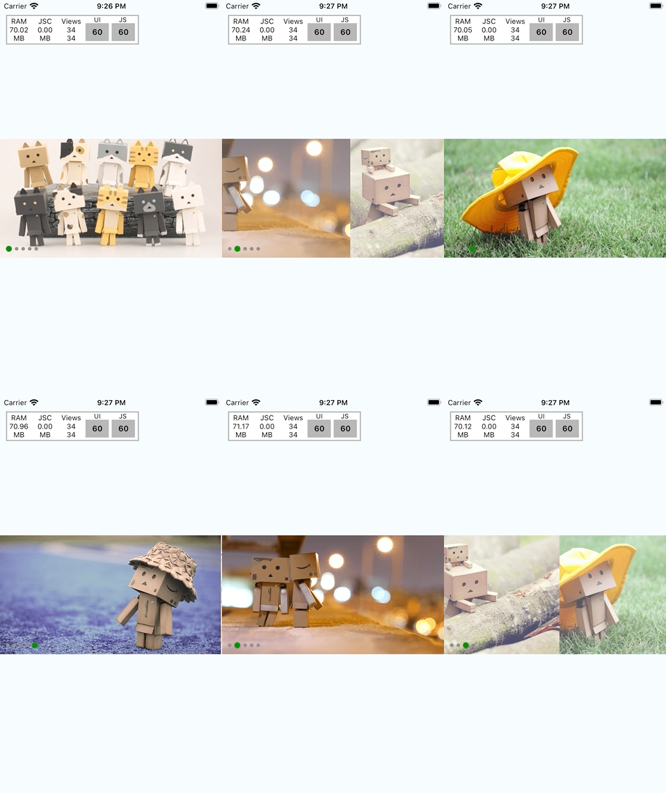
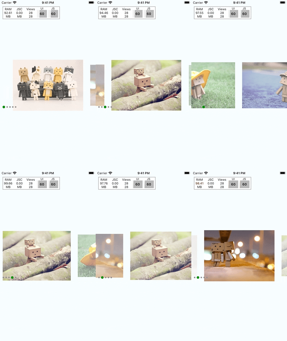
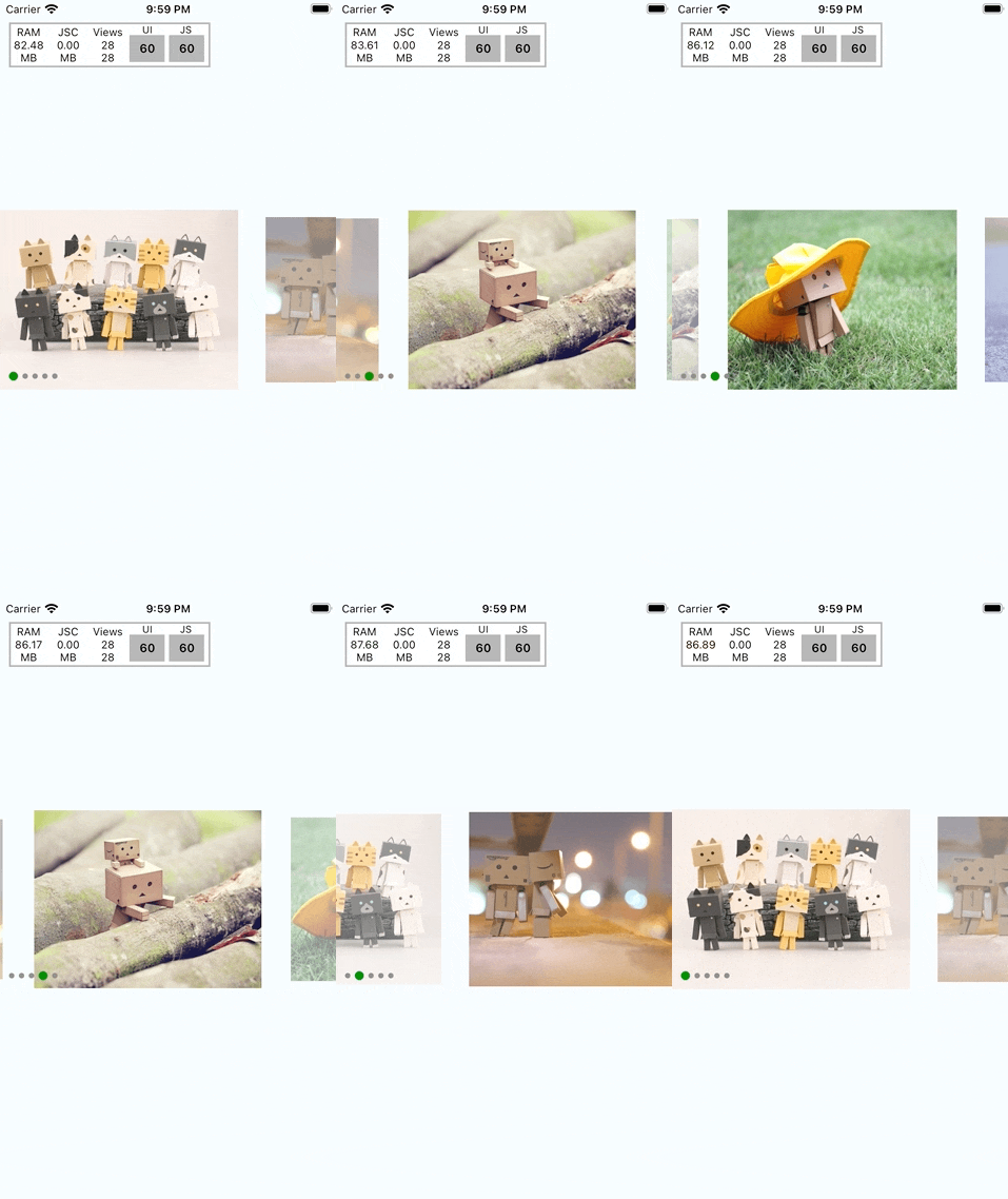
| Loop | Scale | Alignment |
|---|---|---|
 |  |  |
Loop
<Carousel
  loop={true}
  autoPlay={true}
  duration={3000}
  animation="parallax"
/>
Scale
<Carousel
  itemWidth={width - 100}
  inactiveOpacity={0.5}
  inactiveScale={0.9}
/>
Alignment
<Carousel
  itemWidth={width - 100}
  inactiveOpacity={0.5}
  inactiveScale={0.9}
  firstItemAlignment="start"
/>
Usage
import Carousel, {
  withCarouselContext,
  useCarouselContext,
} from '@r0b0t3d/react-native-carousel';

function MyCarousel() {
  const {
    goNext,
    goPrev,
    snapToItem
  } = useCarouselContext(); // <- use this instead of passing ref to Carousel

  return (
    <View>
      <Carousel
        style={{ height: 200 }}
        data={data}
        loop={false}
        autoPlay={true}
        duration={3000}
        itemWidth={width - 100}
        inactiveOpacity={0.5}
        inactiveScale={0.9}
        firstItemAlignment="start"
        spaceBetween={20}
        animatedPage={currentPage}
        renderItem={({item}) => {
          return (
            <Image
              style={{
                flex: 1,
                backgroundColor: 'red',
              }}
              source={{ uri: item.url }}
            />
          );
        }}
      />
      <View>
        <PaginationIndicator
          containerStyle={{ marginTop: 20 }}
          activeIndicatorStyle={{
            height: 10,
            borderRadius: 5,
          }}
          indicatorConfigs={{
            spaceBetween: 10,
            indicatorWidth: 10,
            indicatorSelectedWidth: 20,
          }}
        />
      </View>
    </View>
  );
}

export default withCarouselContext(MyCarousel) // <-- To use carousel context, you need wrap your component with withCarouselContext
Carousel
Properties
| Props | Description | Default |
|---|---|---|
| data | Array of item to be rendered.- id: string: this will be used as key to render- source: ImageSourcePropType: optional. Image source. If you don't want to pass source here. You could use renderItem below to render your custom image. ------ Or it could be array of string | |
| loop? | Whether your carousel can loop or not | false |
| initialPage? | Set the first page show up | 0 |
| additionalPagesPerSide? | When looping, how many page will be added at head and tail to perform loop effect | 2 |
| autoPlay? | Auto animate to next image with duration. | false |
| duration? | Duration to animate. used with autoPlay above | 1000 |
| animation? | Predefined animation. Will be parallax for now | |
| sliderWidth? | Define slider width | screen's width |
| itemWidth? | Define item width | screen's width |
| firstItemAlignment? | 'center' | 'start' Align first item | center |
| inactiveOpacity? | 0 - 1 Define opacity for inactive items | 1 |
| inactiveScale? | 0 - 1 define scale value for inactive items | 1 |
| spaceBetween? | Add additional space between items | 0 |
| spaceHeadTail? | Add more space in head/tail. This only work if firstItemAlignment = 'start' | 0 |
| animatedPage? | Animated value which is the current page. This value used to pass into PaginationIndicator for animation | |
| renderItem | (data: { item: T; index?: number }, animatedData?: { scrollPosition?: Animated.SharedValue<number>, offset?: number }) => React.ReactNodeRender carousel item | |
| onPageChange? | (index: number) => void Callback to notify when page change |
Methods
| Method | Description |
|---|---|
| goNext | Go to next index |
| goPrev | Go to previous index |
| snapToItem | (index: number, animated?: boolean) => voidSnap to specific index - index: destination index- animated: should animate or not, default is true |
withCarouselContext
This HOC provides easy way to wrap your component with CarouselContext.Provider.
So if you'd like to use useCarouselContext, you need to wrap your component with this.
PaginationIndicator
Easy way to define the indicator for your carousel.
Please note that, this component only works with withCarouselContext.
So please make sure that it is rendered under the component that you wrap with withCarouselContext
Check example above for more info
Contributing
See the contributing guide to learn how to contribute to the repository and the development workflow.
License
MIT
1 year ago
4 years ago
4 years ago
5 years ago
5 years ago
5 years ago
5 years ago
5 years ago
5 years ago
5 years ago
5 years ago
5 years ago
5 years ago
5 years ago
5 years ago
5 years ago
5 years ago
5 years ago
5 years ago
5 years ago
5 years ago
5 years ago
5 years ago
5 years ago
5 years ago
6 years ago
6 years ago
6 years ago
6 years ago
6 years ago
6 years ago
6 years ago
6 years ago