0.0.8 • Published 2 years ago
@react-component-library/datepicker v0.0.8
@react-component-library/datepicker
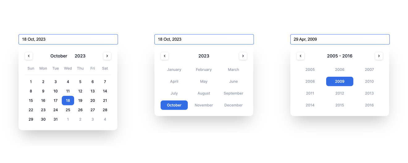
Introducing a user-friendly, intuitive, reusable, and customizable datepicker for React. It offers a wide range of customizable options, allowing you to tailor the datepicker's appearance and behavior to suit your project requirements. Whether adjusting the date format, setting date range restrictions, or customizing appearance using CSS or React, we've got you covered.

Installation
To start using Datepicker in your project, simply install the package via npm:
npm install @react-component-library/datepicker --saveOnce installed, you can import the Datepicker component and integrate it into your React application as follows:
import { useState } from "react";
import { DatePicker } from "@react-component-library/datepicker";

const App = () => {
  const [date, setDate] = useState(new Date());

  return (
    <DatePicker
        value={date}
        onChange={(date) => setDate(date)}
    />
  );
};
With just a few lines of code, you can incorporate Datepicker into your application and start enabling date selection functionality for your users.