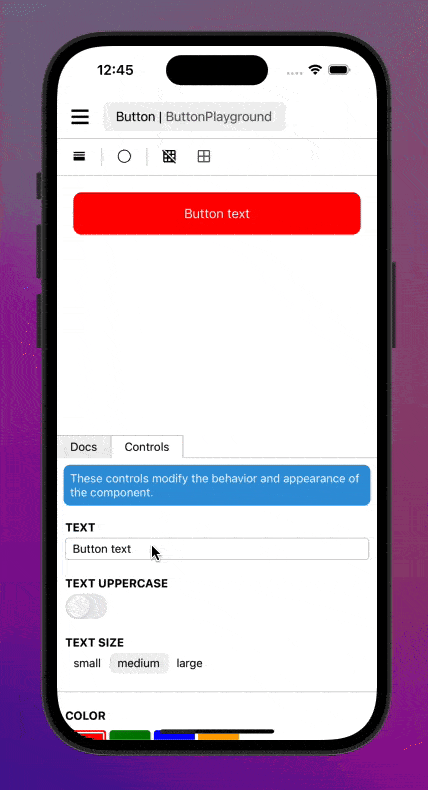
Adds sandbox controls to react-native-sandbox to quickly manipulate component properties directly in the UI.
Installation
Requires react-native-sandbox. Ensure that your sandbox is configured correctly before proceeding.
Open a terminal in your project's folder and run
npm install @react-native-sandbox/controlsModify your sandbox root to load the plugin:
import ControlsPlugin from '@react-native-sandbox/controls';

// ...

function Sandbox() {
    return <SandboxRoot components={comonents} plugins={[ControlsPlugin]}>;
}
Usage
Controls are added to a sandbox by simply invoking the appropriate hook for the desired control. Controls are rendered in the order that the hooks are invoked.
import MyComponent from './MyComponent';
import { useText, useDivider, useNumber } from '@react-native-sandbox/controls';

function MyComponentSandbox() {
    // render a text input control first
    const label = useText("Custom Label", "My Component");

    // render a divider next
    useDivider();

    // render a number input control last
    const num = useNumber("Custom Number", 0);

    return (<MyComponent label={label} value={num} />);
}
The built-in controls are the following:
| Type | Hook | Description |
|---|---|---|
| Boolean | useBoolean | A switch control for boolean props |
| Color | useColor | A color picker |
| Divider | useDivider | A divider in the component control panel |
| Info | useInfo | A info block to display useful information |
| Label | useLabel | A label to display in component control panel |
| Number | useNumber | A number input |
| Object | useObject | A text input control for JSON objects |
| Select | useSelect | A value selector |
| Text | useText | A text input |
Custom Controls
Coming soon