@replytechnologies/reply-pdf v0.0.8
ReplyPDF
Table of Contents
About
If you ever had to create a PDF document you would be familiar with the struggles to get headers, footers, and tables to layout correctly. This library aims to remove the complexity of creating PDF documents by providing purpose built components that handle rendering and data binding.
Interactive demo coming soon
Installation
Node
npm install @replytechnologies/reply-pdfUsage
Import
CommonJS: Node.js <= 12
const ReplyPDF = require('@replytechnologies/reply-pdf');
const { ...components... } = ReplyPDF.components;
const { ...enums... } = ReplyPDF.enums;
const { ...models... } = ReplyPDF.models;
CommonJS: Node.js > 12
const ReplyPDF = require('@replytechnologies/reply-pdf');
const { ...components... } = require('@replytechnologies/reply-pdf/components');
const { ...enums... } = require('@replytechnologies/reply-pdf/enums');
const { ...models... } = require('@replytechnologies/reply-pdf/models');
EJS
import ReplyPDF from '@replytechnologies/reply-pdf';
import { ...components... } from '@replytechnologies/reply-pdf/components';
import { ...enums... } from '@replytechnologies/reply-pdf/enums';
import { ...models... } from '@replytechnologies/reply-pdf/models';
PDF Generation
The basic steps that should be taken to generate a PDF are outlined in the example below:
// create document template
const template = new Page({ ...options... });

// create binding data
const data = { ..binding data... };

// generate PDF
let doc = ReplyPDF.generateDocument({
    data: data,
    template: template
});

// handle document object (review PDFKit documentation for alternatives)
doc.pipe(fs.createWriteStream(outputFilePath));

// close document object
doc.close();
PDF usage
The output object returned from ReplyPDF.generateDocument({...}) is of type PDFDocument. For different methods of handling the returned object, refer to the PDFKit documentation found here.
Under the Hood
PDFKit: renders native elements to the PDF document.
SVG-To-PDFKit: renders SVG images to the PDF document.
Components
BaseComponent
BaseComponent registers properties and functions shared by all components
Hierarchy: BaseComponent
| Property | Type | Description |
|---|---|---|
binding | string | Property of the provided data object to use as data source for bindings |
debug | bool | Indicates whether the component should render rectangles for outline and margin |
BaseLayoutComponent
BaseLayoutComponent registers properties and functions shared by all components that have a physical layout on the document.
Hierarchy: BaseComponent / BaseLayoutComponent
| Property | Type | Description |
|---|---|---|
width | number | Width available to render content |
height | number | Height available to render content |
x | number | Horizontal content offset |
y | number | Vertical content offset |
margin | Offset | Content inset from provided width and height |
border | Border | Border to draw around component |
verticalAlignment | Alignment | Vertical alignment within parent component |
horizontalAlignment | Alignment | Horizontal alignment within parent component |
backgroundColor | string | Color of background fill |
link | string | Link to navigate to on click |
BaseContainerComponent
BaseContainerComponent registers properties and functions shared by all components that contain explicit child elements.
Hierarchy: BaseComponent / BaseLayoutComponent / BaseContainerComponent
| Property | Type | Description |
|---|---|---|
children | [BaseComponent] | Array of children to render as content |
BaseStackComponent
BaseStackComponent registers properties and functions shared by all components that perform stacking of child components.
Hierarchy: BaseComponent / BaseLayoutComponent / BaseContainerComponent / BaseStackComponent
| Property | Type | Description |
|---|---|---|
spacing | number | Spacing between child components |
layout | Layout | Layout mode of child components |
BaseTextComponent
BaseTextComponent registers properties and functions shared by all text oriented components.
Hierarchy: BaseComponent / BaseLayoutComponent / BaseTextComponent
| Property | Type | Description |
|---|---|---|
text | string | Text to render as content |
textAlignment | TextAlignment | Text alignment of content |
fontSize | number | Font size of rendered text |
fontFamily | string | Font family of rendered text |
fontWeight | FontWeight | Font weight of rendered text |
lineBreak | bool | Indicates whether text is allowed to span multiple lines |
ellipsis | string | Indicates the character(s) to append to the end of a string when lineBreak is set to false and the text tries to wrap into the next line |
Page
Page should always be the base component of a template. All child components of a page are provided with the entire page content size to render within.
Hierarchy: BaseComponent / BaseLayoutComponent / BaseContainerComponent / Page
| Property | Type | Description |
|---|---|---|
header | BaseComponent | Component template to render as header |
footer | BaseComponent | Component template to render as footer |
firstPageHeader | BaseComponent | Component template to render as header for first page |
size | Size | Defines the page size |
Example
Go to usage example | Go to sample PDF
const template = new Page({
    size: PageSize.A4,
    margin: new Offset(25),
    header: new Container({
        height: 50,
        backgroundColor: 'sky',
        border: new Border(),
        children: [
            ...
        ],
    }),
    footer: new Container({
        height: 50,
        children: [
            ...
        ],
    }),
    children: [
        ...
    ],
});
Container
Container provides functionality to render child components according to the values of their respective verticalAlignment and horizontalAlignment values.
Hierarchy: BaseComponent / BaseLayoutComponent / BaseContainerComponent / Component
Example
Go to usage example | Go to sample PDF
const container = new Container({
    children: [
        new Text({
            text: 'Lorem ipsum ... anim id est laborum.',
            y: 50,
            width: 400,
            textAlignment: TextAlignment.center,
            horizontalAlignment: Alignment.middle,
            verticalAlignment: Alignment.start,
        }),
        new Text({
            text: 'top left',
            horizontalAlignment: Alignment.start,
            verticalAlignment: Alignment.start,
        }),
        new Text({
            text: 'top center',
            horizontalAlignment: Alignment.middle,
            verticalAlignment: Alignment.start,
        }),
        new Text({
            text: 'top right',
            horizontalAlignment: Alignment.end,
            verticalAlignment: Alignment.start,
        }),
    ],
}),
StackHorizontal
StackHorizontal provides functionality to layout its children horizontally. StackHorizontal is sized automatically according to the size of its children. StackHorizontal does not overflow children into a new row, and does not request a new page when content reaches the end of the page.
Hierarchy: BaseComponent / BaseLayoutComponent / BaseContainerComponent / BaseStackComponent / StackHorizontal
Example
Go to usage example | Go to sample PDF
new StackHorizontal({
    children: [
        new Text({ text: '1', width: 50 }),
        new Text({ text: '2' }),
        new Text({
            backgroundColor: 'orange',
            text: '3',
            margin: new Offset(15)
        }),
        new Text({ text: '4' }),
        new Text({ text: '5' }),
    ],
}),
StackVertical
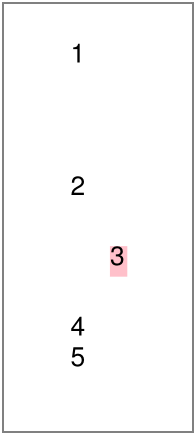
StackVertical provides functionality to layout its children vertically. StackVertival is sized automatically according to the size of its children. StackVertical does not overflow children into a new column, and does not request a new page when content reaches the end of the page.
Hierarchy: BaseComponent / BaseLayoutComponent / BaseContainerComponent / BaseStackComponent / StackVertical
Example
Go to usage example | Go to sample PDF
new StackVertical({
    children: [
        new Text({ text: '1', height: 50 }),
        new Text({ text: '2' }),
        new Text({
            backgroundColor: 'pink',
            text: '3',
            margin: new Offset(15)
        }),
        new Text({ text: '4' }),
        new Text({ text: '5' }),
    ],
}),
GridLayout
GridLayout provides functionality to layout components horizontally in a specified number of columns. When the number of columns is reached, components are added to a new row. When content reaches the end of the page, it will continue to the next page.
Hierarchy: BaseComponent / BaseLayoutComponent / BaseContainerComponent / GridLayout
| Property | Type | Description |
|---|---|---|
columns | number | Number of columns in which to display content |
Example
Go to usage example | Go to sample PDF
const children = [];
for (var i = 0; i < 5; i++) {
    children.push(
        new Text({
            margin: new Offset(10),
            text: `Item: ${i}`,
            fontSize: 20
        }),
    );
}
...
new GridLayout({
    columns: 3,
    children: children
})
Text
Text provides functionality to render text to the document.
Hierarchy: BaseComponent / BaseLayoutComponent / BaseTextComponent / Text
| Property | Type | Description |
|---|---|---|
linkStyle | object | Style to apply to text if value of link is present |
color | string | Text color |
underline | bool | Indicates whether the text should be underlined |
strikethrough | bool | Indicates whether the text should be striked |
italic | bool / number | Indicates whether text should be rendered at an angle, uses a specific angle if italic is set to a number |
Example
Go to usage example | Go to sample PDF
 new Text({
     margin: new Offset(10),
     fontWeight: FontWeight.bold,
     text: 'Go to Google',
     link: 'https://www.google.com'
 }),
Image
Image provides functionality to render an image from a file, string (SVG), buffer, or URL. Base64 strings need to be converted into a Buffer before they can be consumed by an Image component.
Hierarchy: BaseComponent / BaseLayoutComponent / Image
| Property | Type | Description |
|---|---|---|
source | string | Buffer | Image source to render |
stretch | bool | Indicates whether the image should be stretched to the provided width and height |
Example
Go to usage example | Go to sample PDF
const image = new Image({
    width: 100,
    height: 100,
    source: 'https://picsum.photos/300/300',
}),
RepeatVertical
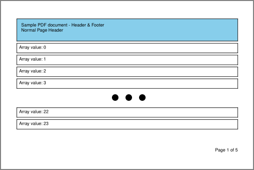
RepeatVertical provides functionality to repeat a template for each value of a provided binding array. RepeatVertical requests new pages when its component generation functionality reaches the end of a page.
Hierarchy: BaseComponent / BaseLayoutComponent / RepeatVertical
| Property | Type | Description |
|---|---|---|
template | BaseComponent | Template to render |
Example
Go to usage example | Go to sample PDF
new RepeatVertical({
    binding: 'arrayValues',
    template: new Container({
        margin: new Offset({
            top: 5,
        }),
        border: new Border(),
        children: [
            new Text({
                margin: new Offset(5),
                text: 'Array value: {{.}}',
            }),
        ],
    }),
})
...
const array = [];
for (let i = 0; i < 5; i++) {
    array.push(i);
}
...
const data = {
    arrayValues: array,
};
Table
Table provides functionality to render a table to the document. Table requests new pages when its component generation functionality reaches the end of a page. Components without specified widths are sized automatically according to available space.
Hierarchy: BaseComponent / BaseLayoutComponent / Table
| Property | Type | Description |
|---|---|---|
headerStyle | Style | Style to apply to header cells |
cellStyle | Style | Style to apply to content cells |
alternativeCellStyle | Style | Style override to apply to content cells of even rows |
columns | [Column] | Defines table columns and data bindings |
Example
Go to usage example | Go to sample PDF
new Table({
    binding: 'tableValues',
    border: new Border(new BorderSide({ thickness: 1 })),
    headerStyle: {
        fontWeight: FontWeight.bold,
        border: new Border(),
    },
    alternativeCellStyle: {
        backgroundColor: '#ccc',
    },
    columns: [
        {
            property: 'id',
            width: 50,
            text: '#',
        },
        {
            property: 'invoice_id',
            text: 'Invoice',
            fx: (index, record, value) => {
                return '#' + value.toString().padStart(6, '0');
            },
        },
        {
            property: 'date_created',
            width: 100,
            text: 'Date',
        },
        {
            property: 'amount',
            width: 70,
            cellStyle: {
                textAlignment: TextAlignment.right,
            },
            text: 'Amount',
            fx: (index, record, value) => {
                return value.toFixed(2);
            }
        }
    ]
})
...
const data = {
    tableValues: [
        { "id": 12, "invoice_id": 23, "date_created": "2021-04-09T05:54:03.000Z", "amount": 60 },
        ...
    ]
};
Enums
Alignment
Alignment.start
Alignment.end
Alignment.middle
Alignment.fill
FontWeight
FontWeight.bold
FontWeight.normal
Layout
Layout.none
Layout.spaceEvenly
Layout.sizeEvenly
TextAlignment
TextAlignment.left
TextAlignment.right
TextAlignment.center
TextAlignment.justify
PageSize
PageSize defines preset page dimensions to apply to the size property of a Page component.
| A | B | C | R & SRA | Other |
|---|---|---|---|---|
PageSize.A0 | PageSize.B0 | PageSize.C0 | PageSize.RA0 | PageSize.EXECUTIVE |
PageSize.A1 | PageSize.B1 | PageSize.C1 | PageSize.RA1 | PageSize.LEGAL |
PageSize.A2 | PageSize.B2 | PageSize.C2 | PageSize.RA2 | PageSize.LETTER |
PageSize.A3 | PageSize.B3 | PageSize.C3 | PageSize.RA3 | PageSize.TABLOID |
PageSize.A4 | PageSize.B4 | PageSize.C4 | PageSize.RA4 | PageSize.FOLIO |
PageSize.A5 | PageSize.B5 | PageSize.C5 | PageSize.SRA0 | PageSize.2A0 |
PageSize.A6 | PageSize.B6 | PageSize.C6 | PageSize.SRA1 | PageSize.4A0 |
PageSize.A7 | PageSize.B7 | PageSize.C7 | PageSize.SRA2 | |
PageSize.A8 | PageSize.B8 | PageSize.C8 | PageSize.SRA3 | |
PageSize.A9 | PageSize.B9 | PageSize.C9 | PageSize.SRA4 | |
PageSize.A10 | PageSize.B10 | PageSize.C10 |
Models
Border
Border constructor requires an object containing the properties listed below. Alternatively the Border constructor can be supplied with a single parameter of type or schema BorderSide to apply to all sides of the border.
| Property | Type | Description |
|---|---|---|
left | BorderSide | Left border to render |
top | BorderSide | Top border to render |
right | BorderSide | Right border to render |
bottom | BorderSide | Bottom border to render |
BorderSide
| Property | Type | Description |
|---|---|---|
thickness | number | Thickness of the border side |
color | string | Color of the border side |
Column
| Property | Type | Description |
|---|---|---|
property | string | Property of table record to display |
text | string | Heading value to display |
width | number | Width of columnA value of 1 is used if omittedValues <= 1 are used to determine fractional size of column |
headerStyle | Style | Style to apply to header cell of the column |
cellStyle | Style | Style to apply to data cells of the column |
alternativeCellStyle | Style | Style to apply to data cells of even rows of the column |
fx | function | Preprocessor function to run before data is displayed(index, record, value) => alteredValue |
Offset
Offset constructor requires an object containing the properties listed below. Alternatively the Offset constructor can be supplied with a single parameter of type number to apply to all sides of the offset.
| Property | Type | Description |
|---|---|---|
left | number | Left offset to apply |
top | number | Top offset to apply |
right | number | Right offset to apply |
bottom | number | Bottom offset to apply |
Size
| Property | Type | Description |
|---|---|---|
width | number | Width value |
height | number | Height value |
Style
| Property | Type | Description |
|---|---|---|
border | Border | Border value |
backgroundColor | string | Background color value |
color | string | Foreground color value |
fontSize | number | Font size value |
fontWeight | FontWeight | Font weight value |
textAlignment | TextAlignment | Horizontal text alignment value |
Binding
Components can bind to a specific property in a data source and provide that binding to its content. String interpolation can be performed by enclosing the binding string in curly brace sets ({{binding_string}}).
For the purposes of binding page information to the header and footer components, the data source should not contain properties named pageNumber or pageCount.
An example of binding can be found here.
new Container({
    binding: 'tier1',
    children: [
        new StackVertical({
            binding: 'tier2',
            children: [
                new Text({
                    binding: 'tier3.tier4',
                    margin: new Offset(10),
                    text: 'date = {{tier5.date}}',
                })
            ]
        })
    ]
})
...
const data = {
    tier1: {
        tier2: {
            tier3: {
                tier4: {
                    tier5: {
	                    date: new Date(),
                    }
                }
            }
        }
    }
};
Header & Footer
Header templates should set in the firstPageHeader and header properties of a Page component. If firstPageHeader has a value, its template will be rendered on the first page of the document, subsequent pages will use header if present. The header template must have an explicit height value set.
The footer template should be set in the footer property of a Page component. The footer template must have an explicit height value set.
Components within the header and footer templates can bind to the pageNumber and pageCount properties of the data source to display the current page information.
...
footer: new Container({
    height: 50,
    children: [
        new Text({
            text: 'Page {{pageNumber}} of {{pageCount}}',
        }),
    ],
}),
...
An example of a header and footer can be found here (PDF).
Multiple Templates
Rendering multiple templates to a single document can be achieved by defining multiple Page templates, and passing the resulting doc as a parameter to the next rendering. Only the last template should define header and footer content, preceding templates should contain empty components which define only the height property. All headers and footers should share the same respective height values. As an alternative to creating empty header and footer components, the preceding pages may specify a larger margin to consume the space.
const template1 = new Page({
    size: PageSize.A4,
    margin: new Offset(50),
    header: new Container({
        height: 50,
    }),
    footer: new Container({
        height: 50,
    }),
    children: [
        ...
    ],
});
const template2 = new Page({
    size: PageSize.A4,
    margin: new Offset(50),
    header: new Container({
        height: 50,
        children: [
            ...
        ],
    }),
    footer: new Container({
        height: 50,
        children: [
            ...
        ],
    }),
    children: [
        ...
    ],
});
...
let doc = ReplyPDF.generateDocument({
    data: data1,
    template: template1,
});

doc = ReplyPDF.generateDocument({
    doc: doc, // provide existing document object
    data: data2,
    template: template2,
});
An example of using multiple templates can be found here (PDF).
Custom Fonts
Custom fonts can be embedded into the PDF document by supplying font names with accompanying buffers containing the content of the font. The buffers can be loaded from a file or from a URL by making a HTTP request. For the fontWeight property to function correctly, the bold version of a font should be named after the regular version + '-Bold'.
Font buffers should be added to the generateDocument function parameter as shown in the example below:
let doc = ReplyPDF.generateDocument({
    fonts: {
        'Robinette': fs.readFileSync('examples/fonts/Robinette.ttf'),
        'GrandAutoDemo': fs.readFileSync('examples/fonts/GrandAutoDemoRegular.ttf'),
        'PlayfairDisplay': fs.readFileSync('examples/fonts/PlayfairDisplay-Regular.ttf'),
        'PlayfairDisplay-Bold': fs.readFileSync('examples/fonts/PlayfairDisplay-Bold.ttf'),
    },
    template: template,
    debug: false,
});
An example of using custom fonts can be found here.
Charts
Charts can be included into the PDF document by including the chart as an image. Chart images can be generated by using some of the chart-to-image services listed below:
- Image Charts (https://www.image-charts.com/)
- Quick Chart (https://quickchart.io/)
- Chart Works (https://www.chartworks.io/charts/image)
An example of including a chart into a PDF can be found here ( PDF).
Debugging
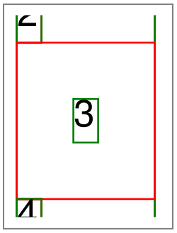
Debugging can be enabled on a document or component level. When debugging is enabled, a green border is drawn around the component outline, and a red border around the component margin.

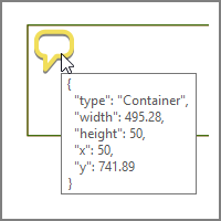
When enabling debugging on component level, an annotation is added to the document describing the component and layout information.

Enabling debugging on document level:
let doc = ReplyPDF.generateDocument({
    ...
    debug: true,
    ...
});
Enabling debugging on component level:
var component = new ComponentTypeGoesHere({
    ...
    debug: true,
    ...
});
Tests
The file test.js contains code to run all the examples in this project. Each example generates a PDF file as output into the examples/outputs directory. To execute the tests, run the following command after cloning:
npm testPitfalls
Components that do not request new pages when content tries to overflow will continue to render content on the same page. The content of these components should ideally be assigned fixed sizes to prevent rendering content off of the page or content that overflows into the footer section.
Image rendering from URL is performed by making synchronous http calls. You may experience delays when building a document with a large number of URL based images.
Roadmap
General Enhancements
Improve multiple template rendering process to be able to render different headers and footers for each template.
Implement functionality to use existing PDF documents as the base to render the template onto. As this functionality is not supported by PDFKit, the merge functionality may be delegated to Hummus or HummusRecipe.
New Components
Barcode: Render a barcode to the document
PageBreak: Continue content rendering on a new page
Component Enhancements
| Component | Enhancements |
|---|---|
| Table | - Render column content based on a template, currently renders all cells as text- Configuration to prevent reprinting of header on new pages, currently headers are repeated on each new page |
| Image | - Restructure image loading process to enable asynchronous calls to read data from a URL |


