1.3.1 • Published 4 years ago
@rickylandino/react-messages v1.3.1
@rickylandino/react-messages
React Messages are customizable and lightweight messages for use with React.


Installation
npm install @rickylandino/react-messagesUsage
import { toast, confirm } from '@rickylandino/react-messages'

//returns a success message from a string
toast.success("Success Message");

//returns a success message from an HTML element, with a 5 second timeout
toast.info(<p>Info Message</p>, { duration: 5 });

//returns a warning message from a string
toast.warning("Warning Message");

//returns an error message from an HTML element, with no timeout, in the top left corner of the screen
toast.error(<p>Error Message</p>, { alignment: 'top-left', duration: 0 });

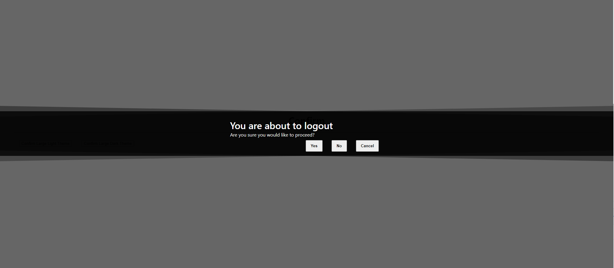
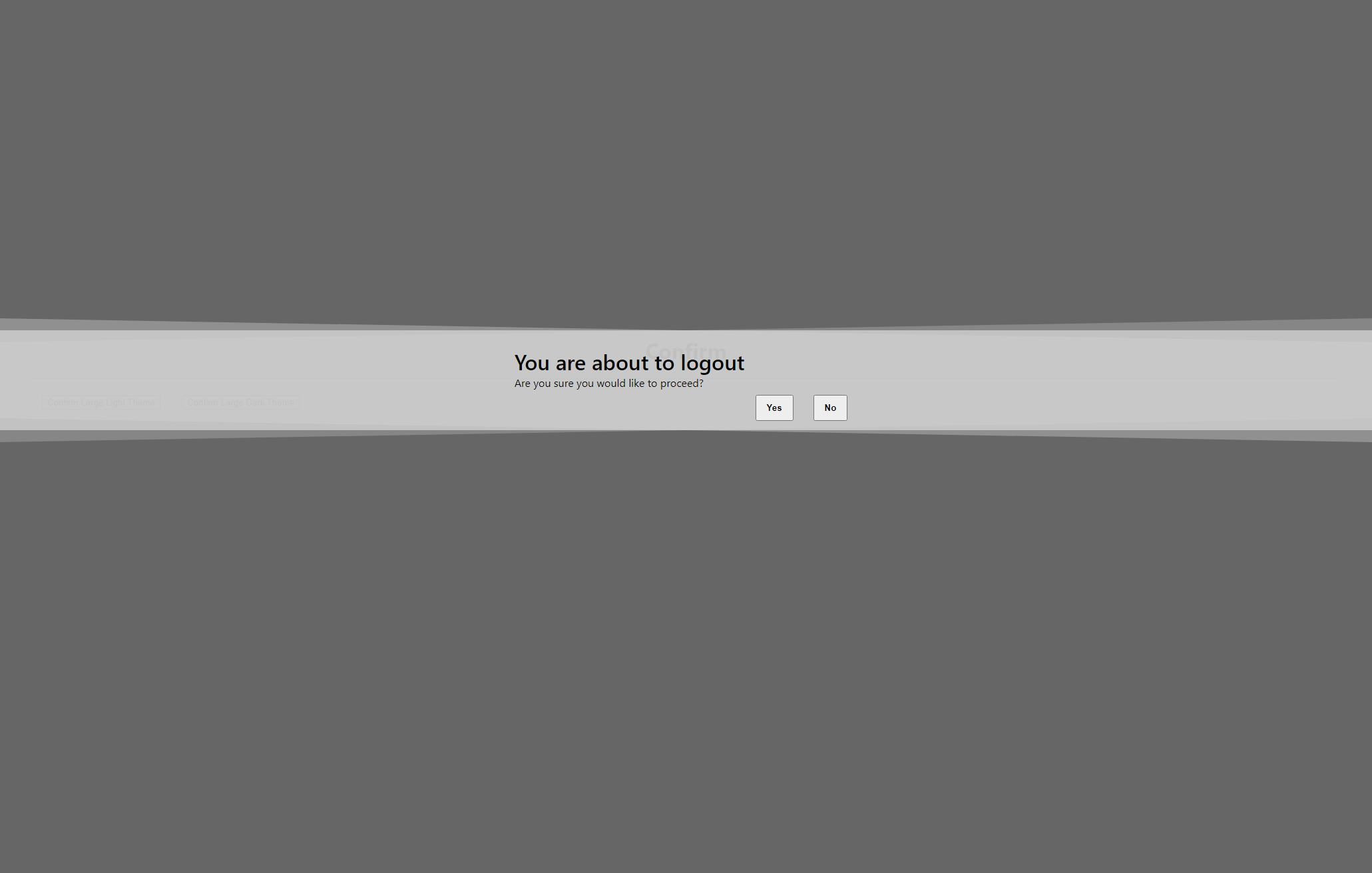
confirm({
                  title: "You are about to logout",
                  content: "Are you sure you would like to proceed?",
                  buttons: ["Yes", "No"]
              }, (buttonPressed) => {
                      if (buttonPressed === 'Yes') {
                          //Do some stuff here
                          return 0;
                      } else {
                        return 0;
                      }
              });
API
This component provides some static methods with usage and arguments below
message.success(toastContent, options)
message.error(toastContent, options)
message.info(toastContent, options)
message.warning(toastContent, options)
message.loading(toastContent, options)
message.custom(messageContent, options)

confirm(confirmContent, callback)
Toast Arguments
| Argument | Description | Type | Default |
|---|---|---|---|
| toastContent | The content of the message | HTMLElement | string | - |
| options | Options to allow for customization. | options | defaultOptions |
The options object accepts the following properties
{
    alignment,
    duration,
    background,
    textColor,
    icon,
    iconColor
}
Note: background, textColor, icon, and iconColor will only display with the message.custom() method. Otherwise, it will use predefined icons and colors.
Default options
{
    alignment: 'top-center',
    duration: 3,
    background: '#fff',
    textColor: '#000',
    icon: 'fas fa-bell',
    iconColor: '#fff'
}
Object attributes
| Argument | Description | Type |
|---|---|---|
| alignment | The placement of the toast message. Options are as follows: 'top-left', 'top-center', 'top-right', 'bottom-left', 'bottom-center', 'bottom-left' | string |
| duration | How long to display the toast message (in seconds). Set to 0 if you do not want it to auto dismiss. | number |
| background | The background color used for the toast message. Accepts Hex colors. | string |
| textColor | The text color used for the toast message. Accepts Hex colors. | string |
| icon | Font awesome icon associated to the toast message. Any free icons they provide will work with this. | string |
| iconColor | The icon color used for the toast message, if you want it different from the text color. Accepts Hex colors. | string |
Confirm Arguments
| Argument | Description | Type | Default |
|---|---|---|---|
| content | Options to allow for customization. Accepts title, content, buttons, and theme. | options | defaultOptions |
| callback(buttonClicked) | Callback function to determine what button was clicked. Accepts a string that notifies what button was clicked. returning 0 or null from the callback will close the confirm dialog. | HTMLElement | string | - |
The content object accepts the following properties
{
    title,
    content,
    buttons,
    theme,
    flare
}
Default content
{
    title: 'Do you want to proceed?',
    content: 'Please confirm below',
    buttons: ['Yes', 'No'],
    theme: 'light',
    flare: true
}
Object attributes
| Argument | Description | Type |
|---|---|---|
| title | The title of the confirm message | string |
| content | Sub text of the confirm message | string |
| buttons | Array of buttons to customize what the user can click | string[] |
| theme | If using a dark theme, you can set theme="dark" | string |
| flare | Set to false if you want to remove the shaded border that adds a little pizzazz to the message | boolean |