@roast-cms/react-sugar-styled v1.0.4
react-sugar-styled
🍬 Customizable and extendable theming dictionary for Styled Components.

- Create more flexible designs with React and Styled Components.
- Pre-built design system that works across all your projects.
- Focus on design, not variables.
Installation:
yarn add @roast-cms/react-sugar-styledThen, in your project:
import styled, { ThemeProvider } from "styled-components"
import { Sugar } from "@roast-cms/react-sugar-styled"
//
// you can access the dictionary values from Styled Components within
// any component that's wrapped in <ThemeProvider />
const MyComponent = styled.div`
  color: ${props => props.theme.color.brand()};
`
//
// pass the dictionary Sugar() as a theme to your app:
const App = props =>
  <ThemeProvider theme={Sugar()}><MyComponent /></ThemeProvider>
Why?
Styled Components lets you apply CSS to your React components with ease. Their theming support adds a level of flexibility and organization to your application. You can make your components visually behave in an organized fashion, while remaining independent.
Theming in this context works as defining a dictionary of values which could be reused across the children components. However, what those values are is a mystery until you finish building your project.
react-sugar-styled provides you with a set of defaults that you can easily customize and extend. They include basics like colours, fonts, key sizes, and more. A set of convenience functions also helps you with responsive design (breakpoints), as well as size and colour modifications.
Theme globals.
All of the values in the theme object are accessible across all your components which are children of <ThemeProvider/>. Here's what they do and how to access them:
To access a value within your CSS (that you wrote with Styled Components) simply include ${props => props.theme.[OBJECT REFERENCE]}, where OBJECT REFERENCE is one of the following:
Colours
| OBJECT REFERENCE | Description | Usage Example |
|---|---|---|
color.brand(alpha) | An rgba value for your "special" theme colour. | color: ${props => props.theme.color.brand()}; |
color.foreground(alpha) | An rgba value for your foreground colour, typically the colour of your body text. | color: ${props => props.theme.color.foreground()}; |
color.background(alpha) | An rgba value for your background colour, typically the colour of your background. | background: ${props => props.theme.color.background()}; |
Typography
| OBJECT REFERENCE | Description | Usage Example |
|---|---|---|
typography.title.auto | Return CSS that sets color, font-family, letter-spacing, line-height, font-weight, and margin designed for title/heading tags. | h1 { ${props => props.theme.typography.title.auto} } |
typography.text.auto | Same as above, but for body text. | p { ${props => props.theme.typography.text.auto} } |
Block measuring sizes
| OBJECT REFERENCE | Description | Usage Example |
|---|---|---|
size.block.padding | Returns a number meant to be used as em value for standard padding width | padding: ${props => props.theme.size.block.padding}em; |
size.block.padding | Returns a number meant to be used as em value for standard spacing between blocks | margin: ${props => props.theme.size.block.spacing}em; |
size.block.border | Returns a number meant to be used as px value for standard border widths | border: ${props => props.theme.size.block.border}px solid; |
size.block.column.m | Returns a number meant to be used as px value for a medium-width content column | article { width: ${props => props.theme.size.column.m} } |
size.block.column.l | Same as above, but for wider screens | article { width: ${props => props.theme.size.column.l} } |
Complete list can be found here
Customizing & extending the theme.
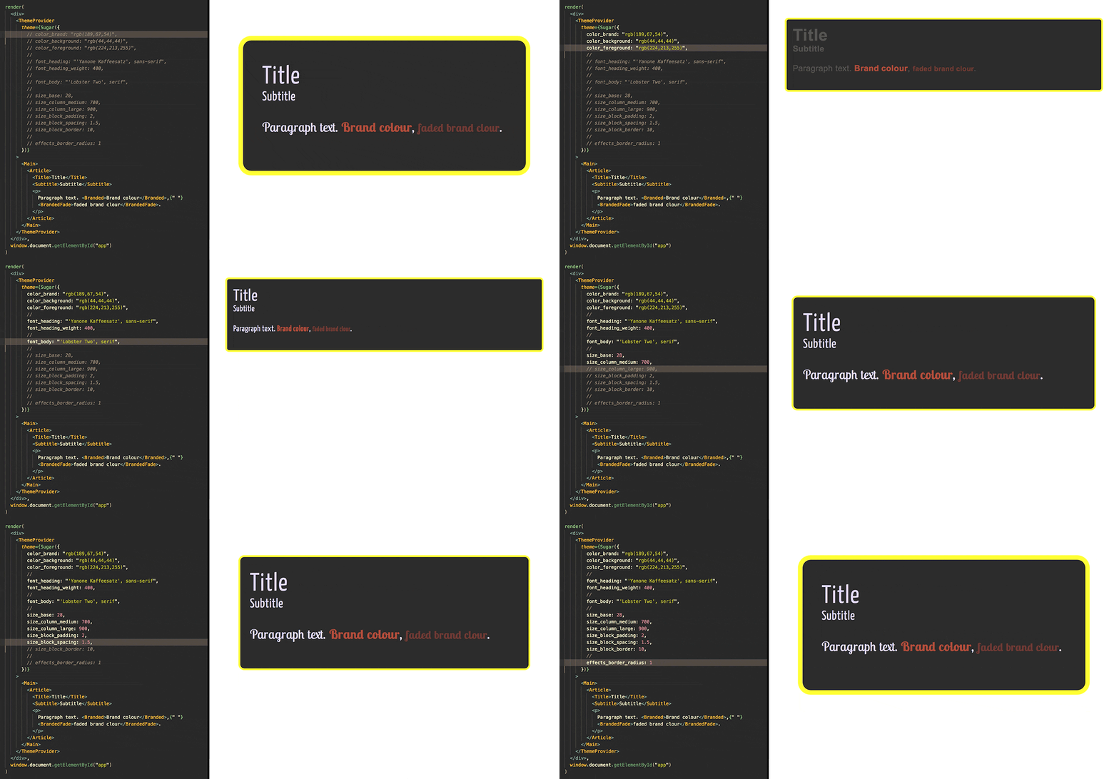
Although you can immediately start designing your components using the default theme dictionary, you may want to customize it. Luckily there's an easy way to do this:
<ThemeProvider
  theme={Sugar({
      color_brand: "rgb(189,67,54)",
      color_background: "rgb(44,44,44)",
      color_foreground: "rgb(224,213,255)",
      //
      font_heading: "'Yanone Kaffeesatz', sans-serif",
      font_heading_weight: 400,
      //
      font_body: "'Lobster Two', serif",
      //
      size_base: 28,
      size_column_medium: 700,
      size_column_large: 900,
      size_block_padding: 2,
      size_block_spacing: 1.5,
      size_block_border: 10,
      //
      effects_border_radius: 1
    })
  }
>
{/* components */}
</ThemeProvider>
You can also extend the theme with your own dictionary values or system using ES6 spread operator:
<ThemeProvider
  theme={{
    ...Sugar(),
    font_special: "'Indie Flower', cursive"
  }}
>
{/* components */}
</ThemeProvider>
Contributions welcome!
To get started with the code: clone the repo, run yarn install then yarn start and open up http://localhost:3002 in your browser.