@scayle/tailwind-base v2.0.1

Getting Started
Visit the Add-On Developer Guide to learn more on how to use the Panel icons.
Visit the Docs to learn more about our system requirements.
What is Scayle ?
SCAYLE is a full-featured e-commerce software solution that comes with flexible APIs. Within SCAYLE, you can manage all aspects of your shop, such as products, stocks, customers, and transactions.
Learn more about SCAYLE’s architecture and commerce modules in the Docs.
@scayle/tailwind-base
A base Tailwind preset for SCAYLE projects. It includes our core colors, fonts, and sizes along with a few plugins. Based on the SCAYLE Style Guide
Installation
npm i -S @scayle/tailwind-baseUsage
Add the following to your tailwind config:
presets: [require('@scayle/tailwind-base')]Or if you don't want to include the default plugins:
presets: [require('@scayle/tailwind-base/core')]Fonts
This preset uses Lato v1, Noto Sans Arabic and Noto Sans Hebrew in the default font-family, but the fonts are not bundled with this package. You must load them yourself.
e.g. Using Google Fonts
@import url('https://fonts.googleapis.com/css2?family=Lato:ital,wght@0,400;0,700;0,900;1,400;1,700;1,900&family=Noto+Sans+Arabic:wght@400;700;900&family=Noto+Sans+Hebrew:wght@400;700;900&display=swap');or
<link rel="preconnect" href="https://fonts.googleapis.com" />
<link rel="preconnect" href="https://fonts.gstatic.com" crossorigin />
<link
  href="https://fonts.googleapis.com/css2?family=Lato:ital,wght@0,400;0,700;0,900;1,400;1,700;1,900&family=Noto+Sans+Arabic:wght@400;700;900&family=Noto+Sans+Hebrew:wght@400;700;900&display=swap"
  rel="stylesheet"
/>
Colors
The settings defined in the preset will be merged with Tailwind's default configuration with the exception of colors and screen breakpoints.
The idea behind this is that the palette defined here should be used in most cases, and many colors in the Tailwind palette would be lost in a merge anyway because of name conflicts.
If you need to use any colors in the Tailwind palette, they can be imported from the Tailwind package.
const tailwindColors = require('tailwindcss/colors');
module.exports = {
  theme: {
    extend: {
      colors: {
        'custom-color': 'rgb(255, 0, 0)',
        ...tailwindColors,
      },
    },
  },
};
Plugins
This package includes a collection of plugins for Tailwind. Most are included by default in the preset, but they can also be used individually. Because plugins added in a preset cannot be removed, if you only want to use some plugins, use the core preset and explicitly add the plugins you want.
Base
The following plugins adjust styles in Tailwind's base layer.
None of them are included in the default preset.
Base
@scayle/tailwind-base/plugins/base.js
This plugin applies some base styles to built-in elements, such as headings, a and img.
Env
@scayle/tailwind-base/plugins/env.js
The env plugin adds two custom properties to the body element: --env-color and --env-name. The values of these custom properties are determined by the panel environment.
It also adds the utility classes bg-env-color for setting the background based on the environment and color-env for the text color.
Element-Plus
@scayle/tailwind-base/plugins/element-plus.js
This plugin sets element-plus css variables based on the tailwind config. It is not included in the default preset.
Utilities
The following plugins add additional utilities to Tailwind's utilities layer.
Filter Color
Utility classes to create filter rules that apply a specific theme color.
Can be used for coloring svg or transparent png icons that are loaded through an img tag.
Creates a filter-[theme-color-name] class for each theme color.
MultiColumn
@scayle/tailwind-base/plugins/multiColumn.js
This plugin adds utility classes for building a Multi-column Layout.
Column Span
Utility classes for controlling the column-span
| Class | Properties |
|---|---|
col-span-all | column-span: all |
col-span-none | column-span: none |
Column Count
Utility classes for controlling the column-count
| Class | Properties |
|---|---|
col-count-1 | column-count: 1 |
col-count-2 | column-count: 2 |
col-count-3 | column-count: 3 |
col-count-auto | column-count: auto |
col-count-[<number>] | column-count: <number> |
Column Rule Width
Utility classes for controlling the column-rule-width.
| Class | Properties |
|---|---|
rule-thin | column-rule-width: thin |
rule-medium | column-rule-width: medium |
rule-thick | column-rule-width: thick |
rule-[<length] | column-rule-width: <length> |
Column Rule Color
Utility classes for controlling the column-rule-color.
Creates a rule-[theme-color-name] class for each theme color. Additionally, it supports the arbitrary value syntax so you can add classes like rule-[#FF0000].
Column Rule Style
Utility classes for controlling the column-rule-style.
| Class | Properties |
|---|---|
rule-none | column-rule-style: none |
rule-hidden | column-rule-style: hidden |
rule-dotted | column-rule-style: dotted |
rule-dashed | column-rule-style: dashed |
rule-solid | column-rule-style: solid |
rule-double | column-rule-style: double |
rule-groove | column-rule-style: groove |
rule-ridge | column-rule-style: ridge |
rule-inset | column-rule-style: inset |
rule-outset | column-rule-style: outset |
No Scrollbar
@scayle/tailwind-base/plugins/noScrollbar.js
Adds a no-scrollbar class which hides the scrollbar while still allowing scroll.
<div style="height: 50px" class="overflow-auto no-scrollbar">
  <div style="height: 75px" class="bg-yellow"></div>
  <div style="height: 75px" class="bg-blue"></div>
</div>
Reset
@scayle/tailwind-base/plugins/reset.js
Adds a few classes to explicitly reset browser styles for certain elements.
Scrollbar styles
@scayle/tailwind-base/plugins/scrollbar.js
Utilities for styling the scrollbar.
| Class | Properties |
|---|---|
scrollbar-auto | scrollbar-width: auto |
scrollbar-thin | scrollbar-width: thin |
scrollbar-none | scrollbar-width: none |
Additionally, it creates thumb-[theme-color-name] and track-[theme-color-name] classes for each theme color.
📝 You must specify both the thumb and track color. If only one is set, the default scrollbar colors will be used for both properties. CSS Scrollbars
<div
  style="height: 50px"
  class="overflow-auto track-red thumb-blue scrollbar-thin"
>
  <div style="height: 75px" class="bg-yellow"></div>
  <div style="height: 75px" class="bg-blue"></div>
</div>
These two properties also support the arbitrary value syntax.
<div
  style="height: 50px"
  class="overflow-auto track-[#FF0000] thumb-[#0000FF] scrollbar-thin"
>
  <div style="height: 75px" class="bg-yellow"></div>
  <div style="height: 75px" class="bg-blue"></div>
</div>
Components
The following plugins add styles for common CSS components to Tailwind's components layer.
Alert
@scayle/tailwind-base/plugins/alert.js
<div class="alert alert-warning">
  <span>Careful! Something bad might happen</span>
</div>
<div class="alert alert-success">
  <span>Yay! It worked</span>
</div>
By default all theme colors are supported along with arbitrary values. For example, alert-red and alert-[#FF0000].
Avatar
@scayle/tailwind-base/plugins/avatar.js
Avatars consist of an .avatar element which contains either an .avatar-image element for icons and images or .avatar-initials for text. A data-initials attribute can also be added to .avatar-image elements. The text will be displayed if the image fails to load.
<div class="avatar">
  <img
    class="avatar-image"
    src="https://images.pexels.com/photos/220453/pexels-photo-220453.jpeg?auto=compress&cs=tinysrgb&dpr=2&h=750&w=1260"
    data-initials="abc"
  />
</div>

<div class="avatar">
  <img class="avatar-image" data-initials="abc" src="/thisisabrokenlink.jpg" />
</div>

<div class="avatar">
    <img
        class="avatar-image bg-dark"
        :src="require('@scayle/panel-icons/icons/checkmark.svg')"
        data-initials="abc"
    />
</div>

<div class="avatar">
  <IconCheckmark class="avatar-image bg-dark text-dark-grey fill-current" />
</div>

<div class="avatar">
  <div class="avatar-initials">XYZ</div>
</div>![]()
There also some size presets for avatars.
| Class | Properties |
|---|---|
avatar-xs | height: '20px'; width: '20px'; |
avatar-sm | height: '29x'; width: '29x'; |
avatar-md | height: '44px'; width: '44px'; |
avatar-lg | height: '60px'; width: '60px'; |
avatar-xl | height: '90px'; width: '90px'; |
<div class="avatar avatar-xs">
  <img
    class="avatar-image"
    src="https://images.pexels.com/photos/220453/pexels-photo-220453.jpeg?auto=compress&cs=tinysrgb&dpr=2&h=750&w=1260"
    data-initials="abc"
  />
</div>

<div class="avatar avatar-sm">
  <img
    class="avatar-image"
    src="https://images.pexels.com/photos/220453/pexels-photo-220453.jpeg?auto=compress&cs=tinysrgb&dpr=2&h=750&w=1260"
    data-initials="abc"
  />
</div>

<div class="avatar avatar-md">
  <img
    class="avatar-image"
    src="https://images.pexels.com/photos/220453/pexels-photo-220453.jpeg?auto=compress&cs=tinysrgb&dpr=2&h=750&w=1260"
    data-initials="abc"
  />
</div>

<div class="avatar avatar-lg">
  <img
    class="avatar-image"
    src="https://images.pexels.com/photos/220453/pexels-photo-220453.jpeg?auto=compress&cs=tinysrgb&dpr=2&h=750&w=1260"
    data-initials="abc"
  />
</div>

<div class="avatar avatar-xl">
  <img
    class="avatar-image"
    src="https://images.pexels.com/photos/220453/pexels-photo-220453.jpeg?auto=compress&cs=tinysrgb&dpr=2&h=750&w=1260"
    data-initials="abc"
  />
</div>![]()
Badge
@scayle/tailwind-base/plugins/badge.js
<div>
  <span class="badge badge-red">Item one</span>
  <span class="badge badge-green">Item two</span>
</div>
By default all theme colors are supported along with arbitrary values. For example, badge-red and badge-[#FF0000].
Bullet
@scayle/tailwind-base/plugins/bullet.js
<div class="flex flex-col">
  <span class="bullet bullet-red">Item one</span>
  <span class="bullet bullet-green">Item two</span>
</div>
By default all theme colors are supported along with arbitrary values. For example, bullet-red and bullet-[#FF0000].
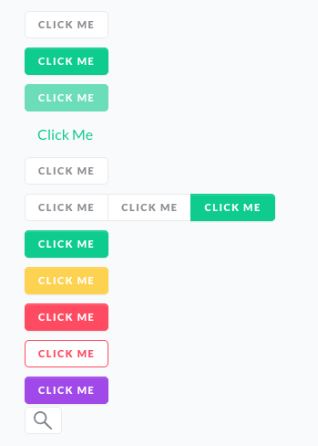
Button
@scayle/tailwind-base/plugins/button.js
<div>
  <button class="btn">Click Me</button>
  <br class="my-2" />
  <button class="btn btn-primary">Click Me</button>
  <br class="my-2" />
  <button class="btn btn-primary" disabled>Click Me</button>
  <br class="my-2" />
  <button class="btn btn-link">Click Me</button>
  <br class="my-2" />
  <button class="btn btn-text text-dark-grey">Click Me</button>
  <br class="my-2" />
  <div class="btn-group">
    <button class="btn">Click Me</button>
    <button class="btn">Click Me</button>
    <button class="btn btn-primary">Click Me</button>
  </div>
  <br class="my-2" />
  <button class="btn btn-success">Click Me</button>
  <br class="my-2" />
  <button class="btn btn-warning">Click Me</button>
  <br class="my-2" />
  <button class="btn btn-danger">Click Me</button>
  <br class="my-2" />
  <button class="btn btn-outline-red">Click Me</button>
  <br class="my-2" />
  <button class="btn btn-primary btn-env-based">Click Me</button>
  <br class="my-2" />
  <button class="btn btn-icon-only"><IconSearch class="icon icon-sm" /></button>
</div>
By default all theme colors are supported along with arbitrary values. For example, btn-red, btn-[#FF0000], btn-outline-red, btn-outline-[#FF0000].
Card
@scayle/tailwind-base/plugins/card.js
<div class="card">
  <div class="card-header">
    <h5>Card Title</h5>
    <span class="count">100</span>
  </div>
  <div class="card-body">Body content here</div>
  <div class="card-footer">You can have a footer too if you want</div>
</div>
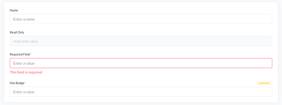
Forms & Labels
@scayle/tailwind-base/plugins/forms.js
<div class="card">
  <div class="card-body grid gap-5">
    <label class="label">
      <span class="label-text">Name</span>

      <input
        class="form-control"
        placeholder="Enter a name"
        :disabled="false"
      />
    </label>

    <label class="label">
      <span class="label-text">Read Only</span>

      <input class="form-control" value="read only value" disabled="" />
    </label>

    <label class="label">
      <span class="label-text is-required">Required Field</span>

      <input
        class="form-control"
        placeholder="Enter a value"
        :class="{ 'is-invalid': true }"
      />

      <span class="invalid-feedback"> This field is required </span>
    </label>

    <label class="label">
      <span class="label-row">
        <span class="label-text is-required">Has Badge</span>
        <span class="label-badge badge-warning">Warning</span>
      </span>

      <input class="form-control" placeholder="Enter a value" />
    </label>
  </div>
</div>
<div class="card">
  <div class="card-body form-horizontal">
    <label class="label-horizontal">
      <span class="label-horizontal-text">Name</span>

      <input
        class="form-control"
        placeholder="Enter a name"
        :disabled="false"
      />
    </label>

    <label class="label-horizontal">
      <span class="label-horizontal-text">Read Only</span>

      <input class="form-control" value="read only value" disabled="" />
    </label>

    <label class="label-horizontal">
      <span class="label-horizontal-text is-required">Required Field</span>

      <div>
        <input
          class="form-control"
          placeholder="Enter a value"
          :class="{ 'is-invalid': true }"
        />

        <span class="invalid-feedback"> This field is required </span>
      </div>
    </label>
  </div>
</div>
Icon
@scayle/tailwind-base/plugins/icon.js
The icon plugin adds classes for working with svg icons.
The icon class adds some basic styling for icons.
<IconStar class="icon"></IconStar>Icons can be sized using width and height utilities. There are also some standard size increments we use.
| Class | Properties |
|---|---|
icon-xs | height: '1rem'; width: '1rem'; |
icon-sm | height: '1.25rem'; width: '1.25rem'; |
icon-md | height: '1.5rem'; width: '1.5rem'; |
icon-lg | height: '2rem'; width: '2rem'; |
icon-xl | height: '3rem'; width: '3rem'; |
icon-[<length>] | height: <length>; width: <length> |
<IconStar class="icon icon-lg"></IconStar>CSS Icons
It's also possible to use pure css icons. Add the icon-bg class, plus a class icon-bg-[icon-name].
Icons are included from @scayle/panel-icons.
<div class="text-red">
  <div class="icon icon-bg icon-bg-shirt icon-xl"></div>
</div>![]()
Colors
Icons will by default use the currentColor. You can change the color by using a text-color utility class.
If you add the icon-native class they will instead use the color from the svg file.
<div class="text-red">
  <div class="icon icon-bg icon-bg-shirt icon-xl icon-native"></div>
</div>![]()
Spinner
@scayle/tailwind-base/plugins/spinner.js
To create a spinner, add an element with the spinner class and containing some spans. Each span will be an animated dot.
<div class="spinner">
  <span></span>
  <span></span>
  <span></span>
  <span></span>
</div>
To change the dot color, add a text color class.
<div class="spinner text-red">
  <span></span>
  <span></span>
  <span></span>
  <span></span>
</div>
A size class can also be added to change the spinner size. It supports arbitrary values of type length.
<div class="spinner spinner-lg">
  <span></span>
  <span></span>
  <span></span>
  <span></span>
</div>| Class | Properties |
|---|---|
spinner-xs | width: '1em'; |
spinner-sm | width: '1.5em'; |
spinner-md | width: '3em'; |
spinner-lg | width: '4.5em'; |
spinner-xl | width: '6em'; |
spinner-[<length>] | width: <length>; |
The spinner-overlay class can be added to an element to display an opaque overlay on top. It can have rounded borders if has-rounded-border is also added. If the spinner has the is-centered class, it will be centered within the overlay.
<div class="card spinner-overlay has-rounded-border">
  <div class="spinner is-centered">
    <span></span>
    <span></span>
    <span></span>
    <span></span>
  </div>
</div>
Typography
@scayle/tailwind-base/plugins/text.js
| Class | Properties |
|---|---|
headline-36 | font-size: 36px; line-height: 44px; letter-spacing: normal; font-weight: black; |
headline-26 | font-size: 26px; line-height: 34px; letter-spacing: normal; font-weight: black; |
headline-19 | font-size: 36px; line-height: 28px; letter-spacing: normal; font-weight: black; |
headline-15 | font-size: 15px; line-height: 24px; letter-spacing: normal; font-weight: bold; |
headline-13 | font-size: 13px; line-height: 20px; letter-spacing: normal; font-weight: bold; |
headline-11 | font-size: 11px; line-height: 16px; letter-spacing: 0.1px; font-weight: bold; |
headline-9 | font-size: 9px; line-height: 14px; letter-spacing: 0.25px; font-weight: bold; |
paragraph-13 | font-size: 13px; line-height: 20px; letter-spacing: normal; font-weight: normal; |
paragraph-11 | font-size: 11px; line-height: 18px; letter-spacing: 0.1px; font-weight: normal; |
paragraph-9 | font-size: 9px; line-height: 16px; letter-spacing: 0.25px; font-weight: bold; |
column-label | font-size: 9px; line-height: 16px; letter-spacing: 0.85px; font-weight: bold; |
btn-label | font-size: 13px; line-height: 20px; letter-spacing: 0.8px; font-weight: black; |
Other channels
License
Licensed under the MIT