@shipt/segmented-arc-for-react-native v2.0.0
Segmented Arc for React Native
Segmented arc component for React Native. Check out our documentation below to learn how to get started.
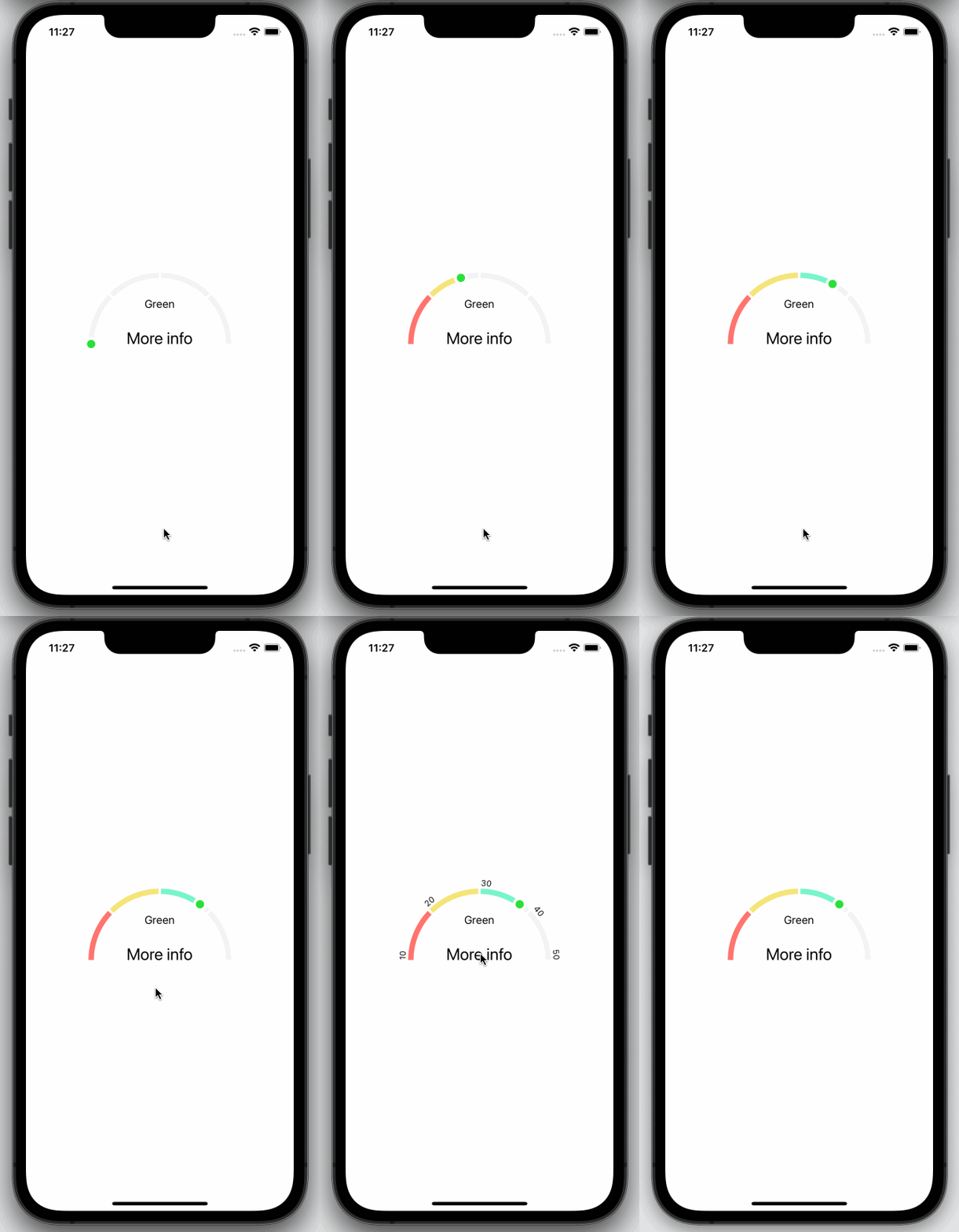
Example app demo

Table of Contents
🚀 Installation
There are two steps to get this package up and running.
Install
react-native-svglibrary by following their instructions.Install
@shipt/segmented-arc-for-react-native:
yarn add @shipt/segmented-arc-for-react-nativeor if you prefer to use npm:
npm install --save @shipt/segmented-arc-for-react-native🎉 Usage
Here is a basic example of how to use this component. It covers all the main features.
import React, { useState } from 'react';
import { View, Text, Pressable } from 'react-native';
import { SegmentedArc } from '@shipt/segmented-arc-for-react-native';

const App = () => {
  const [showArcRanges, setShowArcRanges] = useState(false);

  const segments = [
    {
      scale: 0.25,
      filledColor: '#FF746E',
      emptyColor: '#F2F3F5',
      data: { label: 'Red' }
    },
    {
      scale: 0.25,
      filledColor: '#F5E478',
      emptyColor: '#F2F3F5',
      data: { label: 'Yellow' }
    },
    {
      scale: 0.25,
      filledColor: '#78F5CA',
      emptyColor: '#F2F3F5',
      data: { label: 'Green' }
    },
    {
      scale: 0.25,
      filledColor: '#6E73FF',
      emptyColor: '#F2F3F5',
      data: { label: 'Blue' }
    }
  ];

  const ranges = ['10', '20', '30', '40', '50'];

  const _handlePress = () => {
    setShowArcRanges(!showArcRanges);
  };

  return (
    <View style={{ flex: 1, alignItems: 'center', justifyContent: 'center' }}>
      <SegmentedArc
        segments={segments}
        fillValue={70}
        isAnimated={true}
        animationDelay={1000}
        showArcRanges={showArcRanges}
        ranges={ranges}
      >
        {metaData => (
          <Pressable onPress={_handlePress} style={{ alignItems: 'center' }}>
            <Text style={{ fontSize: 16, paddingTop: 16 }}>{metaData.lastFilledSegment.data.label}</Text>
            <Text style={{ lineHeight: 80, fontSize: 24 }}>More info</Text>
          </Pressable>
        )}
      </SegmentedArc>
    </View>
  );
};

export default App;
Try this example yourself here.
Custom segment sizing
If you would like to adjust the sizing of the segments individually, just provide the arcDegreeScale property on segments whose size you'd like to control. Segments without an arcDegreeScale will be equally sized for the remainder of the arc.
const segments = [
  {
    arcDegreeScale: 0.5, // will take up half the entire arc
    filledColor: '#FF746E',
    emptyColor: '#F2F3F5'
  },
  {
    filledColor: '#F5E478', // each of these segments will use a third of the remainder of the arc, or 1/6 of the total since the segment above is using 50%
    emptyColor: '#F2F3F5'
  },
  {
    filledColor: '#78F5CA',
    emptyColor: '#F2F3F5'
  },
  {
    filledColor: '#6E73FF',
    emptyColor: '#F2F3F5'
  }
];
Invalid props handling
The library can automatically convert invalid props (e.g., scale = NaN or scale = 0) to valid numbers to prevent your app from crashing. To detect these adjustments, use the onDataError and dataErrorComponent props. Additionally, warnings may be shown in development mode to help prevent these errors.
📖 Props
| Name | Type | Default | Description |
|---|---|---|---|
| fillValue | number (0-100) | 0 | Current progress value |
| segments | Array of { scale: number, filledColor: string, emptyColor: string, data: object, arcDegreeScale: number } | [] | Segments of the arc. Here, scale is a percentage value out of 100%, filledColor for filled part of a segment, emptyColor is background color for an empty segment, data could be any object that you'd want to receive back for a segment, and arcDegreeScale is used to resize each segment. Both scale and arcDegreeScale accept percentage in decimal form (e.g., 50% should provided as 0.50). See examples above. |
| filledArcWidth | number | 8 | Thickness of progress line |
| emptyArcWidth | number | 8 | Thickness of background line |
| spaceBetweenSegments | number | 2 | Space between segments |
| arcDegree | number | 180 | Degree of arc |
| radius | number | 100 | Arc radius |
| isAnimated | bool | true | Enable/disable progress animation |
| animationDuration | number | 1000 | Progress animation duration |
| animationDelay | number | 0 | Progress animation delay |
| ranges | Array of strings | [] | Arc ranges (segments) display values |
| rangesTextColor | string | '#000000' | Color of ranges text |
| rangesTextStyle | object | { fontSize: 12 } | Ranges text styling |
| showArcRanges | bool | false | Show/hide arc ranges |
| middleContentContainerStyle | object | {} | Extra styling for the middle content container |
| capInnerColor | string | '#28E037' | Cap's inner color |
| capOuterColor | string | '#FFFFFF' | Cap's outer color |
| alignRangesWithSegments | bool | true | This might be useful when using segment[].arcDegreeScale values to customize the size of individual segments. If you'd like the range display to align with the edge of each segment, pass this prop as true. Otherwise, range displays will be distributed evenly across the arc. |
| children | function | Pass a function as a child. It receives metaData with the last filled segment's data as an argument. From there you can extract data object. See example above. | |
| dataErrorComponent | JSX element or null | DataError | This prop allows you to override the component shown below the graph when invalid props are passed (e.g., scale = NaN or scale = 0). By default, it displays an error message to inform users that the data may be inaccurate. The library internally adjusts invalid values (e.g., changing NaN to a valid number) to prevent crashes. To hide this error, pass null instead. |
| onDataError | function | undefined | This function is called when the library encounters invalid props (e.g., scale = NaN or scale = 0) that are internally adjusted to prevent crashes. It is called with an errors object as the parameter, enabling you to log the errors to monitoring tools. |
📋 Attributions
Read the Attributions here.
👏 Contributing
Please read our CONTRIBUTING.md for details on our community guidelines and the process for submitting pull requests to us.
🧑💻 Maintainers
To find out who our Maintainers are, check out MAINTAINERS.md.
🚅 Versioning
We use SemVer for versioning. For the versions available, see the tags on this repository.
To update versions, run the yarn version and follow the prompts.
📄 License
This project is licensed under the MIT License - see the LICENSE.md file for details.
📜 Notice
Check out NOTICE.md.
🔒 Security
Check out SECURITY.md.