@slipmatio/control-knob v0.1.0
Vue Control Knob
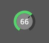
Fully customizable rotary control knob component for Vue 3 that behaves like native audio app controls in Logic Pro or Ableton Live. Component is rendered as an ARIA-friendly SVG element.


Features:
- Supports keyboard, mouse & wheel control
- Changes input only with vertical mouse movement
- Precice mode using shift + movement
- Reset to default with Option-click (alt-click)
- Zero dependencies (apart from Vue 3)
- Fully configurable and Tailwind CSS -friendly styles
- Witten in TypeScript, ships with typings
Installation
- Install
@slipmatio/control-knobpackage from npm - Import Vue component to your project:
import ControlKnob from '@slipmatio/control-knob' - Configure v-model and options
Configuration
All configuration options are optional. The options referencing inner coordinate positions are based on 100x100 coordinate system that is not affected by the imageSize.
| Option | Default | Description |
|---|---|---|
| imageSize | 40 | Rendered SVG width and lenght in pixels. |
| minValue | 0 | Minimum value of the knob v-model. |
| maxValue | 100 | Maximum value of the knob v-model. |
| showTick | true | Show visible marker of the knob position. |
| showValue | true | Show value label inside the knob. |
| hideDefaultValue | false | Hide value label if value hasn't been changed. |
| tickLength | 18 | Tick length in pixels. |
| tickOffset | 10 | Tick offset in pixels. |
| tickStroke | 3 | Tick stroke width. |
| rimStroke | 11 | Outer rim stroke width. |
| valueArchStroke | 11 | Value arch stroke width. |
| bgRadius | 34 | Radius of the background circle. |
| wheelFactor | 10 | Modifier to factor any mousewheel ticks. |
| keyFactor | 10 | Modifier to factor any arrow-key presses. |
| tabIndex | 0 | Tabindex for the HTML element. |
| ariaLabel | 'Knob' | ARIA label for the HTML element. |
| valueTextX | 50 | X-position of the value text label. |
| valueTextY | 62 | Y-position of the value text label. |
| svgClass | 'select-none' | CSS class for the SVG element. |
| bgClass | 'text-#868686' | CSS class for the background circle. |
| rimClass | 'text-#393939' | CSS class for the outer rim. |
| valueArchClass | 'text-#53d769' | CSS class for the value arch. |
| tickClass | 'text-black' | CSS class for the tick line. |
| valueTextClass | 'text-gray-50 text-30px font-normal font-mono' | CSS class for the value text. |
| passiveEvents | false | When set, propagation of handeled events is not prevented. |
Note that if you're using Tailwind CSS with automatic purge, you'll probably want to add the default classes as options so PurgeCSS catches them (or you can just whitelist them):
Default Tailwind CSS classes:
const options = {
  svgClass: 'select-none',
  bgClass: 'text-[#868686]',
  rimClass: 'text-[#393939]',
  valueArchClass: 'text-[#53d769]',
  tickClass: 'text-black',
  valueTextClass: 'text-gray-50 text-[30px] font-normal font-mono',
}
Development
Install dependencies
pnpm i
Run development server
pnpm dev
Run tests
pnpm test
Contributing
Contributions are welcome! Please follow the code of conduct when interacting with others.
Elsewhere
Follow @uninen on Twitter
4 years ago
4 years ago
4 years ago
4 years ago
4 years ago
4 years ago