@sounds.of.limbo/tooltip v0.1.1
@sounds.of.limbo/tooltip
Customizable hover tooltip for React applications
Table of Contents
Overview
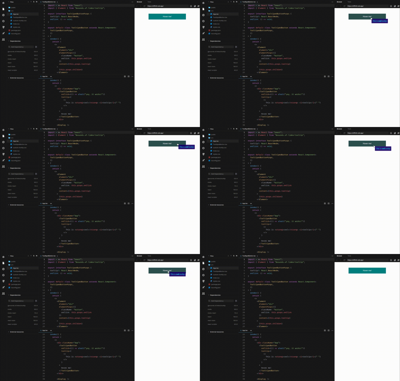
Complete basic usage with comments you can find and CodeSandbox

Preparations
This package is using mobx and mobx-react as peer dependencies, so before (or alognside with) installation you have to install these dependencies:
npm install --save mobx mobx-reactInstallation
Simply install it using NPM:
npm install --save @sounds.of.limbo/tooltipUsage
The package provides 2 React components: Element and Display
Element
Element is component that creates a tooltipable React node. It is possible to pass children as usual.
Props
| Prop name | Type | Is required? | Default value | Notes |
|---|---|---|---|---|
element | keyof HTMLElementTagNameMap | YES | Regular tag name, e.g. div, span, etc. | |
elementProps | React.HTMLAttributes<element> | Props for specified element (className, onClick, etc.) | ||
content | React.ReactNode | Content of the tooltip. If not specified, Element will not have the tooltip on hover |
Example
Let's create simple tooltipable button
import * as React from "react"
import { Element as TooltipElement } from "@sounds.of.limbo/tooltip"

export interface TooltipableButtonProps {
    tooltip?: React.ReactNode
    onClick?: () => void
}

export default
class TooltipableButton
extends React.Component<TooltipableButtonProps, {}> {
    render() {
        const { tooltip, onClick, children } = this.props
        return <>
            <TooltipElement
                element="button"
                elementProps={{
                    className: `c-button`,
                    onClick,
                }}
                content={tooltip}
            >
                {children}
            </TooltipElement>
        </>
    }
}
Now, when we want to create a button with tooltip, we just using this new component:
import * as React from "react"
import TooltipableButton from "./some/where"

export const SomeView: React.FC = () => {
    return <>
        <section className="some-view">
            <h1>
                Terms of use
            </h1>
            <p>
                Lorem ipsum dolor sit amet consectetur adipisicing elit. Cumque nobis veritatis facere!
            </p>
            <TooltipableButton
                tooltip={<>
                    By clicking on <strong>"Accept"</strong> you are confirming that you have <i>read and accept</i> our terms of use, lol
                </>}
                onClick={() => alert("Terms of use have been accepted!")}
            >
                Accept
            </TooltipableButton>
        </section>
    <>
}
Display
Display component is rendering tooltips inside itself. It should be placed as close to the application root as possible. Usually it should be rendered at entrypoint (App.jsx, etc.).
import * as React from "react"
import { Display as TooltipDisplay } from "@sounds.of.limbo/tooltip"

export const App = () => {
    return <>
        <main className="app">
            <h1>
                Hello, world!
            </h1>
        </main>
        <TooltipDisplay /> {/* This is all you need for you tooltips to be shown */}
    </>
}
Customization
By default, when you create minimal working code with the examples from above, you will get tooltips as just black text on transparent background. There are two ways to customize the appearance of the tooltip.
Using default styles
The package provides default styles for the tooltip (white text on black semi-transparent background):

To apply this style, you have to import corresponding stylesheet in the same place where you are rendering Display component.
There are CSS and SASS versions of the stylesheet:
import "@sounds.of.limbo/tooltip/styles/css/tooltip.css" // CSS version
import "@sounds.of.limbo/tooltip/styles/sass/tooltip.sass" // SASS version
Customizing on your own
There are three class names applied to the tooltip:
sol__tooltip- this is the main class name, applied alwayssol__tooltip-fade-in- this class name is being applied at the time of tooltip appearing on the screen. Here you can add some fade-in animations.sol__tooltip-fade-out- this class name is being applied at the time of tooltip is going to disappear (when themouseleaveevent is fired). Here you can add some fade-out animations. However, this won't work until you set up fade-out animation name (see Smooth disappearing)
Smooth disappearing
By default, tooltip will disappear on mouseleave event immediately, without delay. However, if you want to fade-out it smoothly, there is an option to do that.
- Add animation for
sol__tooltip-fade-outclass:
@keyframes fadeOut {
    0% { opacity: 1; }
    100% { opacity: 0; }
}

.sol__tooltip-fade-out {
    animation-name: fadeOut; /* we will use this animaton name later */
    animation-duration: 350ms;
    animation-timing-function: ease;
    animation-fill-mode: both;
}- Set specified animation name to the
fadeOutAnimationNamestatic property of theDisplaycomponent. You should do this at the same place, where you render theDisplaycomponent:
import * as React from "react"
import { Display as TooltipDisplay } from "@sounds.of.limbo/tooltip"

TooltipDisplay.fadeOutAnimationName = "fadeOut" // here we place our animation-name from "sol__tooltip-fade-out" class

export const App = () => {
    return <>
        <main className="app">
            <h1>
                Hello, world!
            </h1>
        </main>
        <TooltipDisplay /> {/* This is all you need for you tooltips to be shown */}
    </>
}
That's it! Since you complete these two steps, on mouseleave event the sol__tooltip-fade-out class will be applied to the tooltip, and the Display component will listen to the animationend event, so the tooltip will actually disappear from the screen once fade-out animation is finished.
Conclusion
Don't hesitate to visit CodeSandbox, all cases from the above are coded and commented there, so you can play with it without additional frictions.
Any questions/proposals are welcome in the "Issues" tab.
