@stevendejong/storybook-stylesheet-toggle v0.0.12
Storybook Stylesheet Toggle addon
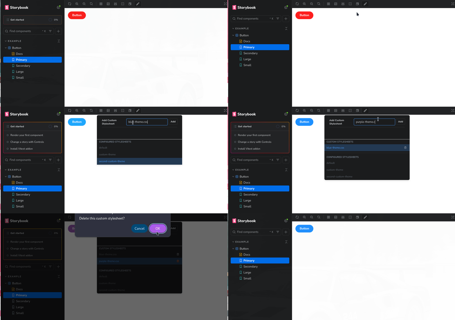
The Storybook Stylesheet Toggle addon is a simple and convenient tool for changing stylesheets on the fly within your Storybook stories. It allows you to dynamically switch between different stylesheets using a dropdown menu accessed via a toolbar button.

Usage
Setting Stylesheets
You can specify the stylesheets you want to toggle in your story using the stylesheetToggle parameter. This parameter should be an object where each key represents a label for the stylesheet option, and the corresponding value is the path to the stylesheet file or a URL:
import type { Preview } from "@storybook/react";

const preview: Preview = {
  parameters: {
    ...
    stylesheetToggle: {
      "default": "main.css",
      "custom-theme": "custom-theme.css",
      "second-custom-theme": "https://second.com/custom-theme.css",
    },
    ...
  },
};

export default preview;
Using the Toggle
Once you've configured your story, you'll see a toolbar button in Storybook that allows you to select and apply different stylesheets to your components during development.
2 years ago
2 years ago
2 years ago
2 years ago
2 years ago
2 years ago
2 years ago
2 years ago
3 years ago
3 years ago
3 years ago
3 years ago
3 years ago
3 years ago
3 years ago
3 years ago
3 years ago
3 years ago
3 years ago
3 years ago
3 years ago
3 years ago