@trackpilots/date-picker v1.0.26
@trackpilots/date-picker


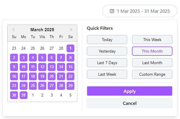
A customizable date picker component built with React and Tailwind CSS.
✨ Screenshots
🚀 Installation
You can install the package using npm or yarn:
Using npm
npm install @trackpilots/date-picker
# or
yarn add @trackpilots/date-picker
Make sure Tailwind CSS is installed in your project.
📌 Usage
Use in Your Component
import React, { useState } from "react";
import DateFilter from "@trackpilots/date-picker";

const App = () => {
  const [selectedDate, setSelectedDate] = useState(null);
  const [chosenDate, setChosenDate] = useState(null);

  const handleSelect = (date) => {
    setSelectedDate(date);
    console.log("Selected Date:", date);
  };

  const handleChoose = (date) => {
    setChosenDate(date);
    console.log("Choosed Date:", date);
  };

  return (
    <div className="p-4">
      <h2 className="text-lg font-bold">Date Picker</h2>
      <DateFilter
        defaultChoosenDate={"This Month"}
        onSelect={handleSelect}
        onChoose={handleChoose}
        selectedColor="#FF5733"
      />
      <p className="mt-2">Choosed Date: {chosenDate ? chosenDate.toDateString() : "None"}</p>
      <p>Selected Date: {selectedDate ? selectedDate.toDateString() : "None"}</p>
    </div>
  );
};

export default App;
📌 DateFilter Component
A React Date Filter component that allows users to select predefined date ranges like "Today", "Yesterday", "Last 7 Days", "Last Week","This Week", "This Month", "Last Month" or "Custom Range".
⚙️ Props
| Prop Name | Type | Default | Description |
|---|---|---|---|
defaultChoosenDate | string or null | Today | Predefined date range selection (e.g.,"Today", "Yesterday", "Last 7 Days", "Last Week","This Week", "This Month", "Last Month", "Custom Range"). |
startDate | Date or null | null | The starting date of the picker. |
endDate | Date or null | null | The ending date of the picker. |
onSelect | function | () => {} | Triggered when a date is selected. |
onChoose | function | () => {} | Triggered when a date is choosed. |
selectedColor | string | "#9D55FF" | Highlight color for the selected date. |
icon | React.ElementType | IoCalendarOutline | Custom calendar icon component. |
✨ Example
<DateFilter
  startDate={new Date("2024-06-01")}
  endDate={new Date("2024-06-30")}
  onSelect={(date) => console.log("User selected:", date)}
  onChoose={(date) => console.log("User Choosed:", date)}
  selectedColor="#007BFF"
/>
📦 Dependencies
- React
- Tailwind CSS
- react-icons (for
IoCalendarOutlineicon)
📌 Maintainers
These packages are maintained by Quick App Studio Developers.
📄 License
This project is licensed under the MIT License.
10 months ago
10 months ago
10 months ago
10 months ago
10 months ago
10 months ago
10 months ago
10 months ago
10 months ago
10 months ago
10 months ago
10 months ago
10 months ago
10 months ago
10 months ago
10 months ago
10 months ago
10 months ago
10 months ago
10 months ago
10 months ago
10 months ago
10 months ago
10 months ago

