@tremonsoft/datetime-picker v19.3.2
Angular Material DatetimePicker, Timepicker for @angular/material 7.x, 8.x, 9.x, 10.x, 11.x, 12.x, 13.x, 14.x, 15.x, 16.x, 18.x, 19.x
Description
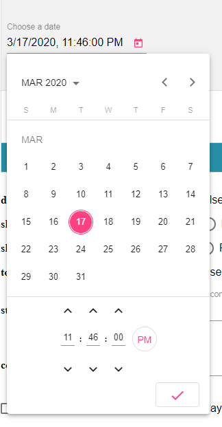
A DatetimePicker like @angular/material Datepicker by adding support for choosing time.
DEMO
@see LIVE DEMO AND DOCUMENTATION
@see DEMO stackblitz

Choose the version corresponding to your Angular version:
| Angular | @ngxmc/datetime-picker |
|---|---|
| 19 | 19.x+ |
| 18 | 18.x+ |
| 16 | 16.x+ |
| 15 | 15.x+ OR 9.x+ for legacy import |
| 14 | 8.x+ |
| 13 | 7.x+ |
| 12 | 6.x+ |
| 11 | 5.x+ |
| 10 | 4.x+ |
| 9 | 2.x+ |
| 8 | 2.x+ |
| 7 | 2.x+ |
Getting started
npm install --save @ngxmc/datetime-pickerSetup
Add the date provider to your app configuration.
!IMPORTANT to prevent the _ERROR Error: NgxMatDatetimePicker: No provider found for DateAdapter. You must import one of the following providers at your application root or standalone component: provideNativeDateAdapter, provideMomentDateAdapter, provideLuxonDateAdapter, provideDateFnsAdapter, or provide a custom implementation.
import { provideNativeDateAdapter } from '@angular/material/core';

export const appConfig: ApplicationConfig = {
  providers: [
    ...,
    provideNativeDateAdapter(),
    ...,
  ],
};
On your component, you can use the datepicker as follows:
import {
  NgxMatDatepickerActions,
  NgxMatDatepickerApply,
  NgxMatDatepickerCancel,
  NgxMatDatepickerClear,
  NgxMatDatepickerInput,
  NgxMatDatetimepicker,
} from '@ngxmc/datetime-picker';

@Component({
  selector: 'test',
  imports: [
    NgxMatDatepickerActions,
    NgxMatDatepickerActions,
    NgxMatDatepickerApply,
    NgxMatDatepickerCancel,
    NgxMatDatepickerClear,
    NgxMatDatepickerInput,
    NgxMatDatetimepicker,
    ..., // other imports
  ],
  template: `
    <input matInput [ngxMatDatetimePicker]="event" class="hidden" />

    <ngx-mat-datetime-picker #event>
      <ngx-mat-datepicker-actions>
        <div class="flex w-full justify-between">
          <button mat-button ngxMatDatepickerClear>Clear</button>
          <div>
            <button mat-button ngxMatDatepickerCancel>Cancel</button>
            <button mat-raised-button color="primary" ngxMatDatepickerApply>Apply</button>
          </div>
        </div>
      </ngx-mat-datepicker-actions>
    </ngx-mat-datetime-picker>
  `,
})
export class TestComponent {}
@see src/app/demo-datetime/demo-datetime.module.ts
Using the component The same API as @angular/material Datepicker (@see [API
docs](https://material.angular.io/components/datepicker/api)) ### Datetime Picker (ngx-mat-datetime-picker)
<mat-form-field>
  <input
    matInput
    [ngxMatDatetimePicker]="picker"
    placeholder="Choose a date"
    [formControl]="dateControl"
    [min]="minDate"
    [max]="maxDate"
    [disabled]="disabled" />
  <mat-datepicker-toggle matSuffix [for]="picker"></mat-datepicker-toggle>
  <ngx-mat-datetime-picker
    #picker
    [showSpinners]="showSpinners"
    [showSeconds]="showSeconds"
    [stepHour]="stepHour"
    [stepMinute]="stepMinute"
    [stepSecond]="stepSecond"
    [touchUi]="touchUi"
    [color]="color"
    [enableMeridian]="enableMeridian"
    [disableMinute]="disableMinute"
    [hideTime]="hideTime">
  </ngx-mat-datetime-picker>
</mat-form-field>
Timepicker (ngx-mat-timepicker)
<ngx-mat-timepicker [(ngModel)]="date"></ngx-mat-timepicker>
<ngx-mat-timepicker [(ngModel)]="date" [disabled]="disabled"></ngx-mat-timepicker>
<ngx-mat-timepicker [(ngModel)]="date" [stepHour]="2" [stepMinute]="5" [stepSecond]="10"></ngx-mat-timepicker>
<ngx-mat-timepicker [(ngModel)]="date" [showSpinners]="showSpinners"></ngx-mat-timepicker>
<ngx-mat-timepicker [(ngModel)]="date" [showSeconds]="showSeconds"></ngx-mat-timepicker>
<ngx-mat-timepicker [(ngModel)]="date" [disableMinute]="disableMinute"></ngx-mat-timepicker>
<ngx-mat-timepicker [(ngModel)]="date" [defaultTime]="defaultTime"></ngx-mat-timepicker>
<ngx-mat-timepicker [formControl]="formControl"></ngx-mat-timepicker>
List of @Input of ngx-mat-timepicker
You can use all @Input of ngx-mat-timepicker for ngx-mat-datetime-picker
| @Input | Type | Default value | Description |
|---|---|---|---|
| disabled | boolean | null | If true, the picker is readonly and can't be modified |
| showSpinners | boolean | true | If true, the spinners above and below input are visible |
| showSeconds | boolean | true | If true, it is not possible to select seconds |
| disableMinute | boolean | false | If true, the minute (and second) is readonly |
| defaultTime | Array | undefined | An array hour, minute, second for default time when the date is not yet defined |
| stepHour | number | 1 | The number of hours to add/substract when clicking hour spinners |
| stepMinute | number | 1 | The number of minutes to add/substract when clicking minute spinners |
| stepSecond | number | 1 | The number of seconds to add/substract when clicking second spinners |
| color | ThemePalette | undefined | Color palette to use on the datepicker's calendar. |
| enableMeridian | boolean | false | Whether to display 12H or 24H mode. |
| hideTime | boolean | false | If true, the time is hidden. |
| touchUi | boolean | false | Whether the calendar UI is in touch mode. In touch mode the calendar opens in a dialog rather than a popup and elements have more padding to allow for bigger touch targets. |
Choosing a date implementation and date format settings
NativeDateAdapter DateFnsAdapter LuxonDateAdapter MomentDateAdapter
For example:
Creating a custom date adapter:
@Injectable()
export class CustomDateAdapter extends DateAdapter<D> {...}
// D can be Date, Moment or customized type
// If using Moment
const CUSTOM_DATE_FORMATS: NgxMatDateFormats = {
parse: {
dateInput: "l, LTS"
},
display: {
dateInput: "l, LTS",
monthYearLabel: "MMM YYYY",
dateA11yLabel: "LL",
monthYearA11yLabel: "MMMM YYYY"
}
};Creating a custom date adapter module
export function provideNgxMatCustomDate() {
  return makeEnvironmentProviders([
    { provide: DateAdapter, useClass: CustomDateAdapter, deps: [MAT_DATE_LOCALE] },
    { provide: NGX_MAT_DATE_FORMATS, useValue: CUSTOM_DATE_FORMATS },
  ]);
}
You can also customize the date format by providing your custom NGX_MAT_DATE_FORMATS in your module.
Theming
- @see @angular/material Using a pre-built theme
- Add the Material Design icon font to your index.html
<link href="https://fonts.googleapis.com/icon?family=Material+Icons&display=block" rel="stylesheet">License
MIT

