This is a temporary fork until our bug fixes have been merged into @glideapps/glide-data-grid. Afterwards the fork will be removed.

Glide Data Grid Cells
Additional cells and features for Glide Data Grid
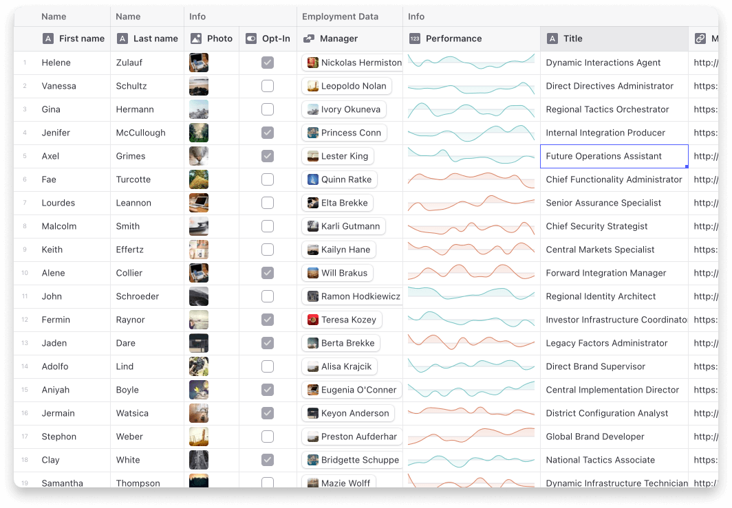
Current cells
- Star (Rating) Cell
- Sparklines
- Article
- Dropdown
- Range
- User profile
- Tags
Usage
Step 1: Add the extra cells to your grid.
import { useExtraCells } from "@glideapps/glide-data-grid-cells";

const Grid = () => {
    const { drawCell, provideEditor } = useExtraCells();

    return <DataEditor {...rest} drawCell={drawCell} provideEditor={provideEditor} />;
};
Step 2: Use the cells in your getCellContent callback
import type { StarCell } from "@glideapps/glide-data-grid-cells";

const getCellContent = React.useCallback(() => {
    const starCell: StarCell = {
        kind: GridCellKind.Custom,
        allowOverlay: true,
        copyData: "4 out of 5",
        data: {
            kind: "star-cell",
            label: "Test",
            rating: 4,
        },
    };

    return starCell;
}, []);
Note on ArticleCell
The ArticleCell uses @toast-ui/editor to provide its editor. To make sure it works correctly your project will need to import the css file it depends on.
import "@toast-ui/editor/dist/toastui-editor.css";