1.1.0 • Published 3 years ago
@wz-mobile/rn-gauge v1.1.0
🍩 React Native Beautiful Gauge ✨
Performant, customizable, beautiful jauge component based on skia engine 🚀

Preview
Installation
yarn add @wz-mobile/rn-gaugeGet Started
import { Gauge } from '@wz-mobile/rn-gauge';

<Gauge
  emptyColor="#C1C1C1"
  colors={['cyan', 'magenta', 'yellow', 'red', 'white']}
  sweepAngle={250}
  strokeWidth={10}
  fillProgress={60}
  renderLabel={Label}
  size={200}
  thickness={60}
/>;
Features
- Gradient Colors
- Sweep Angle resizeable
- Built on top of Skia
- Written in TypeScript
- Smooth Animated effect
- Use your own needle component
Props
| Name | Type | Default value | Description |
|---|---|---|---|
| strokeWidth | number | The external stroke width of the gauge | |
| thickness | number | 50 | Gauge thickness |
| colors (required) | string[] | Colors filling the gauge progress | |
| steps | number[] | Steps as string array to display steps on the gauge | |
| emptyColor (required) | string | Color to display the empty part of the gauge | |
| renderStep | (props: { getX: GetAxisValue; getY: GetAxisValue; step: number; index: number; radius: number; rotationAngle: number; }) => Element | Render step function | |
| fillProgress (required) | number | The progress value of the gauge. | |
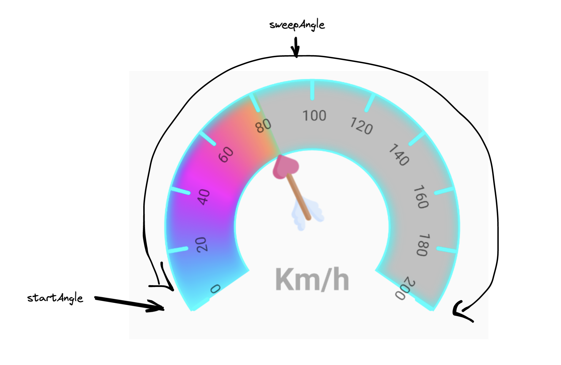
| sweepAngle (required) | number | 250 | Sweep angle of gauge, default is 250 ( how wide is the gauge ) |
| renderNeedle | (params: { getNeedleStyle: GetNeedleStyle; }) => ReactNode | Render prop for needle component, default is null | |
| renderLabel (required) | () => ReactNode | Method to render the label center of the gauge | |
| size (required) | number | Size given to the component | |
| canvasStyle | StyleProp<ViewStyle> | Custom Canvas style | |
| shadowProps | AnimatedProps<ShadowProps> | Shadow props if wanted, could provide nice shadow effects | |
| springConfig | SpringConfig | Spring config for fill progress animation | |
| showGaugeCenter | boolean | Show gauge center |
Use your own needle component
This sample shows you how to use a custom needle component, it's recommended to set showGaugeCenter to true to
fine tune the parameters passed to getNeedleStyle function.
const SimpleNeedle: GaugeProps['renderNeedle'] = ({ getNeedleStyle }) => (
  <>
    <Animated.View style={[getNeedleStyle(80, 80, 14.5, 0, -7.6)]}>
      <AnimatedImage
        style={{ width: 80, height: 80 }}
        resizeMode="contain"
        source={SimpleNeedleImage}
      />
    </Animated.View>
  </>
);
What is sweepAngle ?

Highly customizable
To Do
- RTL Support
Full Sample
You can check full sample in App.tsx located in the example folder for more details about implementation.
Contributing
See the contributing guide to learn how to contribute to the repository and the development workflow.
License
MIT
