@ziocampo/ngx-perfect-layout v0.18.2
NgxPerfectLayout
The perfect layout for your Angular app: responsiveness, eye candy and many other features.
Why?
Because in each project based on the Angular framework I was copy/pasting the wheel, changing small details every time. Elder projects would not benefit from the enhancements made in new ones. A general frustration arose.
Features
Developer friendly
Just import the module in your app.module.ts
import { NgxPerfectLayoutModule, NgxPerfectLayoutService } from '@ziocampo/ngx-perfect-layout';

imports: [
  NgxPerfectLayoutModule,
],
providers: [
    NgxPerfectLayoutService
]
Then use the component right in the app.component.html:
<ngx-perfect-main-layout>
    <ngx-perfect-page-header-left>
        header left zone
    </ngx-perfect-page-header-left>
    <ngx-perfect-page-header-right>
        header right zone
    </ngx-perfect-page-header-right>
    <ngx-perfect-page-content>
        <router-outlet></router-outlet>
    </ngx-perfect-page-content>
    <ngx-perfect-page-footer-left>
        footer left zone
    </ngx-perfect-page-footer-left>
    <ngx-perfect-page-footer-right>
        footer right zone
    </ngx-perfect-page-footer-right>
</ngx-perfect-main-layout>
For more details refer to the showcase project.
Service centerer for options
NgxPerfectLayout is centered around the NgxPerfectLayoutService. Any options you should want to set are there. In any component you can ask for the service by DI:
import { NgxPerfectLayoutService } from '@ziocampo/ngx-perfect-layout';

constructor(
  private _layoutService: NgxPerfectLayoutService
) { }
and then set some option as shown below.
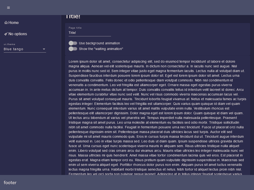
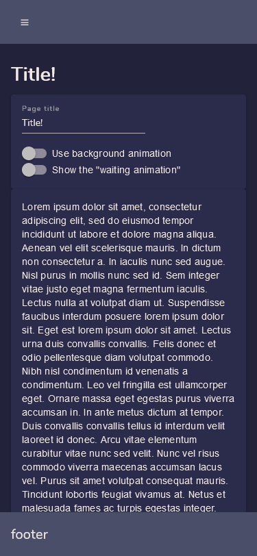
A decent layout, optimized for responsiveness
Layout automatically adapts to many resolutions, from large panels to small ones.
Snap points are the ones that come with the @angular/flex-layout package.
A nice "wait" animation
Just by toggling a bool option you can display a nice wait animation.
this._layoutService.showWaitingAnimation = true;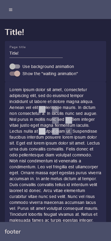
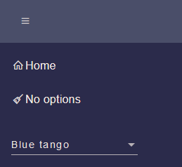
Support for your own themes or for the standard ones
NgxPerfectLayout supports standard Angular themes (Indigo Pink etc.) as well as custom ones you can craft manually or at Material Theme Generator
To provide a list of custom themes just import them as usual in your styles.scss and declare a list of Theme objects:
import { Theme } from '@ziocampo/ngx-perfect-layout';

public themes: Theme[] = [{
    displayName: "Blue tango",
    name: "blue-tango-theme"
}, {
    displayName: "Coffee",
    name: "coffee-theme"
}, {
    displayName: "Relax",
    name: "relax-theme"
}];
then assign it to the themes parameter:
this._layoutService.themes = themes;The themes will be displayed in a mat-select within the app drawer and applied upon the (selectionChange).
Menu from angular routes, the easy way
When you define your routes, just add a data element of type RouteData
import { RouteData } from '@ziocampo/ngx-perfect-layout';

export const routes: Routes = [
  {
    path: "",
    pathMatch: "full",
    redirectTo: "home"
  },
  {
    path: "home",
    component: HomePageComponent,
    data:{
      displayName: "Home",
      iconClass: "la-home"
    } as RouteData
  },
  {
    path: "no-options",
    component: NoOptionsPageComponent,
    data:{
      displayName: "No options",
      iconClass: "la-broom"
    } as RouteData
  }
];
then pass your routes to the routes parameter. Routes containing a RouteData element with a displayName will be shown as navigation.
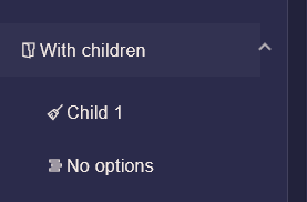
this._layoutService.routes = routes;If you want to have hierarchical menus (just one level) you can group menu items by adding a groupName:string property in the RouteData element:
  {
    path: "child1",
    component: NoOptionsPageComponent,
    data:{
      displayName: "Child 1",
      iconClass: "la-broom",
      groupName:"With children"
    }as RouteData
  },
  {
    path: "child2",
    component: NoOptionsPageComponent,
    data:{
      displayName: "No options",
      iconClass: "la-stream",
      groupName: "With children"
    }as RouteData
  },
Your hierarchical menu will be displayed as an expansion panel:
All the options
| Option | Meaning | Type | Default value |
|---|---|---|---|
| title | The title of the page. If provided the page will display an H1 tag with the title. | string | undefined |
| routes | A Routes object. | Routes | undefined |
| themes | An array of Theme objects. If provided there will be a select in the drawer to allow switching the theme. | Theme[] | [] |
| showWaitingAnimation | If set to true a nice wait animation will be shown. | boolean | false |
| useBackgroundAnimation | If set to true a nice animated background will be shown on the drawer. | boolean | false |
| loginMode | If set to true hides anything not compatible with a login page, e.g.: drawer. | boolean | false |
| hamburgerMenuButtonPosition | Position of the drawer and drawer toggle. | "left", "right" | "left" |
| menuMinWidth | Minimum width of the menu, can be any CSS unit. | string | "260px" |