accessible-date-picker v3.7.6
Accessible Date Picker
Accessible Date Picker is a component designed for React.js. Why yet another date picker? It is very difficult to find a date picker that is accessible, has an inclusive design and is easy to use by everyone. We at Axess Lab decided to build one and open source it so that others could benefit from it.

Getting Started
With an application built using the create-react-app script the easiest way to include Accessible Date Picker is to import it in to the file you will be using it in:
import DatePicker from "accessible-date-picker/dist/accessible-datepicker";
Then the component can be used as such:
< DatePicker value={value} setValue={setValue} dateFormat="YYYY/MM/DD" validation={true}/>
Properties
| Attribute Name | Mandatory | Value | Description |
|---|---|---|---|
| applicationMode | no | boolean | The Accessible Date Picker comes with two modes for the screen readers. By default the picker has applicationMode={false}, which means traditional HTML interpretion techniques will be used. But if you want to support desktop-live web like applications passing down the following attribute will make the date picker behave as such. |
| validation | yes | boolean | Set to true if you want to make use of the validation check to find errors in entered months, dates or in the number of entered characters. |
| dateFormat | yes | "YYYY/MM/DD" "DD-MM-YYYY" "MM.DD.YYYY" "DD/MM/YY" | Enter any string format and separator you wish to use in your input element such as the examples on the left. Please note that /YY formatted years will only work as years in the 2000s. |
| theme | no | {customTheme} | You can either use the built in datepicker theme or you can pass in your own custom theme as an object. const customTheme = { palette: { primary: "red", secondary: "blue", tertiary: "green" }, spacing: "0px", "4px", "8px", "16px", "32px", "64px"], }); |
| value | yes | {value} | To get started you can define a state for value and setValue and pass it down to the component or pass a value you have created as a prop. Exp: const value, setValue = useState(''); |
| setValue | yes | {setValue} | To get started you can define a state for value and setValue and pass it down to the component or pass a value you have created as a prop. Exp: const value, setValue = useState(''); |
You can also find an example usage in the the /demo folder.
Features
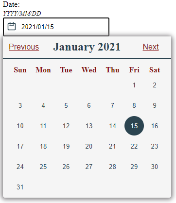
The Aria labels will read out each date of the month and will adjust labels according to selection. The icon is screen reader friendly. It will let the user know whether the calendar is open or not and the screen reader will read an error if it occurs.
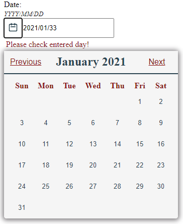
The date picker has a basic validation check for entered dates. It can point out errors in overflow, date and month.

How to install
You can install the date picker as a npm package by running the following command in your project:
npm i accessible-date-picker
How to contribute
We are always open to contributions and improvements. If you find bugs or know of ways of improving our date picker by extra props, styles, screen reader issues help us out by: 1. Forking the Accessible Date Pickers repository on github 2. Clone the repository by running git clone https://github.com/AxessLab/accessible-date-picker.git 3. Once cloned, open the directory and run npm install. 4. Change the webpack entry point to: ./demo/index.tsx and output to output: { path: path.resolve(__dirname, "build"), filename: "bundle.js", }, 4. Run npm start to get the development server up and running. Make your changes in the code. 5. When you're happy, push the code and make a pull request - we will look at it as soon as possible.
Testing and building
- To run the unit test run npm test.