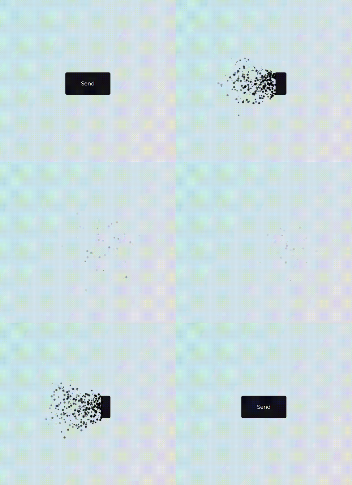
angular-particle-effect-button v0.0.50
angular-particle-effect-button (demo)
Superb particle effect buttons for Angular.
This is a Angular directive used as port of an awesome Codrops Article by Luis Manuel (original source).
Install
npm i --save angular-particle-effect-buttonUsage
Check out the Demo to see it in action.
import { BrowserModule } from "@angular/platform-browser";
import { NgModule } from "@angular/core";
import { ParticleEffectButtonModule } from "angular-particle-effect-button";
import { AppComponent } from "./app.component";

@NgModule({
  declarations: [AppComponent],
  imports: [BrowserModule, ParticleEffectButtonModule],
  providers: [],
  bootstrap: [AppComponent]
})
export class AppModule {}
<button libParticleEffectButton [pHidden]="hidden" (click)="hidden=!hidden">Hide me</button>Note that libParticleEffectButton can be added to anything from a simple <button> to a complex Angular subtree. The element for which you'll add libParticleEffectButton
will be wrapped into a tree like that:
<div style="position: relative; display: inline-block;">
  <div style="position: relative; display: inline-block; overflow: hidden;">
    <button libparticleeffectbutton="">Hide me</button>
  </div>
  <canvas style="position: absolute; pointer-events: none; top: 50%; left: 50%; transform: translate3d(-50%, -50%, 0px); display: none;">
  </canvas>
</div>
Changing the hidden boolean property will trigger an animation, typically as a result of a click on the button's contents.
If hidden changes to true, the button will perform a disintegrating animation. If hidden changes to false, it will reverse and reintegrate the original content.
Props
| Property | Type | Default | Description | |
|---|---|---|---|---|
pHidden | boolean | false | Whether button should be hidden or visible. Changing this property starts an animation. | |
pColor | string | '#000' | Particle color. Should match the button content's background color | |
pDuration | number | 1000 | Animation duration in milliseconds. | |
pEasing | string | 'easeInOutCubic' | Animation easing. | |
pType | string | circle | 'circle' or 'rectangle' or 'triangle' | |
pStyle | string | fill | 'fill' or 'stroke' | |
pDirection | string | 'left' | 'left' or 'right' or 'top' or 'bottom' | |
pCanvasPadding | number | 150 | Amount of extra padding to add to the canvas since the animation will overflow the content's bounds | |
pSize | number | func | random(4) | Particle size. May be a static number or a function which returns numbers. |
pSpeed | number | func | random(2) | Particle speed. May be a static number or a function which returns numbers. |
pParticlesAmountCoefficient | number | 3 | Increases or decreases the relative number of particles | |
pOoscillationCoefficient | number | 30 | Increases or decreases the relative curvature of particles | |
pBegin | EventEmitter | EventEmitter | Callback to get notified when the animation starts. | |
pComplete | EventEmitter | EventEmitter | Callback to get notified when the animation completes. |
I've tried to keep the properties and behavior exactly the same as in the original codrops version.
Related
- anime.js - Underlying animation engine.
- ParticleEffectsButtons - Original source this library is based on.
- Codrops Article - Original article this library is based on.
Development
This module was bootstrapped with angular-cli so it's using the common build/test/lint commands from angular-cli.
Library
- Build: ng build angular-particle-effect-button
- Test: ng test angular-particle-effect-button
- Lint: ng lint angular-particle-effect-button
Project
- See it in action: ng serve
License
MIT © danielpdev
