angular-widget-grid v0.3.0
angular-widget-grid 
A flexible grid layout for responsive dashboards.
Demo: http://patbuergin.github.io/angular-widget-grid/
Installation
Install with Bower / npm, or simply download the files from the root folder:
$ bower install angular-widget-grid
$ npm install angular-widget-grid
Add <script> and <link> tags to your index.html:
<link rel="stylesheet" href="[...]/angular-widget-grid.css">
<script src="[...]/angular-widget-grid.min.js"></script>
Add the angular-widget-grid module as a dependency to your application module:
angular.module('myApp', ['widgetGrid']);Usage
Minimal Example
<wg-grid columns="20" rows="15" style="width: 400px; height: 300px;">
  <wg-widget position="{ top: 2, left: 4, height: 6, width: 8 }">
    <div style="background-color: rgb(140, 198, 0);"></div>
  </wg-widget>
</wg-grid>
When no valid widget position is provided, the module searches for a suitable one and updates the respective scope variable, if any.
Adding Traits
Widgets
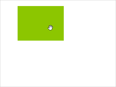
wg-movable
<wg-widget wg-movable editable="true" position="...">If editable is true, users will be able to move the respective widget.
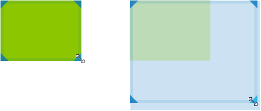
wg-resizable
<wg-widget wg-resizable editable="true" position="...">If editable is true, users will be able to resize the respective widget.
Optionally, you can limit the resize directions:
<wg-widget wg-resizable="{ directions: ['NW', 'NE', 'E', 'SW'] }" ...>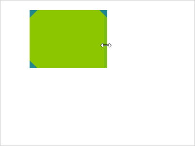
Grid: Options
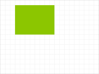
showGrid (default: false)
<wg-grid columns="20" rows="15" options="{ showGrid: true }">Toggles the gridlines.
highlightNextPosition (default: false)
<wg-grid columns="20" rows="15" options="{ highlightNextPosition: true, showGrid: true }">Highlights the largest free area in the grid, if any. This area will be automatically assigned to the next widget with a falsy or conflicting position.
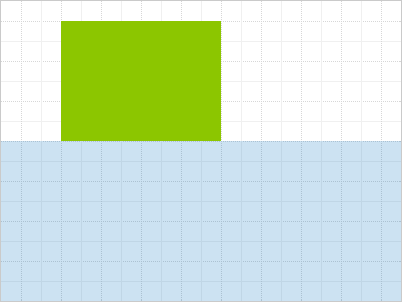
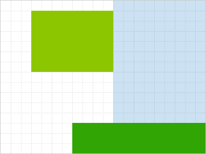
clickThrough (default: false)
<wg-grid columns="20" rows="15" options="{ clickThrough: true }">Passes the mouse down event to the underlying element, when the widget wasn't dragged. This enables the possibility to both have the widget moveable and be able to click or select elements within the widget content.
Events
wg-grid-full & wg-grid-space-available
The grid emits wg-grid-full and wg-grid-space-available in the respective situations, so that you can e.g. enable/disable UI elements accordingly.
$scope.$on('wg-grid-full', function () {
  // e.g. disable something
});
wg-update-position
Emitted whenever the position of a widget is changed. The event comes with an attached object argument, which contains the affected widget's index and its newPosition.
Build
Check out /src for the original source code.
You can build and test the project by executing the following commands after cloning the repository:
$ npm install -g bower grunt grunt-cli

$ npm install
$ bower install
$ grunt serve