astro-carousel
astro-carousel
An accessible carousel component for Astro that works by using browser navigation.
Demo with code: https://stackblitz.com/edit/astro-carousel-demo?file=src%2Fcomponents%2FWelcome.astro
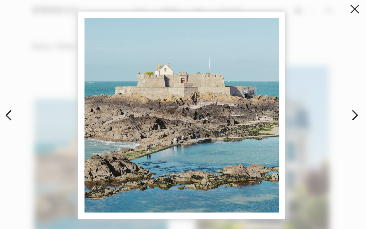
Live example: https://kuraunaito.com/photos/saint-malo/?image=0
Installation
npm install astro-carouselAlso, sass needs to be installed a dev dependency:
npm install --save-dev sassUsage
Import astro-carousel to your Astro component
---
import { Carousel } from 'astro-carousel';
---
...
To open the carousel from a list of images, you need to use id="carouselTargetList" in the parent element and data-carousel-index={index} in the anchor tag of children elements. You also need to set the href of the anchor tag to href={`${path}?image=${index}`}.
<ul id="carouselTargetList">
  {images.map((img, index) => {
    return (
      <li>
        <a
          href={`/?image=${index}`}
          data-carousel-index={index}
        >
          <img
            src={img.src}
            alt=""
          />
        </a>
      </li>
    );
  })}
</ul>
After importing the Carousel component in your Astro component, you just need to create a list of images and pass it to the prop images.
---
import Carousel from 'astro-carousel';
const images: ComponentProps<typeof Carousel>["images"] = [
  {
    src: "https://a.storyblok.com/f/95455/1350x1080/3ef7748922/p5240368.jpg",
    alt: "",
    format: "webp",
    width: 1350,
    height: 1080,
    widths: [450, 675, 1350],
  }
];
---

<Carousel images={images} />
The color of the buttons can be customized by passing the desired color in a CSS color valid format to the prop color.
<Carousel
  images={images}
  color="hsl(239, 90%, 65%)"
/>