1.0.2 • Published 5 years ago
auth-input v1.0.2
Auth Input

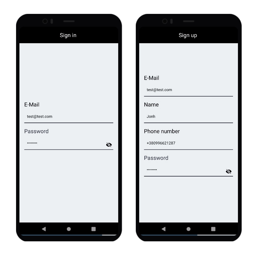
Auth Input is a React Native custom component, providing fields for entering name, password, phone number and email.
Installation
Install the package with NPM.
npm i auth-inputUsage
Usage is very simple. Just add the component to your file.
import React, {useState} from 'react';
import { Text, View } from 'react-native';
import AuthInput from 'auth-input'

export default function App() {
    const [email, setEmail] = useState('')
    const [password, setPassword] = useState('')

    const emailHandler = (text) => {
        setEmail(text)
    }
    const passwordHandler = (text) => {
        setPassword(text)
    }


  return (
                        <AuthInput
                            type="email"
                            label="E-Mail"
                            keyboardType="email-address"
                            minLength={5}
                            maxLength={35}
                            autoCapitalize="none"
                            errorText="Please, use a valid e-mail."
                            onInputChange={emailHandler}
                            value={email}
                        />

                        <AuthInput
                            type="password"
                            label="Password"
                            keyboardType="default"
                            minLength={5}
                            maxLength={15}
                            autoCapitalize="none"
                            errorText="Please, use a valid password."
                            onInputChange={passwordHandler}
                            value={password}
                        />
    </View>
  );
}
Properties
| Prop | Type | Description | Default | Optional |
|---|---|---|---|---|
| type | string | Type of input ("email", "phone", "name" or "password") | - | no |
| label | string | Text above the input | - | no |
| keyboardType | string | Default Ract Native TextInput keyboard types | default | yes |
| minLength | number | lower bound of text length | - | yes |
| maxLength | number | Upper limit of text length | - | yes |
| errorText | string | Text that appears when the user has entered incorrect data | - | no |
| onInputChange | function | Input handler function | - | no |
| value | string | Input state | - | no |
| borderColor | string | Bottom border color | black | yes |
| errorTextColor | string | Error color | red | yes |
| textColor | string | Text color | black | yes |
| labelColor | string | Label above the input color | textColor | yes |
| labelColor | number | Label above the input font size | 20 | yes |
You can use properties of TextInput.
Contributing
Pull requests are welcome. For major changes, please open an issue first to discuss what you would like to change.
Please make sure to update tests as appropriate.