1.0.9 • Published 12 months ago
ben-modal-component v1.0.9
Modal Component by BenjGit
This is a modal component for react.
Getting Started
Install this package:
npm add ben-modal-componentImport the Modal component:
import { Modal } from "ben-modal-component";You can then render the Modal as follow:
<Modal
        isOpen={showSuccessModal}
        onClose={handleCloseSuccessModal}
>
    Employee Created // you can put div span or whatever you want inside it
</Modal>
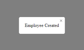
The modal will look like this :

By default the modal take the width and height depending of the content inside it (width:auto and height:auto by default). But you can change style if you want :
The following default styles applied to the modal component can be changed :
width, height, borderRadius, backgroundColor, padding
<Modal
        isOpen={showSuccessModal}
        onClose={handleCloseSuccessModal}
        width='200px'
        height='200px'
        borderRadius='5px'
        backgroundColor='#000'
        padding='20px'
>
    Employee Created
</Modal>