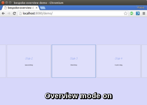
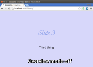
bespoke-simple-overview v1.1.1
bespoke-simple-overview
Displays an overview version of a bespoke presentation when Esc (configurable)
is pressed.


Download
Download the production version or the development version, or use a package manager.
Usage
This plugin is shipped in a UMD format, meaning that it is available as a CommonJS/AMD module or browser global.
For example, when using CommonJS modules:
var bespoke = require('bespoke'),
  overview = require('bespoke-simple-overview');

bespoke.from('#presentation', [
  overview()
]);
When using browser globals:
bespoke.from('#presentation', [
  bespoke.plugins.overview()
]);
There are a few options that can be used to configure the plugin:
bespoke.from('#presentation', [
  overview({
    activationKey: 'c',   // Defaults to ESC (which: 27)
    insertStyles: false   // Defaults to true
  })
]);
By default, bespoke-simple-overview uses the Esc key to activate/deactivate the
overview mode, but it can be changed using the option activationKey.
The plugin works by simply toggling a .bespoke-simple-overview class on the deck.parent element. The option insertStyles (default: true) is used to ask the plugin to inject some CSS rules that use .bespoke-simple-overview to style the deck when the presentation enters overview mode (see lib/bespoke-simple-overview.css). When set to false, you are free to provide the styling the way you want for the presentation.
Peer Dependencies
This plugin needs to have bespoke-classes so the deck slides get all the state classes (e.g., .bespoke-before, bespoke-after etc.).
Load Order of Plugins
If your presentation uses the bespoke-bullets plugin, the bespoke-simple-overview plugin needs to be loaded before it, like this:
window.deck = bespoke.from('article', [
  bespoke.themes.fancy(),
  bespoke.plugins.keys(),
  bespoke.plugins.classes(),
  bespoke.plugins.simpleOverview(),
  bespoke.plugins.bullets()
]);
The reason for this is that when in overview mode, this plugin needs to
suppress the "sub steps" imposed by bespoke-bullets so that navigating to
the next/previous slides effectively changes the active slide, even when
more bullets would still be revealed.
Default Styling
The plugin simply adds/removes a .bespoke-simple-overview class on the
deck.parent element when the activationKey is pressed.
By default, it adds some CSS rules based on that class. To see which CSS
rules are added by default, see the file lib/bespoke-simple-overview.css.
They basically add a rule to the .bespoke-slide class with:
.bespoke-simple-overview .bespoke-slide {
  transform: translated3d(x, 0, -2000px)
}
...so that the slides go further from the "camera" and become smaller. The "x"
varies for each slide so that the ones with class .bespoke-before appear to
the left and the ones with .bespoke-after to the right, accordingly.
Tipically, about 5 .bespoke-slides are shown:
- The current one:
.bespoke-slide.bespoke-active - Two before:
.bespoke-slide.bespoke-before - Two after:
.bespoke-slide.bespoke-after
Events
There are 3 events exposed by this plugin:
simple-overview.enable: Goes into overview modesimple-overview.disable: Leaves to regular modesimple-overview.toggle: Toggles between regular/overview mode
To trigger such event:
deck.fire('simple-overview.disable');Package managers
npm
$ npm install bespoke-simple-overviewBower
$ bower install bespoke-simple-overviewCredits
This plugin was built with generator-bespokeplugin.
