1.0.5 • Published 7 years ago
bootstrap-react-numeric-up-down v1.0.5
bootstrap-react-numeric-up-down

Installation
npm install bootstrap-react-numeric-up-down @fortawesome/fontawesome-svg-core @fortawesome/free-solid-svg-icons @fortawesome/react-fontawesome(Because I couldn't figure out how to get optional dependencies to play nice with rollup and next.js client-side, unfortunately the @fortawesome packages are requirements (peer dependencies). I'd be more than happy to incorporate a PR if someone wants to figure it out for me.)
Usage
import NumericUpDown from 'bootstrap-react-numeric-up-down';

export default function MyComponent({value, min, max, step, ...otherProps}) {
    return (
        <NumericUpDown value={value} min={min} max={max} step={step} {...otherProps} />
    );
};
Properties
| name | type | default | description |
|---|---|---|---|
| allowManualInputWithNaNBounds | boolean? | false | By default, if the min is greater than the max, the <input> is disabled. If set, it will not be disabled. (Your mileage may vary.) |
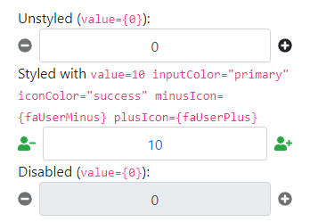
| iconColor | (string|{minus: string, plus: string})? | undefined | The bootstrap theme for coloring the button icons. |
| inputAlign | 'left' | 'center' | 'right' | 'center' | The text-alignment of the <input>. |
| inputColor | string? | undefined | The bootstrap theme for coloring the <input>. |
| disabled | bool? | false | The disabled property assigned to the <input>. If set, also disables the plus and minus buttons. |
| max | (number|string)? | Infinity | The max value applied to the <input>. |
| min | (number|string)? | -Infinity | The min value applied to the <input>. |
| minusIcon | (string|element|object)? | faMinusCircle | The text or icon to use for the minus button. |
| onChange | function? | undefined | The callback called when the value of the <input> changes. |
| plusIcon | (string|element|object)? | faPlusCircle | The text or icon to use for the plus button. |
| step | (number|string)? | 1 | The step value applied to the <input>. |
| value | (number|string)? | undefined | The value property applied the <input>. |
For the plusIcon and minusIcon properties, if an object is specified, it must match the IconDefinition shape
defined by @fortawesome:
interface IconDefinition extends IconLookup {
  icon: [
    number, // width
    number, // height
    string[], // ligatures
    string, // unicode
    string // svgPathData
  ];
}

interface IconLookup {
  prefix: IconPrefix;
  iconName: IconName;
}
Sorry I don't have time to add better explanations for the functionality.