1.0.10 • Published 5 years ago
button-animation v1.0.10
learn from CodingLab
【按钮波纹动画在 HTML CSS 和 JavaScript-哔哩哔哩】https://b23.tv/PheNse
演示效果
1.按钮点击产生波纹
2.按钮悬浮开始变色
install
npm i -s button-animation1.buttonAnimation
import
import { buttonAnimation } from "button-animation";绑定点击事件,需要传入 event
  clickBtn(e) {
      buttonAnimation(e);
    },
波纹颜色默认为#333,接收第二个参数修改波纹颜色
clickBtn(e) {
      buttonAnimation(e, 'red')
      //buttonAnimation(e,'#4e94fd');
      //buttonAnimation(e,'linear-gradient(90deg, #025ce3, #4e94fd)');
    },
示例 demo
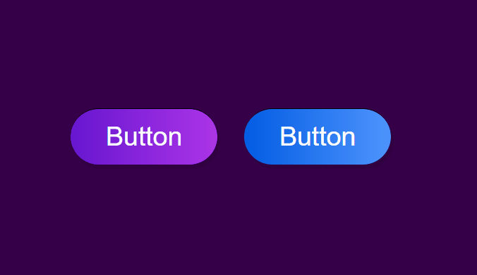
<template>
  <article class="buttons">
    <button @click="clickBtn">Button</button>
    <button @click="clickBtn">Button</button>
  </article>
</template>

<script>
import { buttonAnimation } from "button-animation";
export default {
  methods: {
    clickBtn(e) {
      buttonAnimation(e);
    },
  },
};
</script>

<style>
* {
  margin: 0;
  padding: 0;
  box-sizing: border-box;
}
body {
  margin: 0;
  background-color: #350048;
  display: flex;
  justify-content: center;
  align-items: center;
  height: 100vh;
}
button {
  border: none;
  outline: none;
  color: #fff;
  border-radius: 45px;
  margin: 0 15px;
  padding: 14px 40px;
  font-size: 30px;
  font-weight: 400;
  background: linear-gradient(90deg, #6616d0, #ac34e7);
  box-shadow: 3px 5px rgba(0, 0, 0, 0.1);
  border-top: 1px solid rgba(0, 0, 0, 1);
}
button:nth-child(2) {
  background: linear-gradient(90deg, #025ce3, #4e94fd);
}
</style>
注意
button 的 css 会被设置为 position:relative;overflow:hidden;
2.buttonHover
import
import { buttonHover } from "button-animation";mounted 生命周期中注册,接收三个参数,第一个为 button 类名,第二个为动画颜色,第三个为动画方向
  mounted () {
        buttonHover('button', '#ff7242', 'left')
        buttonHover('button1', '#ff7242', 'center')
        buttonHover('button2', '#ff7242', 'right')
    },
示例 demo
<template>
  <article class="buttons">
    <button class="button">Button</button>
    <button class="button1">Button</button>
    <button class="button2">Button</button>
  </article>
</template>

<script>
import { buttonHover } from "button-animation";
export default {
  mounted() {
    buttonHover("button", "#ff7242", "left");
    buttonHover("button1", "#ff7242", "center");
    buttonHover("button2", "#ff7242", "right");
  },
};
</script>

<style>
* {
  margin: 0;
  padding: 0;
  box-sizing: border-box;
}
body {
  margin: 0;
  background-color: #350048;
  display: flex;
  justify-content: center;
  align-items: center;
  height: 100vh;
}
button {
  border: none;
  outline: none;
  color: #fff;
  border-radius: 45px;
  margin: 0 15px;
  padding: 14px 40px;
  font-size: 30px;
  font-weight: 400;
  background: linear-gradient(90deg, #6616d0, #ac34e7);
  box-shadow: 3px 5px rgba(0, 0, 0, 0.1);
  border-top: 1px solid rgba(0, 0, 0, 1);
}
button:nth-child(2) {
  background: linear-gradient(90deg, #025ce3, #4e94fd);
}
</style>
注意
button 的 css 会被设置为 position:relative;overflow:hidden;