1.0.2 • Published 2 years ago
button-confirm-tk v1.0.2
button-confirm-tk
Description
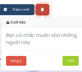
The ButtonConfirm component is a React component designed to provide a customizable confirmation popover for user interactions. It offers a convenient way to prompt users for confirmation before executing a critical action, such as deleting an item or submitting a form.
Key Features:
- Customizable Content: Users can define the body text, header text, and button labels to tailor the confirmation popover to their specific use case.
- Flexible Trigger Button: The component accepts any JSX element as the trigger button, allowing developers to integrate the confirmation functionality seamlessly into their application's UI.
- Event Handling: Developers can specify callback functions to be executed upon confirmation or cancellation, enabling them to perform appropriate actions based on user input.
- Z-index Control: The component provides control over the z-index of the popover, ensuring proper layering with other UI elements.
Installation
You can install ButtonConfirm via npm:
npm install button-confirm-tkor
yarn add button-confirm-tk
Usage
import React from 'react';
import ButtonConfirm from 'button-confirm-tk';

const MyComponent = () => {
  return (
    <div>
      <ButtonConfirm
        onConfirm={() => {
          // handle confirmation
        }}
        onClose={() => {
          // handle close
        }}
        body="Are you sure you want to proceed?"
        btnContent={<button>Open Confirmation</button>}
        btnClass="my-button-class"
        header="Confirmation"
        zIndex={1000}
        okeTxt="OK"
        closeTxt="Cancel"
      />
    </div>
  );
};

export default MyComponent;
Props
| Name | Type | Description |
|---|---|---|
| onConfirm | Function | Function to execute when the confirm button is clicked. |
| onClose | Function | Function to execute when the close button is clicked. |
| body | string | Body text of the confirmation popover. |
| btnContent | JSX.Element | JSX element for the button that triggers the confirmation popover. |
| btnClass | string | CSS class for the trigger button. |
| header | string | Header text of the confirmation popover. |
| zIndex | number | Z-index of the popover. |
| okeTxt | string | Text for the confirm button. |
| closeTxt | string | Text for the close button. |
Version
1.0.0
Author
tk0038
License
ISC