0.2.1 • Published 5 years ago
chakra-layout-components v0.2.1
chakra-ui Layout Helper Components
This project simplify uses horizontal, grid,vertical and space for Chakra UI.
Props
These props are applicable to both Horizontal and Vertical components.
| Prop | Type |
|---|---|
| wrap | boolean |
| spaceBetween | boolean |
| spaceAround | boolean |
| justifyEnd | boolean |
| justifyStart | boolean |
| flex | number |
| spaceFirst | number |
| spacing | number |
| spaceBottom | boolean |
| alignStart | boolean |
| alignItemsStart | boolean |
| center | boolean |
| centerV | boolean |
| centerH | boolean |
| noShrink | boolean |
| styles | CSSProperties |
| invert | boolean |
| reverse | boolean |
| fullW | boolean |
| fullH | boolean |
| debug | boolean |
In addition to this, the components also support Chakra UI's style props.
Example
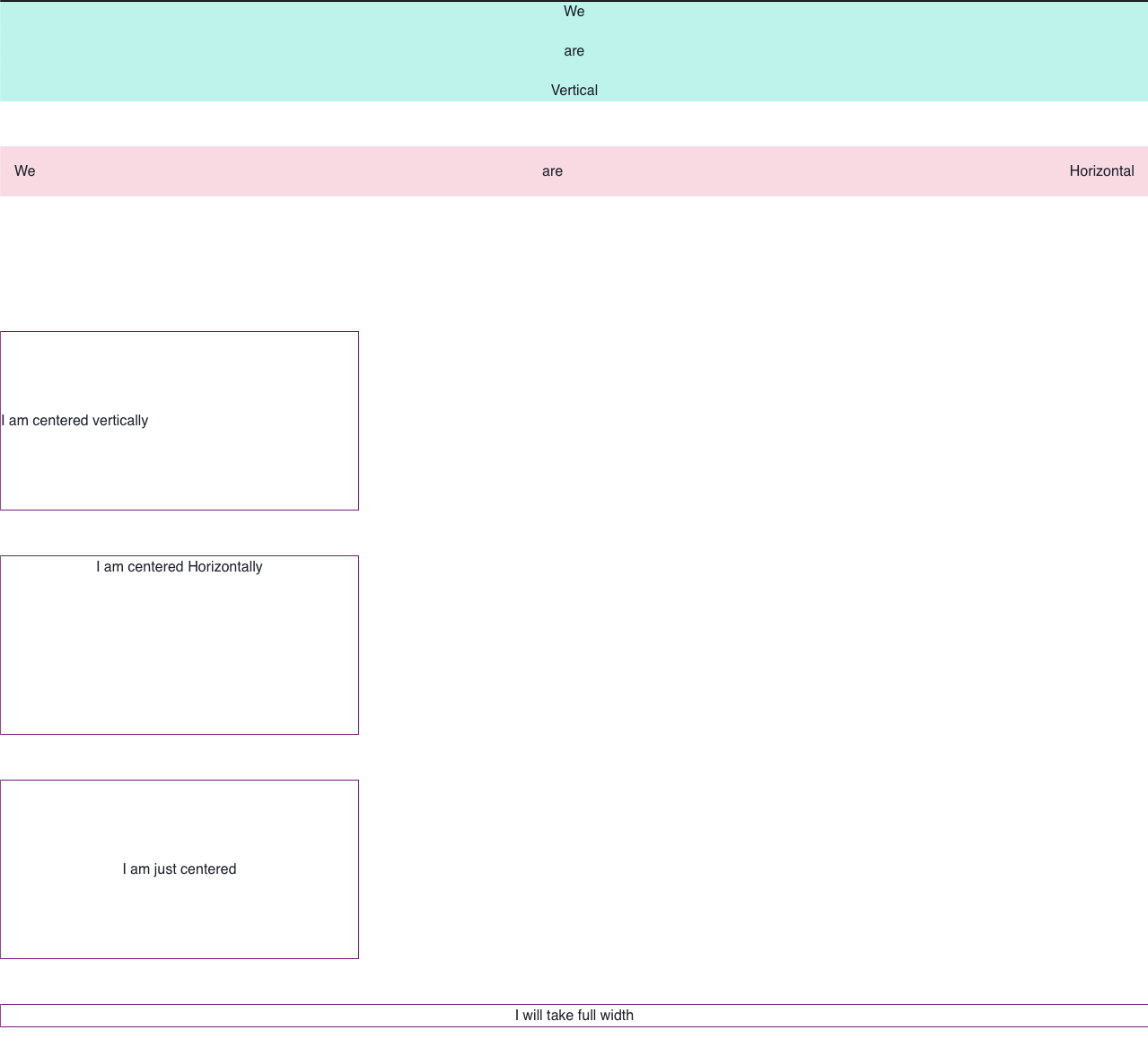
const App = () => {
  return (
    <L.Vertical spacing={50}>
      <L.Vertical spacing={20} bg="teal.100">
        <Text> We </Text>
        <Text> are </Text>
        <Text> Vertical </Text>
      </L.Vertical>

      <L.Horizontal spaceBetween bg="pink.100" p={4}>
        <Text> We </Text>
        <Text> are </Text>
        <Text> Horizontal </Text>
      </L.Horizontal>

      <L.Space size={50} />

      <L.Horizontal centerV h={200} w={400} debug>
        <Text> I am centered vertically </Text>
      </L.Horizontal>

      <L.Horizontal centerH h={200} w={400} debug>
        <Text> I am centered Horizontally </Text>
      </L.Horizontal>

      <L.Horizontal center h={200} w={400} debug>
        <Text> I am just centered </Text>
      </L.Horizontal>

      <L.Vertical fullW debug>
        <Text> I will take full width </Text>
      </L.Vertical>
    </L.Vertical>
  );
};
Produces:

Install
yarn install && yarn watchUsage
cd examples && yarn startSee it in browser at http://localhost:1234
Run tests
yarn run test🤝 Contributing
Contributions, issues and feature requests are welcome!Feel free to check issues page.
Show your support
Give a ⭐️ if this project helped you!
Contributors ✨
Thanks goes to these wonderful people (emoji key):
This project follows the all-contributors specification. Contributions of any kind welcome!
