chakra-react-select v6.0.1
chakra-react-select v6
This component is a wrapper for the popular react component React Select made using the UI library Chakra UI.
This version of Chakra React Select is updated for Chakra UI v3 which works exclusively with React version 18 or above. Chakra React Select v5, which is compatible with Chakra UI v2, will be maintained for the foreseeable future. If you're still using Chakra UI v2 check the docs for chakra-react-select v5 here.
| Light Mode | Dark Mode |
|---|---|
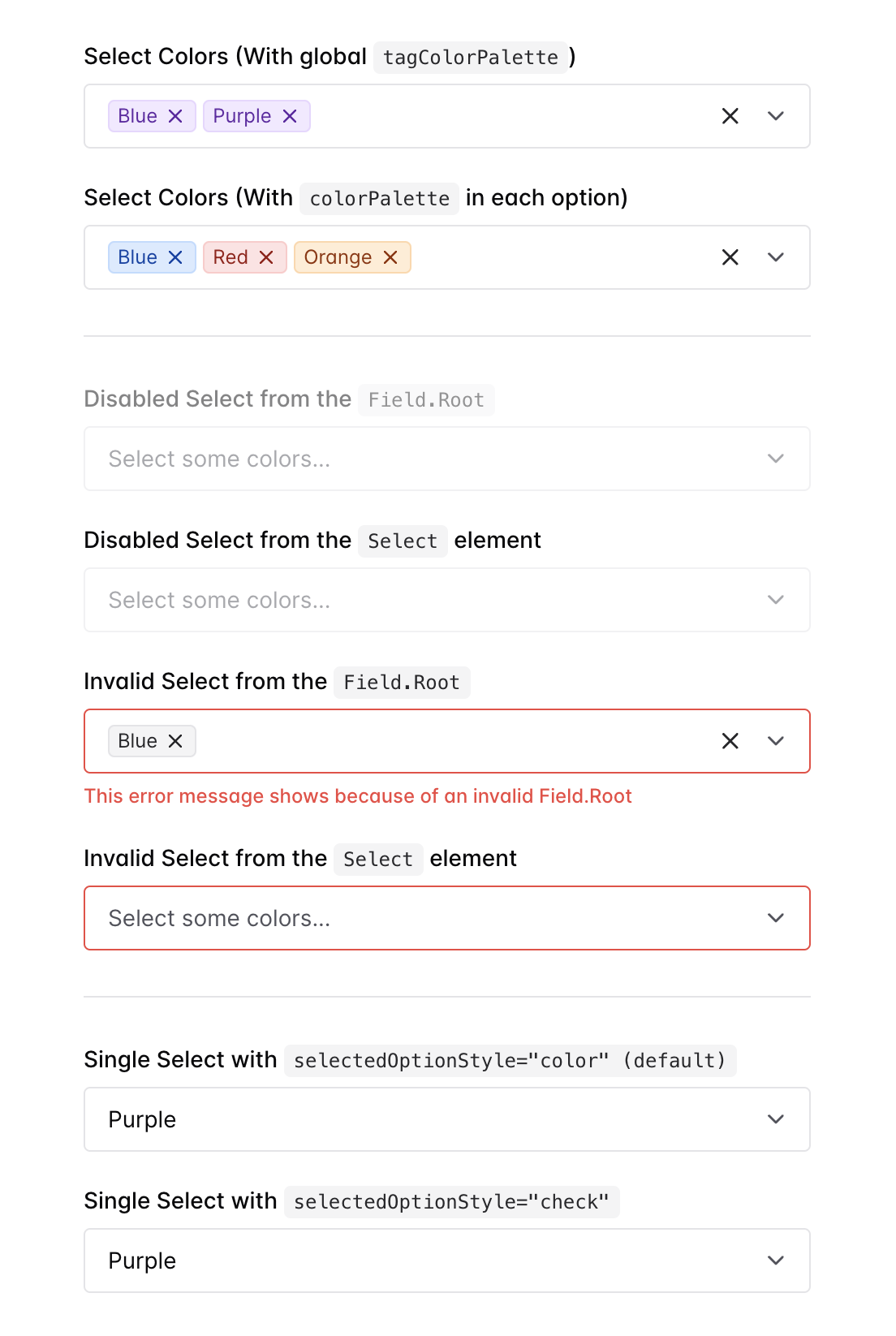 | 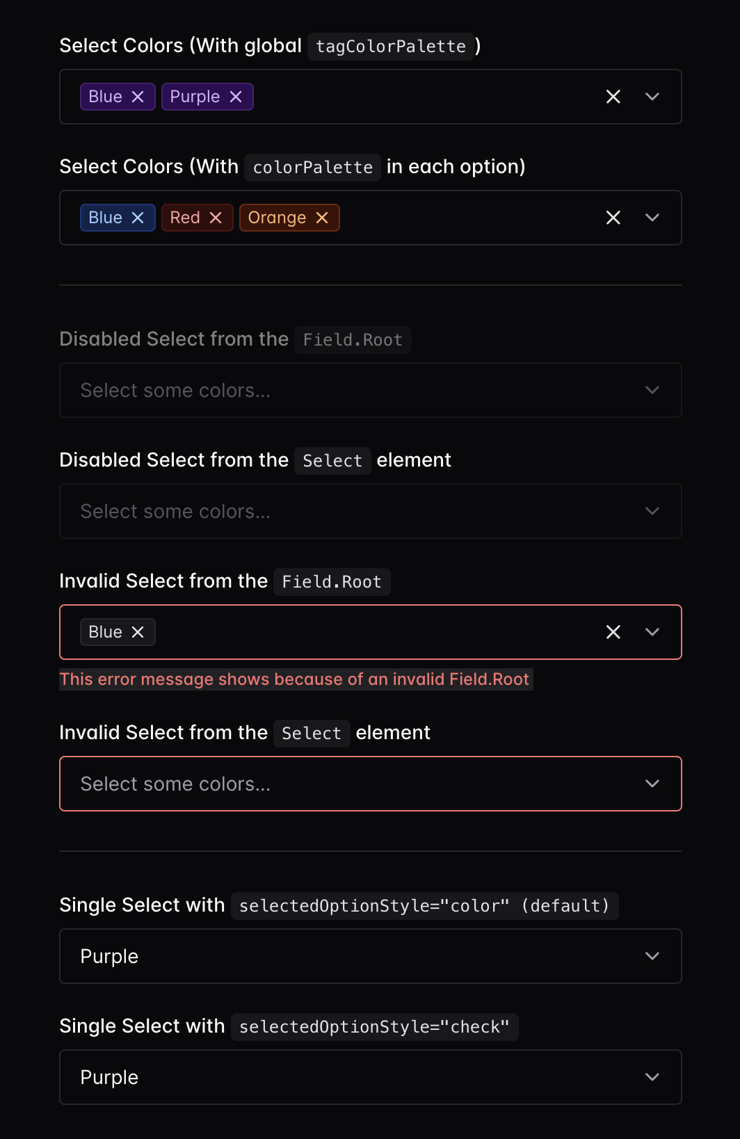 |
Check out the demo here:
Before leaving an issue on this project, remember that this is just a wrapper for
react-select, not a standalone package. A large percentage of the questions people have end up being about howreact-selectitself works, so please read through their documentation to familiarize yourself with it! https://react-select.com/home
Contents
- Usage
- Extra Props
- Styling
- TypeScript Support
- Customizing Components
useChakraSelectProps- Usage with React Form Libraries
- Templates
Usage
To use this package, you'll need to have @chakra-ui/react@3 set up
like in the guide in their docs.
npm i @chakra-ui/react @emotion/react
# ...or...
yarn add @chakra-ui/react @emotion/react
After Chakra UI is set up, install this package from NPM:
npm i chakra-react-select
# ...or...
yarn add chakra-react-select
Once installed, you can import the base select package, the async select, the creatable select or the async creatable select like so:
import {
  AsyncCreatableSelect,
  AsyncSelect,
  CreatableSelect,
  Select,
} from "chakra-react-select";
// ...or...
const {
  AsyncCreatableSelect,
  AsyncSelect,
  CreatableSelect,
  Select,
} = require("chakra-react-select");
All exports, including types, from the original react-select package are also
exported from this package, so you can import any of them if you need them. The
only exception is the root Select components.
Implementing this component in your application should be almost identical to
how you'd normally use react-select. It will
accept all of the props that the original package does, with a few additions and
exceptions listed below. So if you have a question on basic usage, your best bet
is to check the original docs or google "How to (some functionality) with
react-select" and just swap out react-select with chakra-react-select in
your code.
Extra Props
All of the props from the original react-select package are also available in
this package, with a few exceptions. There are also some extra props that have
been added to make this component behave/appear more like the built-in Chakra UI
components.
There are examples of all of the extra props below included in the demo here.
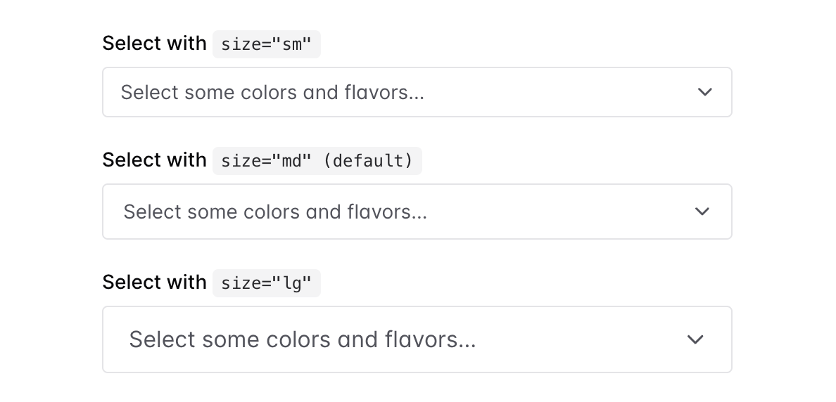
size — Options: ResponsiveValue<"sm" | "md" | "lg"> — Default: md
You can pass the size prop with either sm, md, or lg. These will reflect
the sizes available on the
Chakra <Input /> component
(except for xs because it's too small to work). Alternatively, you can pass a
responsive style array or object
of size values to allow it to change depending on your theme's breakpoints.
If no size is passed, it will default to defaultVariants.size from the theme
for Chakra's Select component. If your component theme for Select is not
modified, it will be md.
return (
  <>
    <Select size="sm" />
    <Select size="md" /> {/* Default */}
    <Select size="lg" />
  </>
);
tagColorPalette
You can pass the tagColorPalette prop to the select component to change all of
the selected options tags' colors. You can view the whole list of available
color palettes in
the Chakra docs, or if you have
a custom color palette, any of the custom color names in that will be available
instead.
Alternatively, you can add the colorPalette key to any of your options objects
and it will only style that option when selected.
return (
  <Select
    {/* The global tag color palette */}
    tagColorPalette="purple"
    options={[
      {
        label: "I am red",
        value: "i-am-red",
        colorPalette: "red", // The option color palette overrides the global
      },
      {
        label: "I fallback to purple",
        value: "i-am-purple",
      },
    ]}
  />
);
tagVariant — Options: subtle | solid | outline — Default: subtle
You can pass the tagVariant prop with either subtle, solid, or outline
(default is subtle). These will reflect the variant prop available on the
Chakra <Tag /> component.
Alternatively, if you have added any custom variants to your theme, you can use
those instead.
Alternatively, you can add the variant key to any of your options objects and
it will only style that option when selected. This will override the
tagVariant prop on the select if both are set
return (
  <Select
    {/* The global variant */}
    tagVariant="solid"
    options={[
      {
        label: "I have the outline style",
        value: "i-am-outlined",
        variant: "outline", // The option variant overrides the global
      },
      {
        label: "I fallback to the global `solid`",
        value: "i-am-solid",
      },
    ]}
  />
);
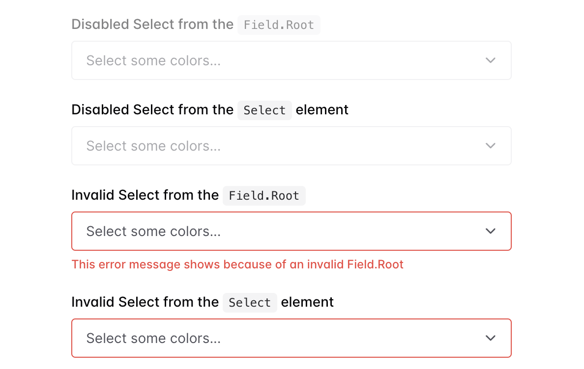
invalid — Default: false | readOnly - Default: false
You can pass invalid to the select component to style it like the Chakra
Input is styled when it receives the same prop. Alternatively, you can pass
readOnly to make the component non-interactive in the same way Chakra's
Input does.
You can pass also pass invalid, disabled, readOnly, or required into a
wrapping Field.Root (or Field if using the snippet) to achieve the same
result as passing these props into the Select component. However, if you pass
these props into the Select component itself, that will override the props
passed into the Field.Root.
In the migration to
Chakra v3,
they ended up removing the invalid prop from the Input, Select, and
Textarea components themselves in favor of always having the user pass it into
the wrapping Field.Root instead. However, it was decided that it wouldn't hurt
to keep the prop on this component as well, as users don't always wrap their
components in a Field.Root in the first place.
return (
  <>
    {/* This will show up with a red border */}
    <Select invalid />

    {/* This will show up normally but will not be interactive */}
    <Select readOnly />

    {/* This will show up grayed out and will not be interactive */}
    {/* Additionally, it will have a red border and the error message will be shown */}
    <Field
      label="Invalid & Disabled Select"
      invalid
      disabled
      invalidText="This error message shows because of an invalid Field.Root"
    >
      <Select />
    </Field>

    {/* Or here's an example without using the snippet */}
    <Field.Root invalid disabled required>
      <Field.Label>
        Invalid & Disabled Select
        <Field.RequiredIndicator />
      </Field.Label>
      <Select />
      <Field.ErrorText>
        This error message shows because of an invalid Field.Root
      </Field.ErrorText>
    </Field.Root>
  </>
);
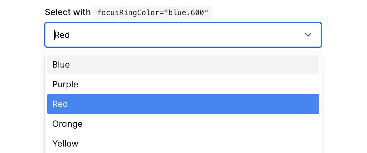
focusRingColor
The prop focusRingColor can be passed with Chakra color tokens which will
emulate style the control component when focused.
return (
  <Select focusRingColor="blue.600" />
);
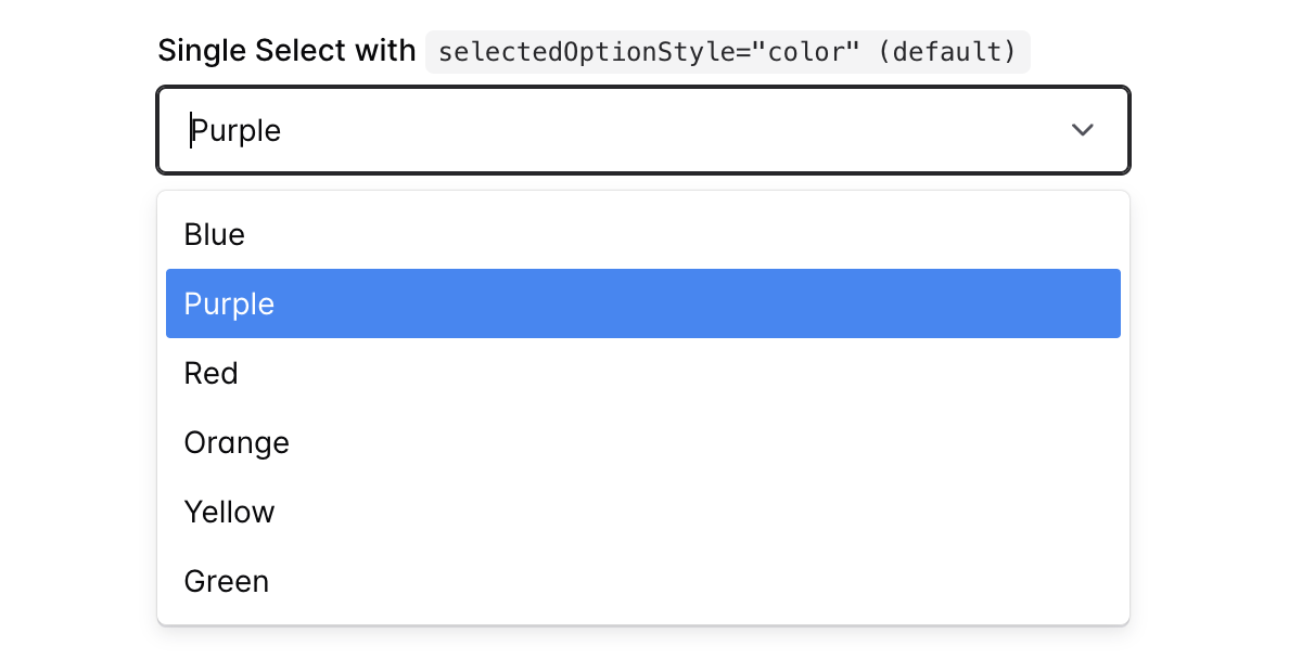
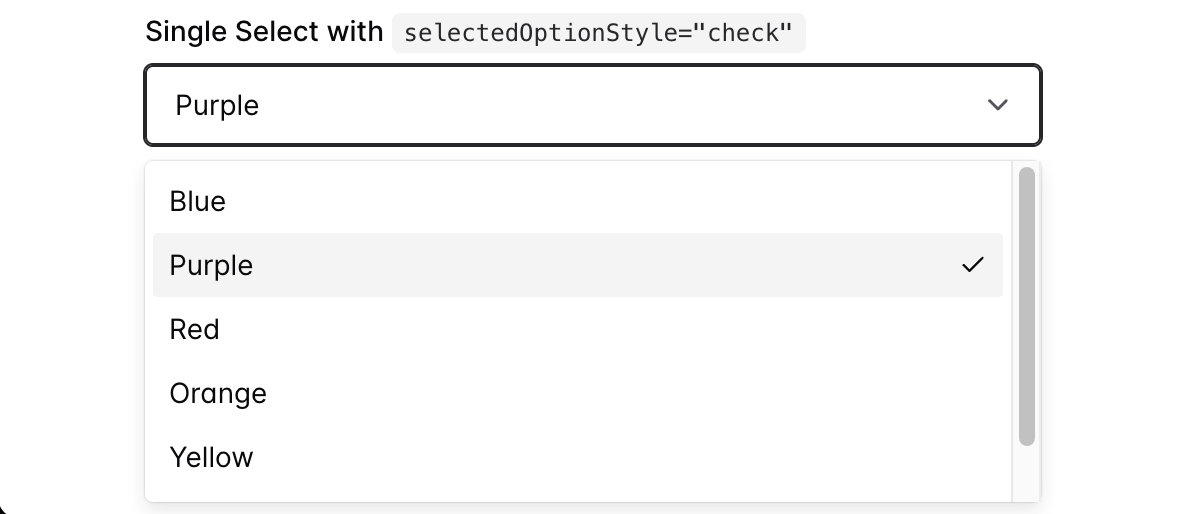
selectedOptionStyle — Options: color | check — Default: color
You can pass the prop selectedOptionStyle with either "color" or "check".
The default option "color" will style a selected option similar to how
react-select does it, by highlighting the selected option in the color blue.
Alternatively, if you pass "check" for the value, the selected option will be
styled like the
Chakra UI <Select /> component
and include a check icon on the right side of the selected option(s).
return (
  <>
    <Select selectedOptionStyle="color" /> {/* Default */}
    <Select selectedOptionStyle="check" /> {/* Chakra UI Menu Style */}
  </>
);
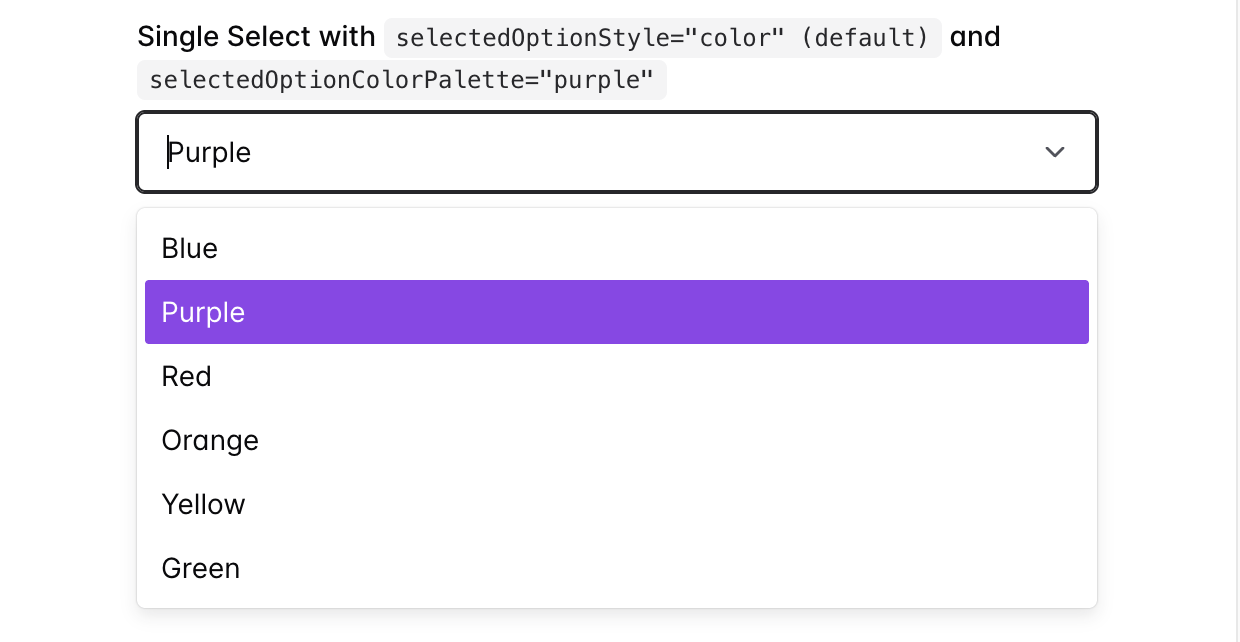
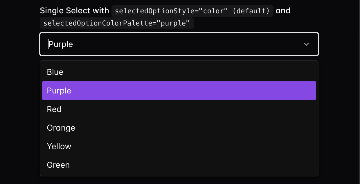
selectedOptionColorPalette — Default: blue
If you choose to stick with the default selectedOptionStyle="color", you have
one additional styling option. If you do not like the default of blue for the
highlight color, you can pass the selectedOptionColorPalette prop to change
it. This prop will accept any named color from your theme's color palette, and
it will use the 500 value in light mode or the 300 value in dark mode.
This prop can only be used for named colors from your theme, not arbitrary hex/rgb colors. If you would like to use a specific color for the background that's not a part of your theme, use the
chakraStylesprop to customize it (see #99 for an example).
return (
  <>
    <Select selectedOptionColorPalette="blue" /> {/* Default */}
    <Select selectedOptionColorPalette="purple" />
  </>
);
variant — Options: outline | subtle — Default: outline
You can pass the variant prop with outline or subtle to change the overall
styling of the Select. These will reflect the various appearances available
for
Chakra's <Select /> component.
Alternatively, if you've added any custom variants to your Chakra theme you can
use those instead. However, it is not guaranteed all styles will be applied how
you intend them to as there are some differences in the structure of the
Select's input component.
If no variant is passed, it will default to defaultProps.variant from the
theme for Chakra's Select component. If your component recipe for Select is
not modified, it will be outline.
The typing for this prop is actually pulled directly from your Chakra theme
props, so if you have any custom variants defined in your theme, you can use
those instead, and the typing will still work. That is, as long as you have run
the typegen command
to generate the new types.
return (
  <>
    <Select variant="outline" /> {/* Default */}
    <Select variant="subtle" />
  </>
);

If you have any other requests for Chakra-like features that could be added via custom props, or problems with the current features, please start a discussion!
Styling
There are a few ways to style the components that make up chakra-react-select.
It's important to note that this package does not use the theme or styles
props that are implemented in react-select. The theme prop isn't used as
most of the components' base styles are pulling from your Chakra theme, and
customizing your base theme (such as colors or component styles) should in turn change the styles in this package.
This package does however offer an alternative to the styles prop,
chakraStyles. It mostly emulates the behavior of the original styles prop,
however, because it’s not identical it is named differently to prevent
confusion.
chakraStyles
To use the chakraStyles prop, first, check the documentation for
the original styles prop from the react-select docs.
This package offers an identical API for the chakraStyles prop, however, the
provided and output style objects use
Chakra's css prop
instead of the default emotion styles the original package offers. This allows
you to both use the shorthand styling props you'd normally use to style Chakra
components, as well as tokens from your theme such as named colors.
The API for an individual style function looks like this:
/**
 * @param {SystemStyleObject} provided -- The component's default Chakra styles
 * @param {Object} state -- The component's current state e.g. `isFocused` (this gives all of the same props that are passed into the component)
 * @returns {SystemStyleObject} An output style object which is forwarded to the component's `sx` prop
 */
function option(provided, state) {
  return {
    ...provided,
    color: state.isFocused ? "blue.500" : "red.400",
  };
}
All of the style keys offered in the original package can be used in the
chakraStyles prop except for menuPortal. Along with
some other caveats, this is explained below.
Most of the components rendered by this package use the basic
Chakra <Box /> component with
a few exceptions. Here are the style keys offered and the corresponding Chakra
component that is rendered:
clearIndicator-Box(uses theme styles for Chakra'sselect.clearTrigger)container-Box(uses theme styles for Chakra'sselect.root)control-Box(uses theme styles for Chakra'sinput)dropdownIndicator-Box(uses theme styles for Chrakra'sselect.indicator)downChevron-chakra.svg(copied fromicons.tsx)crossIcon-chakra.svg(copied fromicons.tsx)group-Box(uses theme styles for Chakra'sselect.itemGroup)groupHeading-Box(uses theme styles for Chakra'sselect.itemGroupLabel)indicatorsContainer-Box(uses theme styles for Chakra'sselect.indicatorGroup)indicatorSeparator-Separatorinput-chakra.input(wrapped in aBox)inputContainer-BoxloadingIndicator-SpinnerloadingMessage-Boxmenu-BoxmenuList-Box(uses theme styles for Chakra'sselect.content)multiValue-Span(uses theme styles for Chakra'stag.root)multiValueLabel-Span(uses theme styles for Chakra'stag.label)multiValueEndElement-Box(uses theme styles for Chakra'stag.endElement. This is new to Chakra v3 due to the extra wrapping element around the close button)multiValueRemove-Box(uses theme styles for Chakra'stag.closeTrigger)noOptionsMessage-Boxoption-Box(uses theme styles for Chakra'sselect.item)placeholder-BoxsingleValue-BoxvalueContainer-Box
If you're using TypeScript, the chakraStyles prop is defined by the exported
ChakraStylesConfig interface.
import { ChakraStylesConfig, Select } from "chakra-react-select";

const App: React.FC = () => {
  const chakraStyles: ChakraStylesConfig = {
    dropdownIndicator: (provided, state) => ({
      ...provided,
      background: state.isFocused ? "blue.100" : provided.background,
      p: 0,
      w: "40px",
    }),
  };

  return <Select chakraStyles={chakraStyles} />;
};
Caveats
One change between the keys in the chakraStyles prop and the original styles
prop, is that in the original the input styles apply to a container
surrounding the HTML <input /> element, and there is no key for styling the
input itself. With the chakraStyles object, the input key now styles the
actual <chakra.input /> element and there is a new key, inputContainer, that
styles the surrounding Box. Both functions use the state argument for the
original input key.
There are also two extra style keys for the icons contained within the
indicators that are not offered in the original package. These are downChevron
which is contained inside the DropdownIndicator, and the crossIcon which is
contained inside the ClearIndicator. Both styles receive the same state
values as their containing indicators. These style keys were added as a
convenience, however you could also apply the same styles using the parent
chakraStyles by doing something like this:
const chakraStyles = {
  dropdownIndicator: (prev, { selectProps }) => ({
    ...prev,
    "> svg": {
      transform: `rotate(${selectProps.menuIsOpen ? -180 : 0}deg)`,
    },
  }),
};
Additionally, there is one key that is available in the styles prop that does
not exist in the chakraStyles object; menuPortal. This key applies to the
MenuPortal element which is only used when the
menuPortalTarget prop is passed
in. This component is replaceable, however, it is very tightly integrated with
the menu placement logic (and a context provider) so it appears to be impossible
to fully replace it with a chakra component. And in turn, it can't pull a key
from the chakraStyles prop. Therefore, if you are passing the
menuPortalTarget prop and would like to change the styles of the MenuPortal
component, you have two options:
- Pass the original
stylesprop with themenuPortalkey. This is the only key in thestylesobject that will be applied to your components.
return (
  <Select
    menuPortalTarget={document.body}
    styles={{
      menuPortal: (provided) => ({
        ...provided,
        // This is the z-index of the normal select in Chakra.
        zIndex: "var(--chakra-z-index-dropdown)",
      }),
    }}
    chakraStyles={{
      // All other component styles
    }}
  />
);- Pass the
classNamePrefixprop as described below and style theMenuPortalwith CSS using the classNameprefix__menu-portal.
// example.js
import "styles.css";

return (
  <Select
    menuPortalTarget={document.body}
    classNamePrefix="crs"
  />
);
/* styles.css */
.crs__menu-portal {
z-index: var(--chakra-z-index-dropdown);
}If anyone has any suggestions for how to fully replace the MenuPortal
component, please leave a comment on
this issue or
submit a pull request.
Theme Styles
As mentioned above, most of the custom components this package implements either use styles from the global Chakra component recipes. As this package pulls directly from your Chakra theme, any changes you make to those components' themes will modify the styles of the components in this package.
Some of the theme styles are manually overridden when this package implements them. This is not as common as it used to be with Chakra V2 due to most styles being pulled from the
Selectslot recipe now, but there are a few other cases where this exception applies. There is no alternative to this currently, so if your custom theme styles are not being applied correctly please usechakraStylesto style your components instead.chakraStylesalways takes the highest priority in overriding the styles of a component.
Here is a list of all components that will be affected by changes to your theme:
react-select component | chakra-ui |
|---|---|
ClearIndicator | select.clearTrigger |
Control | input |
DropdownIndicator | select.indicator |
Group | select.itemGroup |
GroupHeading | select.itemGroupLabel |
IndicatorsContainer | select.indicatorGroup |
LoadingIndicator | spinner |
MenuList | select.content |
MultiValueContainer | tag.root |
MultiValueLabel | tag.label |
MultiValueRemove | tag.endElement / tag.closeTrigger (this is a special case, because the MultiValueRemove renders both the a Box with the tag.endElement styles on it, as well as an inner Box with the tag.closeTrigger styles on it as it's direct child) |
Option | select.item |
SelectContainer | select.root |
In addition to specific component styles, any changes you make to your global color palette will also be reflected in these custom components.
Only make changes to your global component themes if you want them to appear in all instances of that component. Otherwise, just change the individual components' styles using the
chakraStylesprop.
className
This package implements the same classNames on the sub components as the original package so you can use these to style sub-components with CSS. Here is an excerpt from the react-select docs describing how it works:
If you provide the
classNameprop to react-select, the SelectContainer will be given a className based on the provided value.If you provide the
classNamePrefixprop to react-select, all inner elements will be given a className with the provided prefix.For example, given
className='react-select-container'andclassNamePrefix="react-select", the DOM structure is similar to this:<div class="react-select-container"> <div class="react-select__control"> <div class="react-select__value-container">...</div> <div class="react-select__indicators">...</div> </div> <div class="react-select__menu"> <div class="react-select__menu-list"> <div class="react-select__option">...</div> </div> </div> </div>While we encourage you to use the new Styles API, you still have the option of styling via CSS classes. This ensures compatibility with styled components, CSS modules and other libraries.
TypeScript Support
This package has always supported typescript, however until v3.0.0 none of the
type inference was working on the props passed into this component. Now that
they are, you may need to pass in some generics for your component to be typed
properly, but in most cases you shouldn't need to because their types should
be inferred. Here is a snippet from the original documentation on the subject:
Select generics
There are three generics used by the Select component:
Option,IsMulti, andGroup. All of them are optional and TypeScript attempts to detect them automatically, but sometimes it might need some help. Many of thereact-selecttypes include the three generics like this:
Read their full documentation on the topic for more info.
This package exports all of the named module members of the original
react-select in case you need their built-in types in any of your variable
declarations. The root select Props type that is exported by react-select
has been extended using module
augmentation,[1][2]
so if you import that type it will include all of the extra props offered. This
package also exports a few custom types that are specific to the custom props
offered by this package:
ChakraStylesConfig<Option, IsMulti, Group>— The type for the propchakraStylesthat can be passed to customize the component styles. This is almost identical to the built-inStylesConfigtype, however, it uses Chakra'sSystemStyleObjecttype instead of react-select's emotion styles. It also has the same three generics as yourSelectcomponent which would be required if you define your styles separately from your component.OptionBase— A type for your individual select options that includes the custom props for styling each of your selected options. This type is made to give you a base to extend off of and pass in as a generic to the rootSelectcomponent.- Each of the four Select components has a type exported with it:
SelectComponentAsyncSelectComponentCreatableSelectComponentAsyncCreatableSelectComponent
Here is an example of how to pass in the proper generics to
chakra-react-select:
import { GroupBase, OptionBase, Select } from "chakra-react-select";

/**
 * `OptionBase` is a custom type exported by this package meant to be extended
 * to make your custom option types. It includes all of the keys that can be
 * used by this package to customize the styles of your selected options
 *
 * ```
 * interface OptionBase {
 *   variant?: string;
 *   colorPalette?: string;
 *   disabled?: boolean;
 * };
 * ```
 */
interface ColorOption extends OptionBase {
  label: string;
  value: string;
}

const colorOptions = [
  {
    label: "Red",
    value: "red",
    colorPalette: "red", // This is allowed because of the key in the `OptionBase` type
  },
  {
    label: "Blue",
    value: "blue",
  }
]

function CustomMultiSelect() {
  return {
    <Select<ColorOption, true, GroupBase<ColorOption>> // <-- None of these generics should be required
      isMulti
      name="colors"
      options={colorOptions}
      placeholder="Select some colors..."
    />
  }
}
Customizing Components
Like the original react-select, this package exports all of the custom
components that make up the overall select. However, instead of being exported
as components they are exported as chakraComponents to leave the original
components export from react-select alone (you can import that as well if
you'd like, however there shouldn't be any reason to). When implementing this
component, you have the option to wrap these components and alter their state
and the children they return
in the same way the original does.
It's important to note, however, that there are 3 components offered in the
original react-select that are missing from chakraComponents. These are the
CrossIcon, DownChevron, and MenuPortal. The MenuPortal could not be
replaced at all as mentioned earlier, so if you'd like to customize
it, use the original from the components import. The icons posed issues with
prop compatibility when passing them into the core Select so the easiest way
to replace them would be to use a custom DropdownIndicator or ClearIndicator
and pass custom icons in as children:
import {
  type GroupBase,
  type SelectComponentsConfig,
  chakraComponents,
} from "chakra-react-select";
import { LuArrowDown, LuCircleX } from "react-icons/lu";

interface Option {
  label: string;
  value: string;
}

const components: SelectComponentsConfig<Option, true, GroupBase<Option>> = {
  ClearIndicator: (props) => (
    <chakraComponents.ClearIndicator {...props}>
      <LuCircleX />
    </chakraComponents.ClearIndicator>
  ),
  DropdownIndicator: (props) => (
    <chakraComponents.DropdownIndicator {...props}>
      <LuArrowDown />
    </chakraComponents.DropdownIndicator>
  ),
};
Here's a complete example of how you might use custom components to create a
select with a custom Option:
import { Box, Icon, useSlotRecipe } from "@chakra-ui/react";
import {
  type GroupBase,
  Select,
  type SelectComponentsConfig,
  chakraComponents,
} from "chakra-react-select";
import {
  GiCherry,
  GiChocolateBar,
  GiCoffeeBeans,
  GiStrawberry,
} from "react-icons/gi";

interface FlavorOption {
  label: string;
  value: string;
  Icon: React.FC;
  iconColor: string;
}

const flavorOptions: FlavorOption[] = [
  {
    value: "coffee",
    label: "Coffee",
    Icon: GiCoffeeBeans,
    iconColor: "orange.700",
  },
  {
    value: "chocolate",
    label: "Chocolate",
    Icon: GiChocolateBar,
    iconColor: "yellow.800",
  },
  {
    value: "strawberry",
    label: "Strawberry",
    Icon: GiStrawberry,
    iconColor: "red.500",
  },
  {
    value: "cherry",
    label: "Cherry",
    Icon: GiCherry,
    iconColor: "red.600",
  },
];

const customComponents: SelectComponentsConfig<
  FlavorOption,
  true,
  GroupBase<FlavorOption>
> = {
  Option: ({ children, ...props }) => (
    <chakraComponents.Option {...props}>
      <Icon color={props.data.iconColor} boxSize={4}>
        <props.data.Icon />
      </Icon>
      <Box flexGrow={1}>{children}</Box>
    </chakraComponents.Option>
  ),
  MultiValueContainer: ({ children, ...props }) => {
    const tagStyles = useSlotRecipe({ key: "tag" })();
    return (
      <chakraComponents.MultiValueContainer {...props}>
        <Box css={tagStyles.startElement} color={props.data.iconColor}>
          <props.data.Icon />
        </Box>
        {children}
      </chakraComponents.MultiValueContainer>
    );
  },
};

const OptionsWithIconsExample = () => (
  <Select
    isMulti
    options={flavorOptions}
    placeholder="Select some flavors..."
    components={customComponents}
  />
);
Demos of both of the above examples can be found in the main demo StackBlitz.
Custom LoadingIndicator (Chakra Spinner)
For most sub components, the styling can be easily accomplished using the
chakraStyles prop. However, in the case of the
LoadingIndicator there are a few props which do not directly correlate very
well with styling props. To solve that problem, the
chakraComponents.LoadingIndicator component can be passed a few extra props
which are normally available on the Chakra UI
Spinner. Here is an
example demonstrating which extra props are offered:
import { AsyncSelect, chakraComponents } from "chakra-react-select";

// These are the defaults for each of the custom props
const asyncComponents = {
  LoadingIndicator: (props) => (
    <chakraComponents.LoadingIndicator
      // The color palette of the filled in area of the spinner (there is no default)
      colorPalette="gray"
      // The color of the main line which makes up the spinner
      // This could be accomplished using `chakraStyles` but it is also available as a custom prop
      color="currentColor" // <-- This default's to your theme's text color (Light mode: gray.700 | Dark mode: whiteAlpha.900)
      // The color of the remaining space that makes up the spinner
      trackColor="transparent"
      // The `size` prop on the Chakra spinner
      // Defaults to one size smaller than the Select's size
      spinnerSize="md"
      // A CSS <time> variable (s or ms) which determines the time it takes for the spinner to make one full rotation
      animationDuration="500ms"
      // A CSS size string representing the thickness of the spinner's line
      borderWidth="2px"
      // Don't forget to forward the props!
      {...props}
    />
  ),
};

const App = () => (
  <AsyncSelect
    isMulti
    name="colors"
    placeholder="Select some colors..."
    components={asyncComponents}
    loadOptions={(inputValue, callback) => {
      setTimeout(() => {
        const values = colorOptions.filter((i) =>
          i.label.toLowerCase().includes(inputValue.toLowerCase())
        );
        callback(values);
      }, 1500);
    }}
  />
);
useChakraSelectProps
Being a wrapper for react-select, all of the customizations done to
react-select are passed in as props. There is a hook,
useChakraSelectProps that handles merging
any extra customizations from the end user with the customizations done by this
package. In some cases you may simply want to use this hook to get the custom
props and pass them into a react-select instance yourself.
To do so, simply import the hook from this package, and call it by passing in
any extra custom props you'd like into it and spread it onto a base
react-select component:
import { useState } from "react";
import { useChakraSelectProps } from "chakra-react-select";
import Select from "react-select";
import { options } from "./data";

const CustomSelect = () => {
  const [selectedOptions, setSelectedOptions] = useState([]);

  const selectProps = useChakraSelectProps({
    isMulti: true,
    value: selectedOptions,
    onChange: setSelectedOptions,
  });

  return <Select {...selectProps} />;
};
One important thing to note however, is that this hook generally adds no benefit
if you're just going to pass the props it returns into the core Select
component from this package. The only time it really becomes useful is if you're
passing the resulting props into the core react-select component, or another
component that wraps it.
One example of how you might use this is to customize the component
react-google-places-autocomplete, which is an autocomplete dropdown for Google
Places that uses the AsyncSelect from react-select as it's core. Therefore,
it accepts all of the same select props as the core react-select does meaning
you can use the useChakraSelectProps hook to style it:
import { useState } from "react";
import { useChakraSelectProps } from "chakra-react-select";
import GooglePlacesAutocomplete from "react-google-places-autocomplete";

const GooglePlacesAutocomplete = () => {
  const [place, setPlace] = useState(null);

  const selectProps = useChakraSelectProps({
    value: place,
    onChange: setPlace,
  });

  return (
    <GooglePlacesAutocomplete
      apiKey="YOUR API KEY HERE"
      selectProps={selectProps}
    />
  );
};

export default GooglePlacesAutocomplete;An API key would be needed to create a CodeSandbox example for this so you will have to implement it in your own project if you'd like to test it out.
Usage with React Form Libraries
This section is a work in progress, check back soon for more examples
This package can be used with form controllers such as Formik or React Hook Form
in the same way you would with the original React Select, and the quickest way
to figure out how to do so would be to Google something along the lines of
"react-select with formik/react-hook-form/etc" and replace the react-select
component in those examples with a chakra-react-select component. However,
here are a few examples to help you get started. If you'd like to see examples
using other form providers, you can
submit it as a Q&A discussion.
react-hook-form
See this issue for some discussion about using this package with
react-hook-form: https://github.com/csandman/chakra-react-select/issues/7
By default, react-hook-form uses
uncontrolled components
to reduced input renders however this only works for native HTML inputs. Because
chakra-react-select is not a native HTML input, you'll need to use
react-hook-form's
Controller
component or useController
hook in order to keep the value(s) tracked in react-hook-form's state. Here
are some examples using each:
These examples still need to be updated to the newest version of
chakra-react-selectat some point, but they should still give you a good idea of how to implement what you want.
Controller multi select with built-in validation
useController multi select with built-in validation
useController single select
Multi select with yup validation (advanced example)
Single select with yup validation (advanced example)
Multi select with zod validation (advanced example)
Single select with zod validation (advanced example)
formik
See this discussion for some examples of using this package with formik:
https://github.com/csandman/chakra-react-select/discussions/111
Single select with built-in validation
- Vanilla JS: coming soon
- TypeScript: coming soon
Multi select with built-in validation
- Vanilla JS: coming soon
- TypeScript: coming soon
Multi select with yup validation
- Vanilla JS: coming soon
- TypeScript: coming soon
Templates
When submitting a bug report, please include a minimum reproduction of your issue using one of these templates:
- Vanilla JS Starter: https://stackblitz.com/edit/crs-v6-js?file=src%2Fapp.jsx
- TypeScript Starter: https://stackblitz.com/edit/crs-v6-ts?file=src%2Fapp.tsx
1 year ago
1 year ago
1 year ago
1 year ago
1 year ago
1 year ago
1 year ago
1 year ago
1 year ago
1 year ago
1 year ago
1 year ago
1 year ago
1 year ago
1 year ago
1 year ago
1 year ago
1 year ago
1 year ago
1 year ago
1 year ago
1 year ago
1 year ago
1 year ago
1 year ago
2 years ago
2 years ago
2 years ago
2 years ago
2 years ago
2 years ago
2 years ago
2 years ago
2 years ago
2 years ago
2 years ago
2 years ago
2 years ago
2 years ago
3 years ago
2 years ago
2 years ago
2 years ago
2 years ago
2 years ago
2 years ago
2 years ago
3 years ago
3 years ago
3 years ago
3 years ago
3 years ago
3 years ago
3 years ago
3 years ago
3 years ago
3 years ago
4 years ago
3 years ago
3 years ago
3 years ago
3 years ago
3 years ago
4 years ago
4 years ago
3 years ago
4 years ago
4 years ago
4 years ago
4 years ago
4 years ago
4 years ago
4 years ago
4 years ago
4 years ago
4 years ago
4 years ago
4 years ago
4 years ago
4 years ago
4 years ago
4 years ago
4 years ago
4 years ago
4 years ago
4 years ago
4 years ago
4 years ago
4 years ago
4 years ago
4 years ago
4 years ago
4 years ago
4 years ago
4 years ago
4 years ago
4 years ago
4 years ago
4 years ago
4 years ago
4 years ago
4 years ago
4 years ago
4 years ago
4 years ago
4 years ago
4 years ago
4 years ago
4 years ago
4 years ago
4 years ago
4 years ago
4 years ago
4 years ago
4 years ago
4 years ago
4 years ago
4 years ago
4 years ago
4 years ago
4 years ago
4 years ago
4 years ago
4 years ago
4 years ago
4 years ago
4 years ago
4 years ago
4 years ago
4 years ago
4 years ago
4 years ago
4 years ago
4 years ago
4 years ago
4 years ago
4 years ago
4 years ago
4 years ago
4 years ago
4 years ago
4 years ago
4 years ago
4 years ago
4 years ago


