chartogram v0.1.23
chartogram
Charts in JS with no dependencies.
Also includes a React component for those who're using React.
Originally created as part of Telegram Charts Contest.
Screenshots
Day
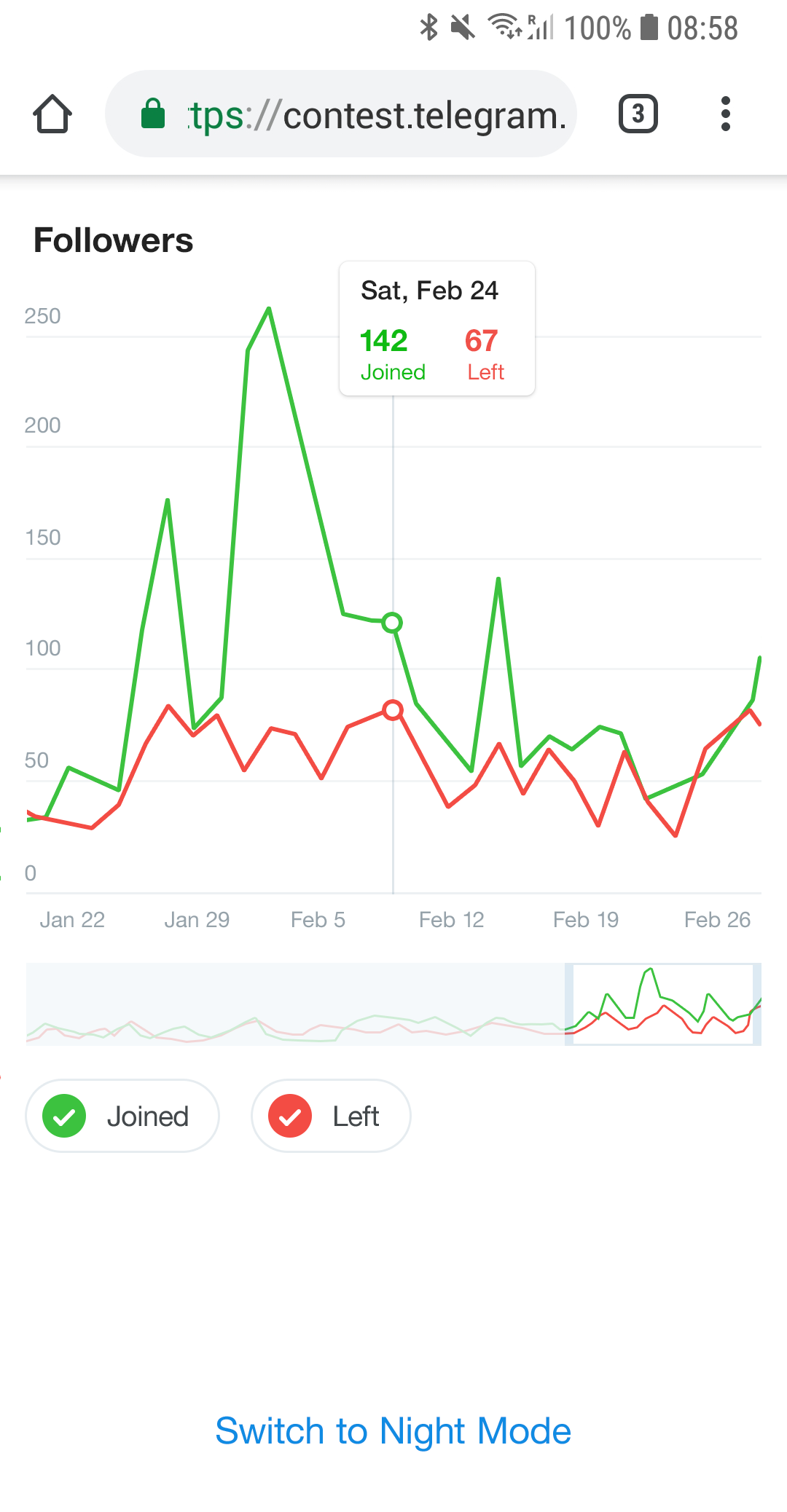
Night
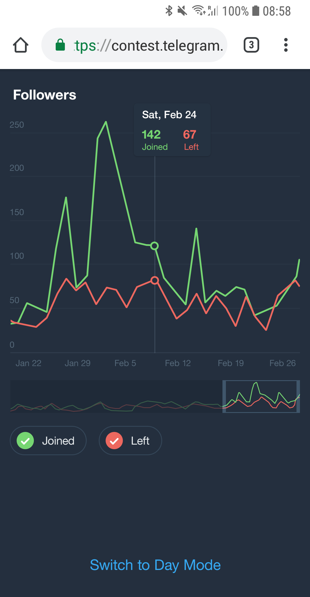
Use
The default exported function takes four arguments:
- The DOM element where the chart will be rendered.
- Chart data.
- Chart title.
- (optional)
options.
Chart data must have shape:
{
  x: {
    points: Number[]
  },
  y: {
    id: string,
    name: string,
    color: string,
    points: Number[]
  }[]
}
So there must be a single x and one or more ys.
Example:
{
  x: {
    points: [
      1553769000,
      1553770000,
      1553771000
    ]
  },
  y: [
    {
      id: 'y1',
      name: 'Temperature',
      color: '#cc0000',
      points: [
        60,
        69,
        65
      ]
    },
    {
      id: 'y2',
      name: 'CPU load',
      color: '#00aa00',
      points: [
        95,
        98,
        90
      ]
    }
  ]
}
The default exported function returns another function which must be called in case of "destroying" the chart (it cleans up global event listeners and resets the DOM node).
Browser
<!DOCTYPE html>
<html>
  <head>
    <script src="https://unpkg.com/chartogram@[version]/bundle/chartogram.js"></script>
    <link rel="stylesheet" href="https://unpkg.com/chartogram@[version]/style.css"/>
  </head>

  <body>
    <section id="chart"></section>
    <script>
      chartogram(document.getElementById('chart'), data, 'Title')
    </script>
  </body>
</html>
where [version] is an npm package version range (for example, 0.1.x or ^0.1.0).
Bundler
npm install chartogram --saveimport chartogram from 'chartogram'
import 'chartogram/style.css'
chartogram(element, data, title)React (bundler)
npm install chartogram --saveimport React from 'react'
import Chartogram from 'chartogram/react'
import 'chartogram/style.css'
export default class Page extends React.Component {
render() {
return (
<Chartogram
data={data}
title={title}
options={options}/>
)
}
}React (browser)
<!DOCTYPE html>
<html>
  <head>
    <script src="https://unpkg.com/chartogram@[version]/bundle/chartogram-react.js"></script>
    <link rel="stylesheet" href="https://unpkg.com/chartogram@[version]/style.css"/>
  </head>

  <body>
    <section id="page"></section>

    <script>
      class Page extends React.Component {
        render() {
          return (
            <Chartogram
              data={data}
              title="Followers"
              options={options}/>
          )
        }
      }

      ReactDOM.render(
        <Page/>,
        document.getElementById("page")
      )
    </script>
  </body>
</html>
where [version] is an npm package version range (for example, 0.1.x or ^0.1.0).
Night mode
Add chartogram--night-mode CSS class to the chart <section/> to switch to Night Mode.
Options
formatX(value: number, { long: boolean })— Formats X axis labels.longoption is for the tooltip. UsesIntl.DateTimeFormatby default.formatY(value: number)— Formats Y axis labels (including tooltip). UsesIntl.NumberFormatby default.locale: string— Is used to format dates (the default system locale is used if none supplied).transitionDuration: number— The maximum transition duration (in milliseconds).transitionEasing: string— IseaseOutQuadby default.yAxisTickMarksCount: number— Y axis tick marks count.yAxisPrecision: number— Y axis tick mark labels rounding precision: the number of fraction digits to use when formatting Y axis labels. Is0by default.xAxisTickMarkWidth: number— (in pixels) Is used to calculate the count of X axis tick marks based on canvas width (in pixels).canvasWidth: number— SVGviewBoxwidth (not pixels).precision: number— SVG coordinates rounding precision.timelineWindowSize: number— The initial size of timeline window (in points).
Custom colors
To customize colors override the CSS variables:
body {
	--content-color: black;
	--background-color: white;
	--night-mode-transition-duration: 300ms;
}

.night-mode {
	--background-color: rgb(36,47,62);
	--content-color: white;
}

.chartogram {
	--chartogram-background-color: var(--background-color);
	--chartogram-content-color: var(--content-color);
	--chartogram-night-mode-transition-duration: var(--night-mode-transition-duration);
	/* See `style.css` for the list of all available CSS variables. */
	--chartogram-font-size: 16px;
	--chartogram-tooltip-background-color: white;
}

.chartogram--night-mode {
	/* See `style.css` for the list of all available CSS variables. */
	--chartogram-tooltip-background-color: #293544;
}
Browser compatibility
Tested in Chrome, Firefox, Microsoft Edge, Internet Explorer 11 and iOS Safari.
The styles use CSS variables which are supported in all browsers except Internet Explorer that would require using something like PostCSS with a plugin like postcss-custom-properties or postcss-css-variables.
Internet Explorer would also require the following polyfills:
7 years ago
7 years ago
7 years ago
7 years ago
7 years ago
7 years ago
7 years ago
7 years ago
7 years ago
7 years ago
7 years ago
7 years ago
7 years ago
7 years ago
7 years ago
7 years ago
7 years ago
7 years ago
7 years ago
7 years ago
7 years ago
7 years ago
7 years ago
7 years ago