
Single Bar | Multi Bar | Options | Examples | Presets | Events
CLI-Progress
easy to use progress-bar for command-line/terminal applications

Install
$ yarn add cli-progress
$ npm install cli-progress --save
Features
- Simple, Robust and Easy to use
- Full customizable output format (various placeholders are available)
- Single progressbar mode
- Multi progessbar mode
- Custom Bar Characters
- FPS limiter
- ETA calculation based on elapsed time
- Custom Tokens to display additional data (payload) within the bar
- TTY and NOTTY mode
- No callbacks required - designed as pure, external controlled UI widget
- Works in Asynchronous and Synchronous tasks
- Preset/Theme support
- Custom bar formatters (via callback)
- Logging during multibar operation
Usage
Multiple examples are available e.g. example.js - just try it $ node example.js
const cliProgress = require('cli-progress');

// create a new progress bar instance and use shades_classic theme
const bar1 = new cliProgress.SingleBar({}, cliProgress.Presets.shades_classic);

// start the progress bar with a total value of 200 and start value of 0
bar1.start(200, 0);

// update the current value in your application..
bar1.update(100);

// stop the progress bar
bar1.stop();
Single Bar Mode
Example
const cliProgress = require('cli-progress');

// note: you have to install this dependency manually since it's not required by cli-progress
const colors = require('ansi-colors');

// create new progress bar
const b1 = new cliProgress.SingleBar({
    format: 'CLI Progress |' + colors.cyan('{bar}') + '| {percentage}% || {value}/{total} Chunks || Speed: {speed}',
    barCompleteChar: '\u2588',
    barIncompleteChar: '\u2591',
    hideCursor: true
});

// initialize the bar - defining payload token "speed" with the default value "N/A"
b1.start(200, 0, {
    speed: "N/A"
});

// update values
b1.increment();
b1.update(20);

// stop the bar
b1.stop();
Constructor
Initialize a new Progress bar. An instance can be used multiple times! it's not required to re-create it!
const cliProgress = require('cli-progress');

const <instance> = new cliProgress.SingleBar(options:object [, preset:object]);
Options
::start()
Starts the progress bar and set the total and initial value
<instance>.start(totalValue:int, startValue:int [, payload:object = {}]);::update()
Sets the current progress value and optionally the payload with values of custom tokens as a second parameter. To update payload only, set currentValue to null.
<instance>.update([currentValue:int [, payload:object = {}]]);

// update progress without altering value
<instance>.update([payload:object = {}]);
::increment()
Increases the current progress value by a specified amount (default +1). Update payload optionally
<instance>.increment([delta:int [, payload:object = {}]]);

// delta=1 assumed
<instance>.increment(payload:object = {}]);
::setTotal()
Sets the total progress value while progressbar is active. Especially useful handling dynamic tasks.
<instance>.setTotal(totalValue:int);::stop()
Stops the progress bar and go to next line
<instance>.stop();::updateETA()
Force eta calculation update (long running processes) without altering the progress values.
Note: you may want to increase etaBuffer size - otherwise it can cause INF eta values in case the value didn't changed within the time series.
<instance>.updateETA();Multi Bar Mode
Example
const cliProgress = require('cli-progress');

// create new container
const multibar = new cliProgress.MultiBar({
    clearOnComplete: false,
    hideCursor: true,
    format: ' {bar} | {filename} | {value}/{total}',
}, cliProgress.Presets.shades_grey);

// add bars
const b1 = multibar.create(200, 0);
const b2 = multibar.create(1000, 0);

// control bars
b1.increment();
b2.update(20, {filename: "test1.txt"});
b1.update(20, {filename: "helloworld.txt"});

// stop all bars
multibar.stop();
Constructor
Initialize a new multiprogress container. Bars need to be added. The options/presets are used for each single bar!
const cliProgress = require('cli-progress');

const <instance> = new cliProgress.MultiBar(options:object [, preset:object]);
::create()
Adds a new progress bar to the container and starts the bar. Returns regular SingleBar object which can be individually controlled.
Additional barOptions can be passed directly to the generic-bar to override the global options for a single bar instance. This can be useful to change the appearance of a single bar object. But be patient: this should only be used to override formats - DON'T try to set other global options like the terminal, synchronous flags, etc..
const <barInstance> = <instance>.create(totalValue:int, startValue:int [, payload:object = {} [, barOptions:object = {}]]);::remove()
Removes an existing bar from the multi progress container.
<instance>.remove(<barInstance>:object);::stop()
Stops the all progress bars
<instance>.stop();::log()
Outputs (buffered) content on top of the multibars during operation.
Notice: newline at the end is required
Example: example-logging.js
<instance>.log("Hello World\n");Options
The following options can be changed
format(type:string|function) - progress bar output format @see format sectionfps(type:float) - the maximum update rate (default: 10)stream(type:stream) - output stream to use (default:process.stderr)stopOnComplete(type:boolean) - automatically callstop()when the value reaches the total (default: false)clearOnComplete(type:boolean) - clear the progress bar on complete /stop()call (default: false)barsize(type:int) - the length of the progress bar in chars (default: 40)align(type:char) - position of the progress bar - 'left' (default), 'right' or 'center'barCompleteChar(type:char) - character to use as "complete" indicator in the bar (default: "=")barIncompleteChar(type:char) - character to use as "incomplete" indicator in the bar (default: "-")hideCursor(type:boolean) - hide the cursor during progress operation; restored on complete (default: false) - passnullto keep terminal settingslinewrap(type:boolean) - disable line wrapping (default: false) - passnullto keep terminal settings; passtrueto add linebreaks automatically (not recommended)gracefulExit(type:boolean) - stop the bars in case ofSIGINTorSIGTERM- this restores most cursor settings before exiting (default:true)etaBuffer(type:int) - number of updates with which to calculate the eta; higher numbers give a more stable eta (default: 10)etaAsynchronousUpdate(type:boolean) - trigger an eta calculation update during asynchronous rendering trigger using the current value - should only be used for long running processes in conjunction with loffpsvalues and largeetaBuffer(default: false)progressCalculationRelative(type:boolean) - progress calculation usesstartValueas zero-offset (default: false)synchronousUpdate(type:boolean) - trigger redraw duringupdate()in case threshold time x2 is exceeded (default: true) - limited to single bar usagenoTTYOutput(type:boolean) - enable scheduled output to notty streams - e.g. redirect to files (default: false)notTTYSchedule(type:int) - set the output schedule/interval for notty output inms(default: 2000ms)emptyOnZero(type:boolean) - display progress bars with 'total' of zero(0) as empty, not full (default: false)forceRedraw(type:boolean) - trigger redraw on every frame even if progress remains the same; can be useful if progress bar gets overwritten by other concurrent writes to the terminal (default: false)barGlue(type:string) - a "glue" string between the complete and incomplete bar elements used to insert ascii control sequences for colorization (default: empty) - Note: in case you add visible "glue" characters the barsize will be increased by the length of the glue!autopadding(type: boolean) - add padding chars to formatted time and percentage to force fixed width (default: false) - Note: handled standard format functions!autopaddingChar(type: string) - the character sequence used for autopadding (default: " ") - Note: due to performance optimizations this value requires a length of 3 identical charsformatBar(type: function) - a custom bar formatter function which renders the bar-element (default: format-bar.js)formatTime(type: function) - a custom timer formatter function which renders the formatted time elements likeeta_formattedandduration-formatted(default: format-time.js)formatValue(type: function) - a custom value formatter function which renders all other values (default: format-value.js)
Events
The classes extends EventEmitter which allows you to hook into different events.
See event docs for detailed information + examples.
Bar Formatting
The progressbar can be customized by using the following build-in placeholders. They can be combined in any order.
{bar}- the progress bar, customizable by the options barsize, barCompleteString and barIncompleteString{percentage}- the current progress in percent (0-100){total}- the end value{value}- the current value set by lastupdate()call{eta}- expected time of accomplishment in seconds (limmited to 115days, otherwise INF is displayed){duration}- elapsed time in seconds{eta_formatted}- expected time of accomplishment formatted into appropriate units{duration_formatted}- elapsed time formatted into appropriate units{<payloadKeyName>}- the payload value identified by its key
Example
const opt = {
    format: 'progress [{bar}] {percentage}% | ETA: {eta}s | {value}/{total}'
}
is rendered as
progress [========================================] 100% | ETA: 0s | 200/200Custom formatters
Instead of a "static" format string it is also possible to pass a custom callback function as formatter.
For a full example (including params) take a look on lib/formatter.js
Example 1
function formatter(options, params, payload){

    // bar grows dynamically by current progress - no whitespaces are added
    const bar = options.barCompleteString.substr(0, Math.round(params.progress*options.barsize));

    // end value reached ?
    // change color to green when finished
    if (params.value >= params.total){
        return '# ' + colors.grey(payload.task) + '   ' + colors.green(params.value + '/' + params.total) + ' --[' + bar + ']-- ';
    }else{
        return '# ' + payload.task + '   ' + colors.yellow(params.value + '/' + params.total) + ' --[' + bar + ']-- ';
    }
}

const opt = {
    format: formatter
}
is rendered as
# Task 1     0/200 --[]--
# Task 1     98/200 --[████████████████████]--
# Task 1     200/200 --[████████████████████████████████████████]--
Example 2
You can also access the default format functions to use them within your formatter:
const {TimeFormat, ValueFormat, BarFormat, Formatter} = require('cli-progess').Format;
...
Examples
Example 1 - Set Options
// change the progress characters
// set fps limit to 5
// change the output stream and barsize
const bar = new _progress.Bar({
    barCompleteChar: '#',
    barIncompleteChar: '.',
    fps: 5,
    stream: process.stdout,
    barsize: 65,
    position: 'center'
});
Example 2 - Change Styles defined by Preset
// uee shades preset
// change the barsize
const bar = new _progress.Bar({
    barsize: 65,
    position: 'right'
}, _progress.Presets.shades_grey);
Example 3 - Custom Payload
The payload object keys should only contain keys matching standard \w+ regex!
// create new progress bar with custom token "speed"
const bar = new _progress.Bar({
    format: 'progress [{bar}] {percentage}% | ETA: {eta}s | {value}/{total} | Speed: {speed} kbit'
});

// initialize the bar - set payload token "speed" with the default value "N/A"
bar.start(200, 0, {
    speed: "N/A"
});

// some code/update loop
// ...

// update bar value. set custom token "speed" to 125
bar.update(5, {
    speed: '125'
});

// process finished
bar.stop();
Example 4 - Custom Presets
File myPreset.js
const colors = require('ansi-colors');

module.exports = {
    format: colors.red(' {bar}') + ' {percentage}% | ETA: {eta}s | {value}/{total} | Speed: {speed} kbit',
    barCompleteChar: '\u2588',
    barIncompleteChar: '\u2591'
};
Application
const myPreset = require('./myPreset.js');

const bar = new _progress.Bar({
    barsize: 65
}, myPreset);
Presets/Themes
Need a more modern appearance ? cli-progress supports predefined themes via presets. You are welcome to add your custom one :)
But keep in mind that a lot of the "special-chars" rely on Unicode - it might not work as expected on legacy systems.
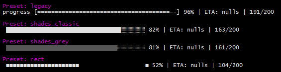
Default Presets
The following presets are included by default
- legacy - Styles as of cli-progress v1.3.0
- shades-classic - Unicode background shades are used for the bar
- shades-grey - Unicode background shades with grey bar
- rect - Unicode Rectangles
Compatibility
cli-progress is designed for linux/macOS/container applications which mostly providing standard compliant tty terminals/shells. In non-tty mode it is suitable to be used with logging daemons (cyclic output).
It also works with PowerShell on Windows 10 - the legacy command prompt on outdated Windows versions won't work as expected and is not supported!
Any Questions ? Report a Bug ? Enhancements ?
Please open a new issue on GitHub
License
CLI-Progress is OpenSource and licensed under the Terms of The MIT License (X11). You're welcome to contribute!