1.2.0 • Published 4 years ago
col-slider
Licence
ISC
Version
1.2.0
Deps
0
Size
17 kB
Vulns
0
Weekly
0
The package is present images by slide image in frame divided by column around the center view
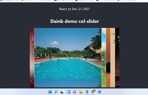
Usage
- import { colSlider } from "col-slider"
- Get array image
i. Item is object has src propertyconst images = [{src: "img url"}] - call function with important params then set parent element use class name or id
colSlider({ slides: images }).append('.parentClassName'); - In web application: User can click/touch down and drag horizontal to move on the left/right
- Happy codding!!!
Demo in React app
import React, { useState, useEffect } from 'react';
import './App.css';
import { colSlider } from 'col-slider';

function App() {
    return (
        <div className="App">
        <header className="App-header">
            <MainBody />
        </header>
        </div>
    );
}

export default App;

function MainBody() {
    useEffect(() => {
        const imgs = [
            { src: 'https://live.staticflickr.com/65535/51728456656_7e4105ffc0.jpg' },
            { src: 'https://live.staticflickr.com/65535/51728456656_7e4105ffc0.jpg' },
            { src: 'https://live.staticflickr.com/65535/51728456656_7e4105ffc0.jpg' },
            { src: 'https://live.staticflickr.com/65535/51728456656_7e4105ffc0.jpg' },
            { src: 'https://live.staticflickr.com/65535/51728456656_7e4105ffc0.jpg' },
            { src: 'https://live.staticflickr.com/65535/51728456656_7e4105ffc0.jpg' }
        ];
        colSlider({
        slides: imgs,
        mainWidth: '75%' //, viewWidth: 800
        }).append('.dnbBody');
    });
    return (
        <div className="dnbBody">
        <h2>Dainb demo col-slider</h2>
        </div>
    );
}
Version 1.2.0 - output active index in function onDragEnd
//import React, { useState, useEffect } from 'react';
function MainBody() {
  const [index, setIndex] = useState(0);

  useEffect(() => {
    const imgs = [
            { src: 'https://live.staticflickr.com/65535/51728456656_7e4105ffc0.jpg' },
            { src: 'https://live.staticflickr.com/65535/51728456656_7e4105ffc0.jpg' },
            { src: 'https://live.staticflickr.com/65535/51728456656_7e4105ffc0.jpg' },
            { src: 'https://live.staticflickr.com/65535/51728456656_7e4105ffc0.jpg' },
            { src: 'https://live.staticflickr.com/65535/51728456656_7e4105ffc0.jpg' },
            { src: 'https://live.staticflickr.com/65535/51728456656_7e4105ffc0.jpg' }
        ];
    colSlider({
      slides: imgs,
      mainWidth: '75%'
    }).append('.dnbBody').onDragEnd(function(_index){
      setIndex(_index);
    });
  });
  return (
    <div className="dnbBody">
      {console.log(index)}
      <h2>Dainb demo col-slider</h2>
    </div>
  );
}