custom-element-react-wrappers v1.7.0
Custom Element React Wrapper
Make your web components React compatible!
- No manual event mapping
- Automatically generates types for your components and props
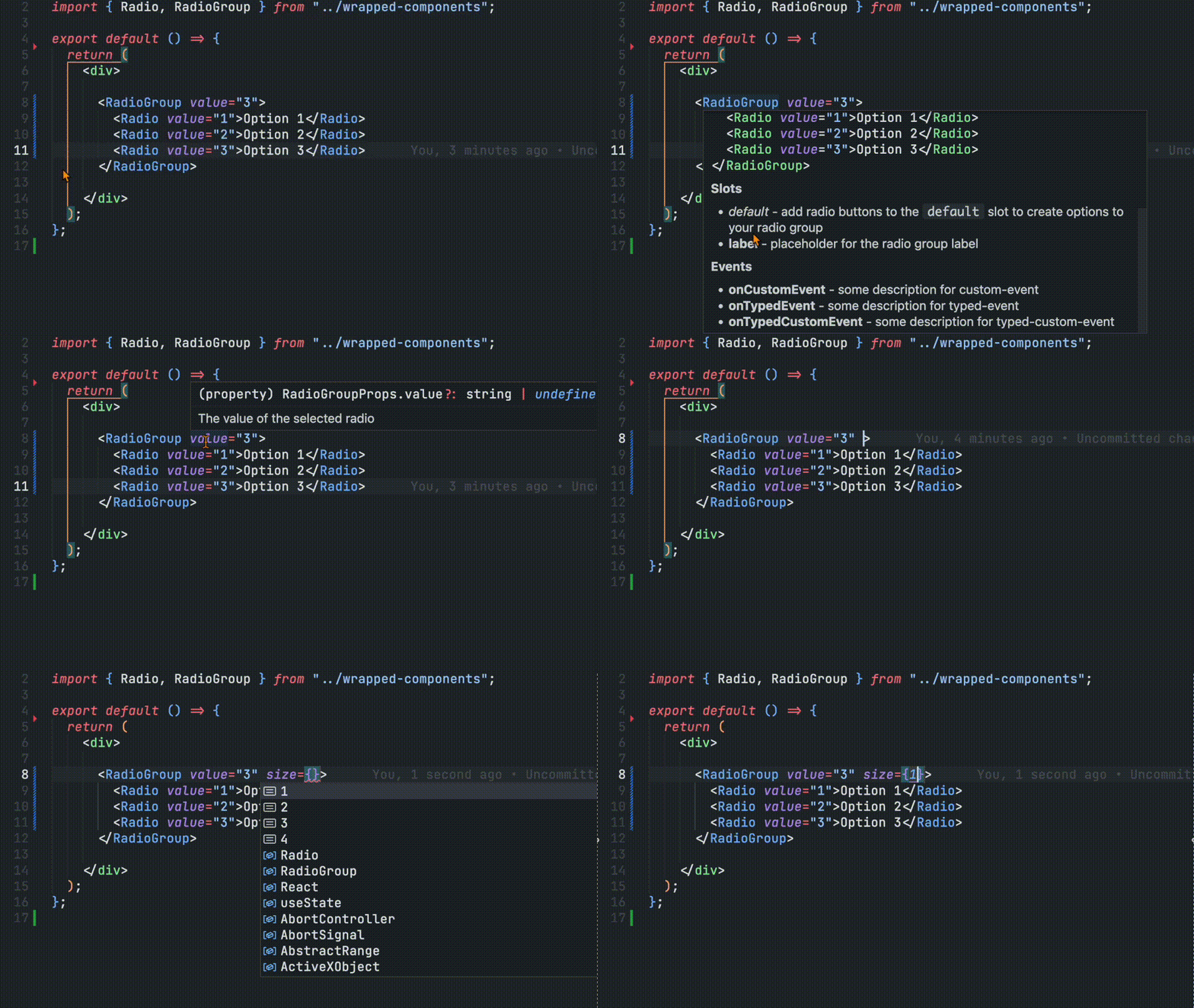
- Provides editor autocomplete features and documentation
- Configurable
- Very easy to set up and use
Usage
This package includes two ways to generate the custom data config file:
- calling a function in your build pipeline
- as a plugin for the Custom Element Manifest Analyzer
Install
npm i -D custom-element-react-wrappersBuild Pipeline
import { generateReactWrappers } from "custom-element-react-wrappers";
import manifest from "./path/to/custom-elements.json";

const options = {...};

generateReactWrappers(manifest, options);
CEM Analyzer
Set-up
Ensure the following steps have been taken in your component library prior to using this plugin:
- Install and set up the Custom Elements Manifest Analyzer
- Create a config file
Import
// custom-elements-manifest.config.js

import { customElementReactWrapperPlugin } from "custom-element-react-wrappers";

const options = {...};

export default {
  plugins: [
    customElementReactWrapperPlugin(options)
  ],
};
Once you run the analyzer, you should see a new directory (the default directory name is react) with the component wrappers and their types!
You should now be able to start using your "react" components or deploy them with your component library for others to enjoy.
import { MyElement, MyOtherElement } from "./react";

// or

import { MyElement, MyOtherElement } from "my-component-library/react";
Configuration
The configuration has the following optional parameters:
{
  /** Used to get a specific path for a given component */
  modulePath?: (className: string, tagName: string) => string;
  /** Used to provide alternative property name to prevent name collisions with React */
  attributeMapping?: { [key: string]: string };
  /** Used to add custom global props to all component types */
  globalProps?: MappedAttribute[];
  /** Used to add global element props to all component types */
  globalEvents?: GlobalEvent[];
  /** Includes React props defined for HTML elements */
  reactProps?: string[] | boolean;
  /** Generates context provider to scope component tags with a custom prefix or suffix */
  scopedTags?: boolean;
  /** Formats wrappers to make them safe to run in environments with Server Side Rendering (SSR) */
  ssrSafe?: boolean;
  /** Path to output directory */
  outdir?: string;
  /** Class names of any components you would like to exclude from the custom data */
  exclude?: string[];
  /** The property name from the component object that you would like to use for the description of your component */
  descriptionSrc?: "description" | "summary" | string;
  /** Indicates if the component classes are a default export rather than a named export */
  defaultExport?: boolean;
  /** Displays the slot section of the element description */
  hideSlotDocs?: boolean;
  /** Displays the event section of the element description */
  hideEventDocs?: boolean;
  /** Displays the CSS custom properties section of the element description */
  hideCssPropertiesDocs?: boolean;
  /** Displays the CSS parts section of the element description */
  hideCssPartsDocs?: boolean;
  /** Displays the methods section of the element description */
  hideMethodDocs?: boolean;
  /** Overrides the default section labels in the component description */
  labels?: {
    slots?: string;
    events?: string;
    cssProperties?: string;
    cssParts?: string;
    methods?: string;
  };
  /** Hides logs produced by the plugin */
  hideLogs?: boolean;
  /** Prevents plugin from executing */
  skip?: boolean;
}
// custom-elements-manifest.config.js
import { reactWrapper } from "cem-react-wrapper";
export default {
plugins: [
reactWrapper({
/** Provide an attribute mapping to avoid collisions with JS/React reserved keywords */
attributeMapping: {
for: "_for",
},
/** Array of class names to exclude */
exclude: ["MyBaseElement"],
/** Specify the path where the component module is defined */
modulePath: (className, tagName) => `../dist/${tagName}/${className}.js`,
/** Output directory to write the React wrappers to - default is "react" */
outdir: `dist/react`,
/** The property name from the component object constructed by the CEM Analyzer */
descriptionSrc: "description",
}),
],
};Attribute Mapping
React components operate as JavaScript functions and because of that, there are a number of reserved words in React and JavaScript that will cause problems if they are used in React components. To prevent this from happening, the attributeMapping object allows you to create alternate names for attributes to prevent naming collisions. The attribute for your component will remain the same, but the React component will take advantage of these alternate names to prevent issues.
{
  attributeMapping: {
    for: "_for",
    goto: "go_to"
  },
}
<MyElement _for={"Some Value"} />Exclude
Many component libraries contain internal components and base classes used to help construct other components. These may not necessarily need their own wrapper. If that's the case, they can be excluded from the process using the exclude property. Pass an array fo the class names you would like to exclude and they will be skipped.
{
  exclude: ["MyInternalElement", "MyBaseClass"];
}
Module Path
This setting is used to determine where to pull the pull the logic for the custom element. If nothing is defined, it will try to use the module property defined in the package.json, otherwise it will throw an error.
This configuration accepts a function with the component's class name and tag name as parameters. This should provide flexibility in identifying file locations.
Note: These paths are relative to the React wrapper output directory.
{
  modulePath: (className, tagName) => `../dist/${tagName}/${className}.js`,
}
If there is only a single entry point, a simple string with the path referenced can be returned.
{
  modulePath: () => `../../index.js`,
}
Advanced logic can also be abstracted.
{
  modulePath: (className, tagName) => getMyComponentPath(className, tagName),
}
Output Directory
The outdir configuration identifies where the wrappers will be added. The default directory is called react and added at the root of your project.
In addition to the wrappers, a manifest file (index.js) to provide a single point of entry to access the components.
import { MyElement, MyOtherElement } from "./react";Components can also be accessed directly from each component file.
import { MyElement } from "./react/MyElement.js";
import { MyOtherElement } from "./react/MyOtherElement.js";
Descriptions
Using the descriptionSrc configuration, you can determine the source of the text that gets displayed in the editor autocomplete bubble. This is useful if you want to provide alternate descriptions for your React users.
If no value is provided, the plugin will use the summary property and then fall back to the description property if a summary is not available.
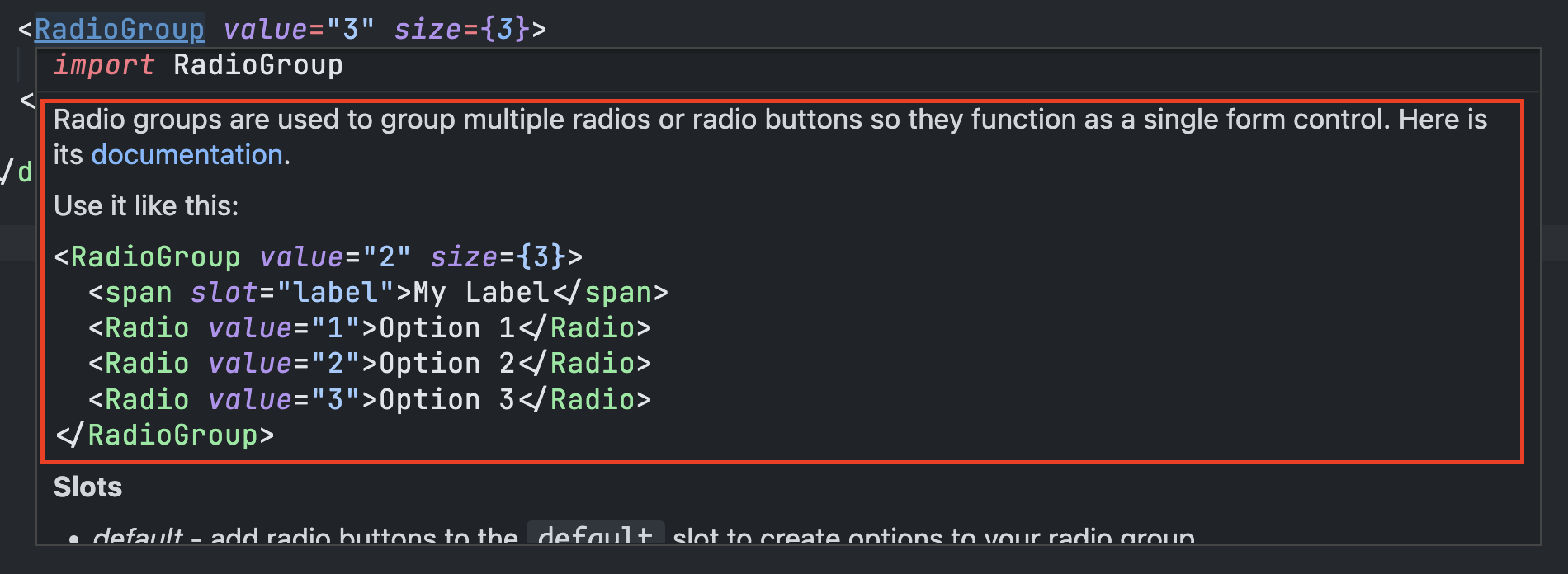
Note: Descriptions support multiple lines by breaking the comment up into multiple lines whereas summaries do not and will need to be manually added using \n.
// description example

/**
 *
 * Radio groups are used to group multiple radios or radio buttons so they function as a single form control. Here is its [documentation](https://my-docsite.com).
 *
 * Use it like this:
 * ```html
 * <RadioGroup value="2" size={3}>
 *   <span slot="label">My Label</span>
 *   <Radio value="1">Option 1</Radio>
 *   <Radio value="2">Option 2</Radio>
 *   <Radio value="3">Option 3</Radio>
 * </RadioGroup>
 * ```
 *
 */
// summary example
/**
*
* @summary Radios buttons allow users to select a single option from a group. Here is its [documentation](https://my-site.com/documentation).\n\nUse it like this:\n```html\n<Radio value="1" disabled>Your label</Radio>\n```
*
* /Default Exports
If you component class does not provide a named export and is the default export, be sure to set defaultExport to true. This will endure the import for the class gets resolved correctly.
Attributes and Properties
All attributes and public property names (with the exception of those that were mapped using the attributeMapping config) are converted to camel-case properties on the React component.
<MyCheckbox myLabel={"My Checkbox"} />Additionally, complex objects can also be passed as properties as well.
<MyTodoList items={["Wash car", "Pay bills", "Deploy code"]} />Slots
Slotted items get passed to the component slot using the children property under the hood and should behave like normal slots.
<MySelect>
  <span slot="label">My Label</span>
  <MyOption>Option 1</MyOption>
  <MyOption>Option 2</MyOption>
  <MyOption>Option 3</MyOption>
</MySelect>
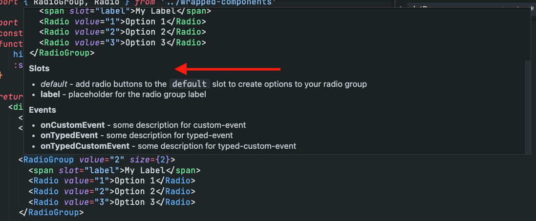
Slot information will display with the element description during autocompletion or when hovered over. This section can be hidden by setting slotDocs to false in the config.
Events
Event names are converted to camel-case names prefixed with on. For example, an event named my-change will be converted to onMyChange.
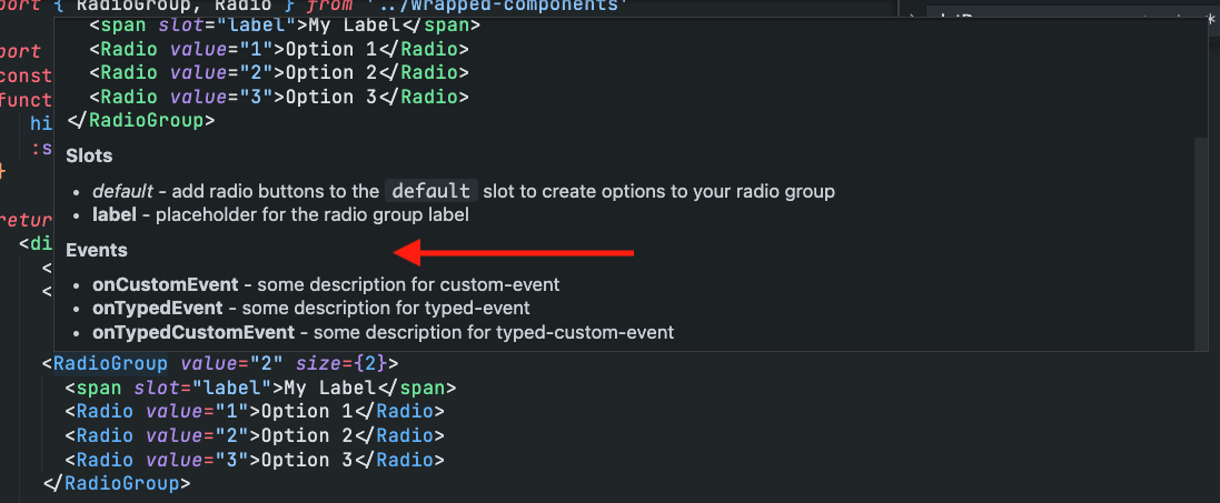
<MySelect onMyChange={handleMyChange} />Event information will display with the element description during autocompletion or when hovered over. This section can be hidden by setting hideSlotEvents to true in the config.
Global Events
If you want to include global custom events, you can use the globalEvents option. Pass it an array of events you want to add to your components. Here are some examples:
globalEvents: [
  {
    event: "onMyCustomEvent",
    description: "Triggered when you do a specific thing.",
    type: "CustomEvent<MyDetails>",
  },
];
CSS
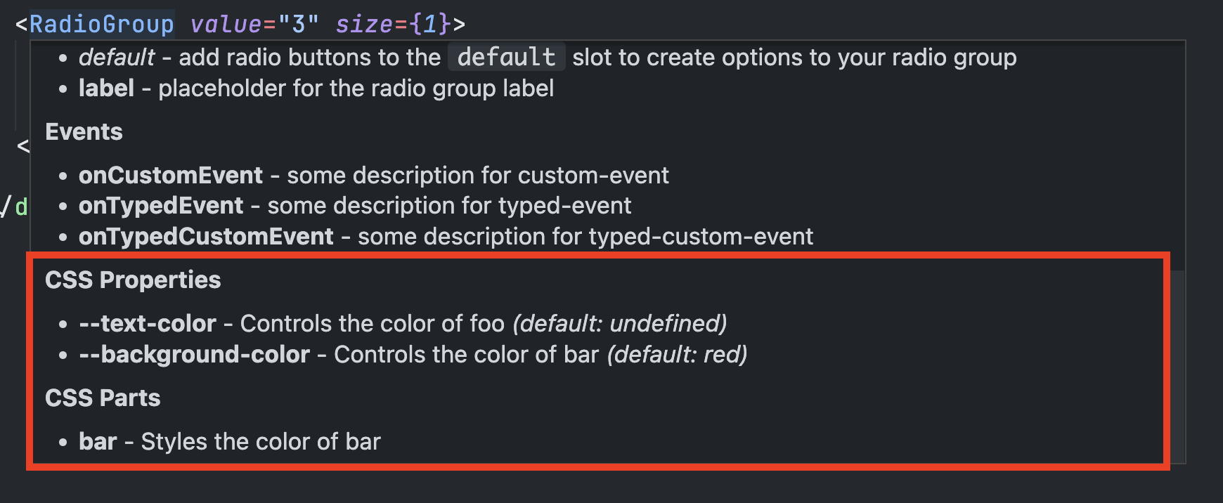
Component-specific CSS Properties and CSS Parts are included in the component documentation. These can be hidden using the hideCssPropertiesDocs and hideCssPartsDocs configuration options respectively.
TypeScript Support
There are a few important things to keep in mind when using types in your new React-wrapped components.
Component Type
Your component wrappers will likely have the same name as the class used to declare the custom element. In order to prevent name collisions, references to your to the web component will be suffixed with Element - (example - MySwitch -> MySwitchElement). This is useful if you want to provide types and autocomplete when using refs with your components.
import React, { useRef } from "react";
import { MySwitch, MySwitchElement } from "../components/react";

export default () => {
  const switchRef = useRef<MySwitchElement>(null);

  const handleClick = () => {
    switchRef.current?.toggle();
  };

  return (
    <>
      <button onClick={handleClick}>Toggle</button>
      <MySwitch ref={switchRef} />
    </>
  );
};
This is also important when referencing an element from the event target.
import { MyInput, MyInputElement, MyInputChangeEvent } from "../components/react";

export default () => {
  // If your events have a `details` payload, be sure to provide types and export them. They will be included in the wrapper types.
  const handleChange = e => {
    const value = (e.target as MyInputElement).value;
    ...
  };

  return <MyInput onChange={handleChange} />;
}
Prop Types
Each React component will provide types for the component properties using the component name suffixed with Props (example - MyButton -> MyButtonProps). This will automatically be applied to the component to provide editor autocomplete and type-safety, but there may be times where you need access to the types of those properties. The example below shows how you can import the prop types to provide relevant types to your state management and other values in your components.
import { MyButton, MyButtonProps } from "../components/react";

export default () => {
  // Now TypeScript will only allow valid variants to be set using `setButtonVariant` and the `variant` prop will identify `buttonVariant` as a valid variable type.
  const [buttonVariant, setButtonVariant] =
    useState<MyButtonProps["variant"]>("primary");

  return <MyButton variant={buttonVariant}>Button</MyButton>;
};
Extending Types
All components will come with the following default prop types:
[
  "children",
  "className",
  "dir",
  "exportparts",
  "htmlFor",
  "hidden",
  "id",
  "key",
  "lang",
  "part",
  "ref",
  "slot",
  "style",
  "tabIndex",
  "title",
  "translate",
  "onClick",
  "onFocus",
  "onBlur",
];
If you would like to extend the types to include those from React's props list, they can be added using the reactProps option in the configuration. Pass it a string array of the props you would like to include.
{
  /* other config options */
  reactProps: ["autoCapitalize", "draggable", "onAnimationEnd"];
}
To include all props and events for the HTMLElement type, set the reactProps option to true.
Component Scoping
One of the challenges with custom elements is that you can only register a tag once. If you have multiple versions of your component library running on a page at the same time, you need to provide a way to prevent tag name collision. A common way to do this is by providing tag names with a prefix or suffix to create custom tag names.
To provide custom prefixes or suffixes to your custom element tag names that are rendered in the react wrappers, first update the config property scopedTags to true. This will generate a new ScopeProvider component where a prefix or suffix can be specified.
<ScopeProvider prefix="test_" suffix="_test2">
  {/* the rest of your app */}
</ScopeProvider>
Now you can add your components inside of that scope provider.
<ScopeProvider prefix="test_" suffix="_test2">
  <RadioGroup>
    <RadioButton></RadioButton>
    <RadioButton></RadioButton>
    <RadioButton></RadioButton>
  </RadioGroup>
</ScopeProvider>
The custom elements will now be rendered with the new tag names.
<test_radio-group_test2>
  <test_radio-button_test2></test_radio-button_test2>
  <test_radio-button_test2></test_radio-button_test2>
  <test_radio-button_test2></test_radio-button_test2>
</test_radio-group_test2>
IMPORTANT: It is important to note that this will not define your elements with scopes. It will also not scope any components used within your components. It only renders the specified tag name.
SSR Safety
If you or anyone are planning on using your components in an environment where they are being server-side rendered like in Next.js or Remix, be sure to set the config ssrSafe to true. This will allow your components to run in those environments without throwing any errors.
IMPORTANT: This feature does not make your components render on the server (although the tag will be), but instead waits for the client before attempting to register and execute your components.
11 months ago
1 year ago
1 year ago
1 year ago
1 year ago
1 year ago
1 year ago
1 year ago
1 year ago
2 years ago
2 years ago
2 years ago
2 years ago
2 years ago
2 years ago
2 years ago
2 years ago
2 years ago
2 years ago
2 years ago
2 years ago
2 years ago
2 years ago
2 years ago
2 years ago
2 years ago
2 years ago