custom-modal-react-component v1.0.1
Custom Modal React Component
React component which allows to display a customizable modal with different themes and parameters.
Table of content
- Installation
- Version
- Technologies
- Usage
- Props
- Modal preview
- Global settings
- Customization
- Themes
- Contribution
- Author
- Changelog
- Licensing
Installation
npm install custom-modal-react-componentVersion
This package is in version 1.0.1
Technologies
- JavaScript
- SASS: 1.80.5
- React: 18.3.1
- React DOM: 18.3.1
- Node: 18.16.1
Usage
import React, { useRef } from "react"
import Modal from "custom-modal-react-component"
import "custom-modal-react-component/dist/styles/modal-component.css"
import closeIcon from "custom-modal-react-component/dist/icons/close.svg" /* You can change the closeIcon path if it is different */

function App() {
	const modalRef = useRef()

	/* Call modalRef.current.open() when you want the modal to open, for example after a form submission.
	   Only "if(modalRef.current)" and its content are mandatory, you can adapt this example for your own needs.
	*/
	const handleSubmit = (e) => {
		e.preventDefault()
		if (modalRef.current) {
			modalRef.current.open()
		}
	}

	return (
		<>
			{/* Only the <Modal /> component with its required props is mandatory here, you can adapt this example for your own needs. */}
			<Modal ref={modalRef} icon={Your icon path} title="Your title" message="Your message" theme="light" closeIconPath={closeIcon} />
			<form onSubmit={handleSubmit}>
			<label htmlFor="Field">Field</label>
				<input type="text" />
				<button>Submit</button>
			</form>
		</>
	)
}
Props
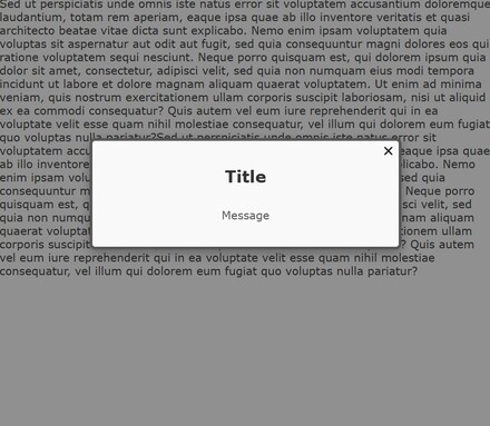
Modal preview
A background is added behind the modal, preventing to interact with the back of the page.
Global settings
The modal is designed with a maximum height and width of 75% of its container.
A scrollbar appears if the content exceeds the modal height.
Customization
To apply default styles, import the component's CSS:
import "custom-modal-react-component/dist/styles/modal-component.css"Several preset themes are available, go to the next section to check.
Available Classes for Custom Styling
- .modal : Style the modal container (e.g., background, border)
- .modal-title : Style the title text
- .modal-message : Style the message content
Themes
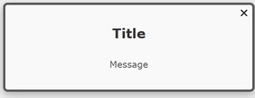
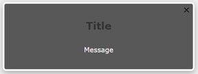
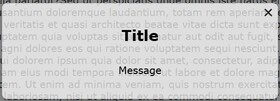
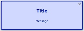
Choose from multiple themes by setting the theme prop with one of the theme names below.
How to use it with the candy theme, for example :
<Modal ref={modalRef} title="Your title" message="Your message" theme="candy" closeIconPath={closeIcon} />Light theme
Dark theme
Minimal theme
Mystic theme
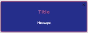
Candy theme
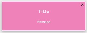
Organic theme
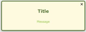
Coffee theme
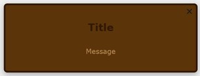
Tech theme
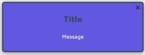
Urban theme
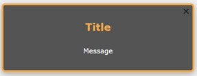
Success theme
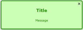
Warning theme
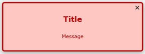
Information theme
Contribution
This project was conducted as part of a training course and is not open to external contributions at this time.
Author
Mégane Navarro (navarromegane@gmail.com)
Changelog
1.0.1 - 2024-11-15
- First stable version
- Adding a declaration file
- Documentation improvement
0.0.0 - 2024-11-10
- First Beta Version
Licensing
This project was built under the ISC licence.