d3-object-charts v1.2.22
D3 Object Charts
This is a collection of unconventional D3 charts that aren't typically included in D3 graphing libraries such as C3, available as ES6 classes.
D3 visualization components implemented as objects. Available charts:
- Calendar grid chart
- Range slider - slider with two handles and configurable min/max's between the handles.
- Simple slider - slider with single handle that slides continuously.
- Snap slider - slider with one handle that will snap to values provided as labels.
- Comparative pie - Nest a standard pie chart within another circle, whose circumference intersects at bottom left corner of graph.
- Overlap bar - Similar to a stacked bar chart, but bars all start at 0, so you can style some bars to be transparent and provide an overlapped comparative view.
The easiest way get a feel for these charts is to checkout the examples.
- See them in action here.
- Checkout intialization in example entry.js.
- CSS plays a big role in the utility of some of these graphs example style.css.
Installing
Make sure the following packages are installed on your machine
- node.js
- npm
Install dependencies
$ npm installMinified production build
Compile into a minified bundle with external stylesheets.
$ gulp buildUsage
After the installation of the dependencies the required chart can be instantiated in src/main.js.
Upon completion it has to be compiled using:
$ gulp buildThe compiled JS and CSS files can now be referenced to from within an HTML file.
// Minified stylesheets
<link href="dist/style.min.css" rel="stylesheet" type="text/css">

// Minified bundle containing D3 and chart implementation
<script charset="utf-8" src="dist/bundle.js"></script>
API reference
Calendar grid chart
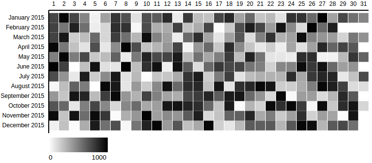
Grid chart showing one month per row. Displays the y values in different opacities of a color tone. Higher values equal a darker color.

This example depicts a calendar grid chart created with the required options using this example data set.
var calendar = new CalendarGridChart({
  container: '#container-calendar',
});
calendar.drawData({
  values: data
});
Options: object instantiation
The following list shows all available options that can be passed to the CalendarGridChart object during the instantiation.
var calendar = new CalendarGridChart({
  container: '#container-calendar',
  // optional properties:
  date_attr: 'date',
  // ...
});
Properties marked in this format are required.
| property | description |
|---|---|
container | The selector representing the parent element in which the SVG will be created. |
| date_attr | The identifier for the x scale property within the data objects. Defaults to 'date'. |
| range_attr | The identifier for the x scale property within the data objects. Defaults to 'date'. |
| outer_width | The initial width of the SVG that contains the chart. Defaults to 800px. |
| outer_height | The initial height of the SVG that contains the chart. Defaults to 360px. |
| margin | The margin defines the space of the four sides surrounding the chart. Defaults to {top: 30, left: 150, bottom: 30, right: 0} |
| color_min | The brightest color rendered for the lowest value of the range. Defaults to #fff |
| color_max | The darkest color rendered for the highest value of the range. Defaults to #000 |
| grid_padding | The amount of space in the range interval to be allocated to padding. Typically in the range 0,1. Defaults to 0.05. |
| display_date_format | The format of the Y axis ticks. Defaults to %B %Y (Month Year). |
| min_range_zero | Sets the minimum value of the range to 0. Defaults to false. |
| legend | Shows a legend with the color range that is used from the minimum value to the maximum value. Defaults to true. |
Options: drawData method call
The following list shows all available options that can be passed to the drawData method call.
// previously created variable is referenced
calendar.drawData({
  css_class: "production-value",
  // optional property:
  values: data
});
Properties marked in this format are required.
| property | description |
|---|---|
values | The array containing the data for the chart. Can refer to a variable or the objects can be inserted inline. |
| css_class | The CSS class identifying each rect element in the data set. Defaults to none. |
Range slider
Slider to update the data range (integer or date) dynamically. The range selection (minimum and maximum) is instantly provided as an output.

This example depicts a range slider created with the required options.
var range_slider = new RangeSlider({
  container: '#range-slider-int',
  outer_height: 100,
  delta: {
    'min': 50,
    'max': 100
  },
  onRangeUpdated: function(min, max) {
    console.log('min', min);
    console.log('max', max);
  }
});
range_slider.drawData({
  abs_min: 0,
  abs_max: 1000,
  current_min: 100,
  current_max: 200,
});
Options: object instantiation
The following list shows all available options that can be passed to the RangeSlider object during the instantiation.
var range_slider = new RangeSlider({
  container: '#range-slider',
  delta: {
    'min': 50,
    'max': 100
  },
  onRangeUpdated: function(min, max) {
    // specify what to do with output range
  }
});
Properties marked in this format are required.
| property | description |
|---|---|
container | The selector representing the parent element in which the SVG will be created. |
delta | The minimum and maximum value defining the range selection spectrum. Has to be given as an object in format as follows. *delta: { 'min': 50, 'max': 100 } |
onRangeUpdated | The selection of a range using the slider triggers this event. Hands over the current minimum and maximum value. Must be a function. Example definition: onRangeUpdated: function(min, max) {} |
| date_range | The indicator for whether the input data is given as a Date object or integer. Defaults to boolean false. |
| tick_amount | The amount of ticks that should be displayed on the x axis. The specified count is only a hint; the scale may return more or fewer values depending on the input domain. Defaults to 6. |
| outer_width | The initial width of the SVG that contains the chart. Defaults to 600px. |
| outer_height | The initial height of the SVG that contains the chart. Defaults to 100px. |
| margin | The margin defines the space of the four sides surrounding the chart. Defaults to {top: 20, left: 30, bottom: 20, right: 30} |
Options: drawData method call
The following list shows all available options that can be passed to the drawData method call.
// previously created variable is referenced
range_slider.drawData({
  abs_min: 0,
  abs_max: 1000,
  current_min: 100,
  current_max: 200,
});
Properties marked in this format are required.
| property | description |
|---|---|
abs_min | The absolute minium value of the domain. Specifies the start of the x axis. |
abs_max | The absolute maximum value of the domain. Specifies the end of the x axis. |
current_min | The minimum value of the initial range selection. Specifies the position of the left handle bar. |
current_max | The maximum value of the initial range selection. Specifies the position of the right handle bar. |
Examples
Calendar grid chart
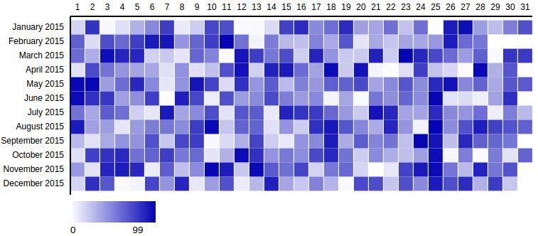
This example depicts a calendar grid chart created with additional non-default options and this example data set.

var calendar1 = new CalendarGridChart({
  container: '#container-calendar1',
  date_attr: 'day_date',
  range_attr: 'production',
  outer_width: 800,
  outer_height: 400,
  color_max: '#0404B4'
});

calendar1.drawData({
  css_class: "prod-value",
  values: data1
});
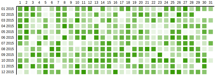
This example depicts a calendar grid chart created with additional non-default options and this example data set.

var calendar2 = new CalendarGridChart({
  container: '#container-calendar2',
  grid_padding: 0.3,
  margin: {
    top: 50,
    left: 115,
    bottom: 50,
    right: 0
  },
  display_date_format: '%m %Y',
  date_attr: 'date',
  min_range_zero: true,
  range_attr: 'value',
  color_max: '#339900',
  legend: false
});

calendar2.drawData({
  css_class: "value",
  values: data2
});
Range slider
This example depicts a range slider created with additional non-default options.

var range_slider = new RangeSlider({
  container: '#range-slider',
  delta: {
    'min': 3600 * 24 * 1 * 1000,
    'max': 3600 * 24 * 5 * 1000
  },
  date_range: true,
  onRangeUpdated: function(min, max) {
    console.log('min', min);
    console.log('max', max);
  }
});

range_slider.drawData({
  abs_min: new Date(new Date() - 3600 * 24 * 30 * 1000), // 30 days ago
  abs_max: new Date(),
  current_min: new Date(new Date() - 3600 * 24 * 10 * 1000),
  current_max: new Date(new Date() - 3600 * 24 * 6 * 1000)
});
This example depicts a calendar grid chart created with additional non-default options.

var range_slider_int = new RangeSlider({
  container: '#range-slider-int',
  delta: {
    'min': 10,
    'max': 20
  },
  tick_amount: 4,
  onRangeUpdated: function(min, max) {
    console.log('min', min);
    console.log('max', max);
  }
});

range_slider_int.drawData({
  abs_min: 10,
  abs_max: 99,
  current_min: 40,
  current_max: 50,
});
Simple Slider
You can pass a axis_click_handle boolean to move the handle position by clicking on any part of the x axis. This feature is disabled by default.
var simple_slider = new SimpleSlider({
  container: '#simple-slider',
  tick_labels: {
    0: '0%',
    10: '10%',
    20: '20%',
    30: '30%',
    40: '40%',
    50: '50%',
    60: '60%',
    70: '70%',
    80: '80%',
    90: '90%',
    100: '100%'
  },
  axis_click_handle: true,
  onChange: function(new_value) {
    console.log('new_value', new_value);
  }
});

simple_slider.drawData({
  abs_min: 0,
  abs_max: 100,
  current_value: 30
});
Snap Slider
Snap slider is a simple slider that will snap a D3 brush to the nearest tick mark.
You can pass in a snap_debounce time in ms, to make the handler more or less smooth.
Additionally you can pass a axis_click_handle boolean to move the handle position by clicking on any part of the x axis. The handle then smoothly scrolls to the nearest tick mark. This feature is disabled by default.
The onSnap call back is triggered anytime the handle is snapped to a tick mark.
var snap_slider = new SnapSlider({
  container: '#snap-slider',
  tick_labels: {
    0: '0%',
    10: '10%',
    20: '20%',
    30: '30%',
    40: '40%',
    50: '50%',
    60: '60%',
    70: '70%',
    80: '80%',
    90: '90%',
    100: '100%'
  },
  snap_debounce: 100,
  axis_click_handle: true,
  onSnap: function(snap_value) {
    console.log('snap_value', snap_value);
  }
});

snap_slider.drawData({
  abs_min: 0,
  abs_max: 100,
  current_value: 30
});
Developing
Build development files
Compile into a un-minified bundle.
$ gulp devWatch mode
Recompile after detected file change.
$ gulp watchRun Jasmine spec tests
$ gulp test8 years ago
8 years ago
8 years ago
9 years ago
9 years ago
9 years ago
9 years ago
9 years ago
9 years ago
9 years ago
9 years ago
9 years ago
9 years ago
9 years ago
9 years ago
10 years ago
10 years ago
10 years ago
10 years ago
10 years ago
10 years ago
10 years ago
10 years ago
10 years ago
10 years ago