0.1.0 • Published 7 years ago
d3-relation-graph v0.1.0
d3-relation-graph
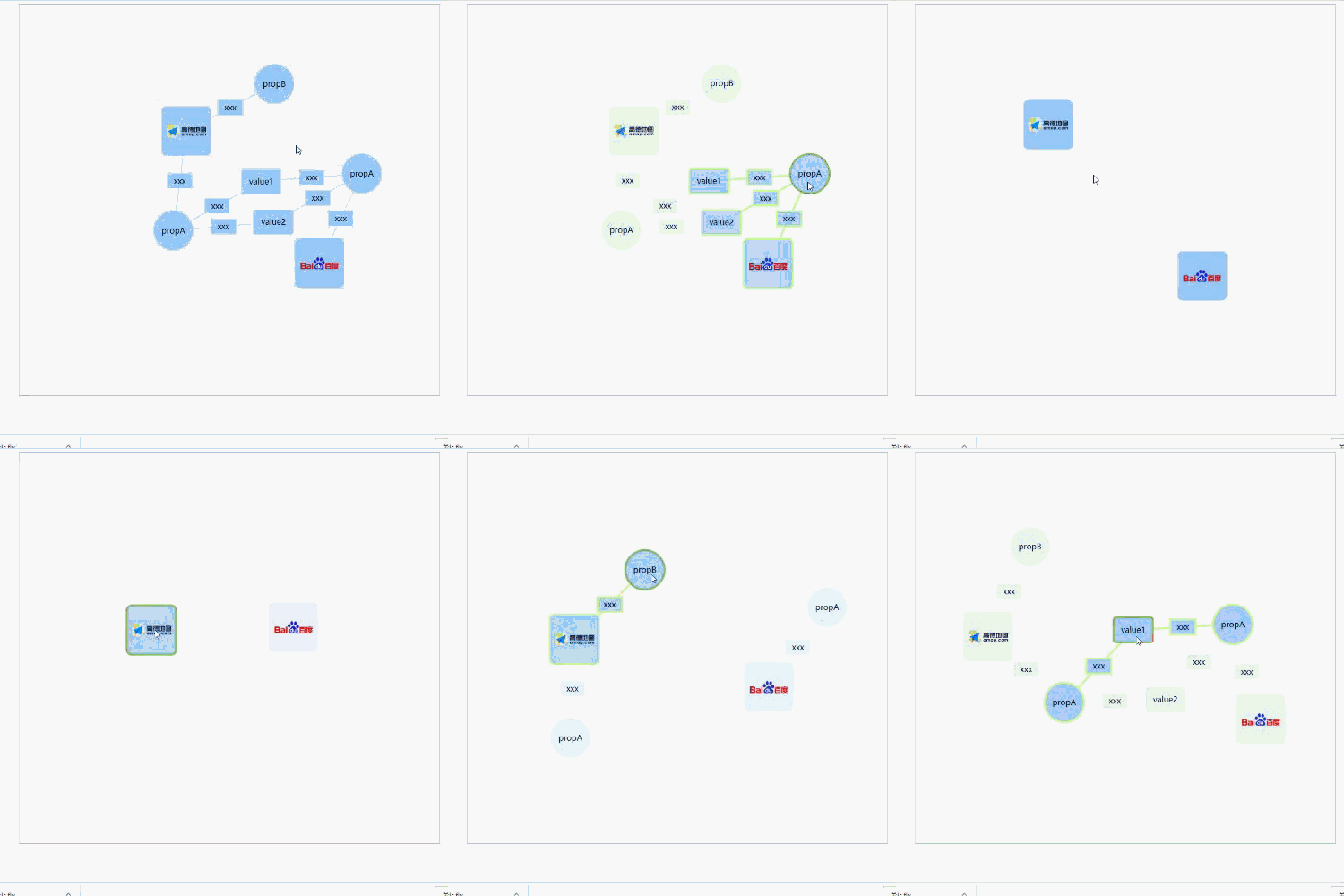
A visual relation graph based on d3.js. It has the functions: dragging, enlarging/shrinking by mouse wheel, double-clicking shrinking/expanding, highlighting, custom shapes, etc.
DEMO
Please clone the repository and run locally
Basic

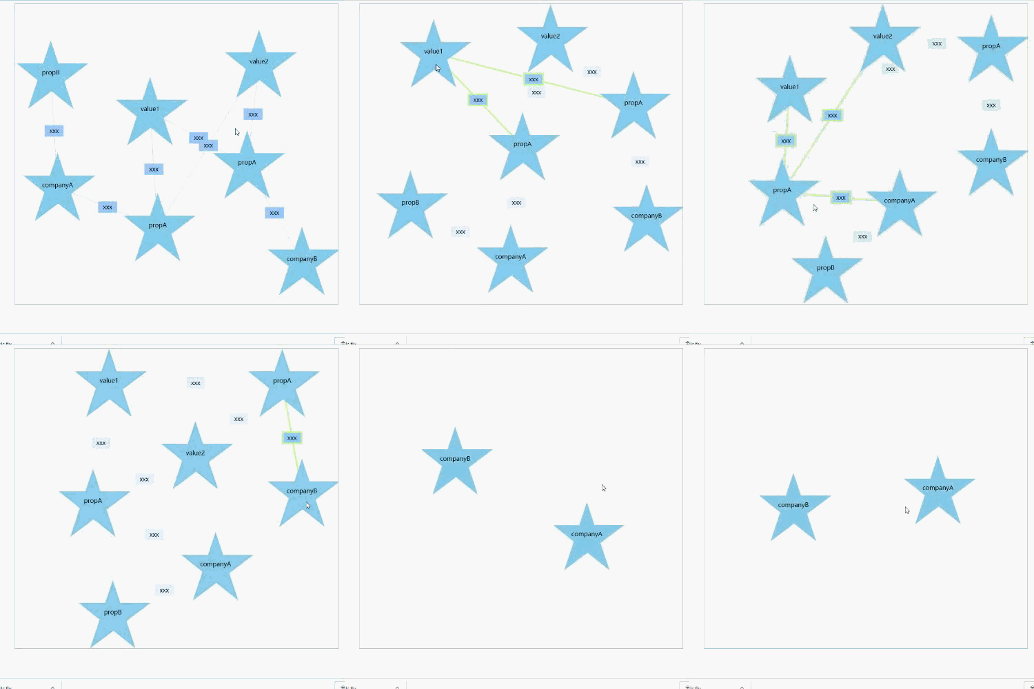
Customize Content

INSTALL
NPM
npm install d3-relation-graph --save<script>
<!-- optional, and if you need to modify the style, please refer to the file -->
<link rel="stylesheet" href="dist/css/d3-relation-graph.css" />

<!-- Importing d3.js must be in front of d3-relation-graph -->
<script src="../node_modules/d3/dist/d3.js"></script>
<script type="text/javascript" src="dist/js/d3-relation-graph.min.js"></script>
USAGE
- HTML:
<div id="app">
  <!-- SVG will be generated here, and its size is based on the parent element -->
</div>
JS:
// optional, and if you need to modify the style, please refer to the file import "d3-relation-graph/dist/css/d3-relation-graph.css"; import * as rg from "d3-relation-graph"; let rgObj = rg.create(options);let rgObj = rg.create(options);
API
Methods
create(options):
RGObj
Generate the graph, and return an object(RGObj)Options
Prop Type Default Description Necessary wrapper string | Object - The target element's id or DOM object √ typeOptions TypeOptions - Structure(appearance) configuration of the nodes and links data RGData - The data of relation graph √ defaultShowLevel number 3 Configures which level of nodes(nodes which is less than or equal the level) to display when initializing levelKey string "level" Prop name of the node level params nodeTypeKey string "type" Prop name of the node type params linkTypeKey string "type" Prop name of the link type params isZoomable boolean false Controls whether the graph can be scaled. If isZoomable is true, isBounding will be set falseforciblyisBounding boolean true If true, the nodes are not removed from the boundary. But if isZoomable is true,isBounding will be set falseforciblyisSticky boolean false If true, the nodes after being dragged will be stuck(fixed position, but they still can be dragged) click function(EventObj) - The callback while the node/link was clicked clickEmpty function(EventObj) - The callback while click the background mouseover function(EventObj) - The callback while node/link was mouseovered mouseout function(EventObj) - The callback while node/link was mouseouted TypeOptions
Define the types of nodes and linksProps
nodes: Object
typeOptions.nodes = { // The name of node type, which is used in RGData.nodes nodeA: { // Defining appearance appearance: { // Defining the content of appearance: Array contents: [ { // name of content class, optional value: Rect/Circle/Image/Text, See below for details(Shape) className: "Rect", // Corresponding class parameters,See below for details(Shape) params: { width: 100, height: 100, borderRadius: 10 } }, { className: "Image", params: { width: 80, height: 80, srcKey: "imgUrl" } } ] }, // The strength of the node's charge(The greater the charge intensity, the stronger the repulsive force between the nodes) collideRadius: 50 }, nodeB: { appearance: { contents: [ { className: "Circle", params: { r: 40 } }, { className: "Text", params: { textStrKey: "label", isOverflowHidden: true, maxWidth: 60 } } ] }, collideRadius: 40 }, customizeA: { appearance: { contents: [ // Customize Content, param options'prop includes d3Parent(The d3 selection object of the root element of the node, // see d3 selector for details, similar to jQuery) { draw: function(options) { var d3Parent = options.d3Parent; var polygon = d3Parent.append("polygon"); polygon .attr("points", "0,-90 60,90 -90,-30 100,-30 -60,90") .style("fill", "skyblue"); var text = d3Parent.append("text").text(function(d) { return d.showText; }); } } ] }, collideRadius: 150 } };links<Array> Define what is displayed in the middle of the link, similar to the above nodes, but not configuration of
collideRadiustypeOptions.links = { linkA: { describe: { contents: [ { className: "Rect", params: { width: 50, height: 30, borderRadius: 0 } }, { className: "Text", params: { textStrKey: "label", isOverflowHidden: true, maxWidth: 50 } } ] } } }
Shape
Rect
- Params
- width: number Default 100
- height: number Default 100
- borderRadius: number The width of border, default 10
- Params
Circle
- Params
- r The radius, default 40
- Params
- Image
- Params
- width Default 80
- height Default 80
- srcKey The prop's name of image url, default "src"
- Params
- Text
- Params
- textStrKey Prop's name of showing text, default "showText"
- maxWidth Max width of the text, default 60
- isOverflowHidden Whether the text length is longer than the max width and the ellipsis is displayed, default true
- Params
RGData
Props
- nodes<Array>
[ { // The id of node id: "companyA", // The node type, which is defined in typeOptions.nodes type: "nodeA", // Url for image(Shape.Image)(srcKey is assigned to "imgUrl" in shape image of nodeA) imgUrl: "https://upload.wikimedia.org/wikipedia/en/thumb/e/e7/AutoNaviLogo.png/220px-AutoNaviLogo.png", // The level of node level: 1 }, { id: "companyA-propA", type: "nodeB", // For showing text(Shap.Text)(textStrKey is assigned to "label" in shape text of nodeB) label: "propA", level: 2 } ]; links<Array>
[
  {
    // The id of link
    id: "1",
    // The id of source node
    source: "companyA",
    // The id of target node
    target: "companyA-propB",
    // The link type, which is defined in typeOptions.links
    type: "linkA",
    // For showing text(Shap.Text)(textStrKey is assigned to "label" in shape text of linkA)
    label: "something"
  },
  {
    id: "2",
    source: "companyB-propA",
    target: "value2",
    type: "linkA",
    label: "something"
  }
]
- nodes<Array>
EventObj
属性
- targetData: Object
The data object corresponding to the trigger event, e.g. if clicked a node, targetData will be the data of the node. - event: Event
The event object.
- targetData: Object
RGObj Methods
- showNodeById(id) - show node based on node's id
- hideNodeById(id) - hide node based on node's id
- showAllNodeByKey(key, value) - Display all eligible nodes based on the attribute and value
- hideAllNodeByKey(key, value) - Hide all eligible nodes based on the attribute and value
- updateData(data) - Update the data of graph
- destroy() - Destroy the graph(Remove the svg and all relational objects)
Browser Compatibility
Compatible with IE11(has not tested the compatibility of IE11)